
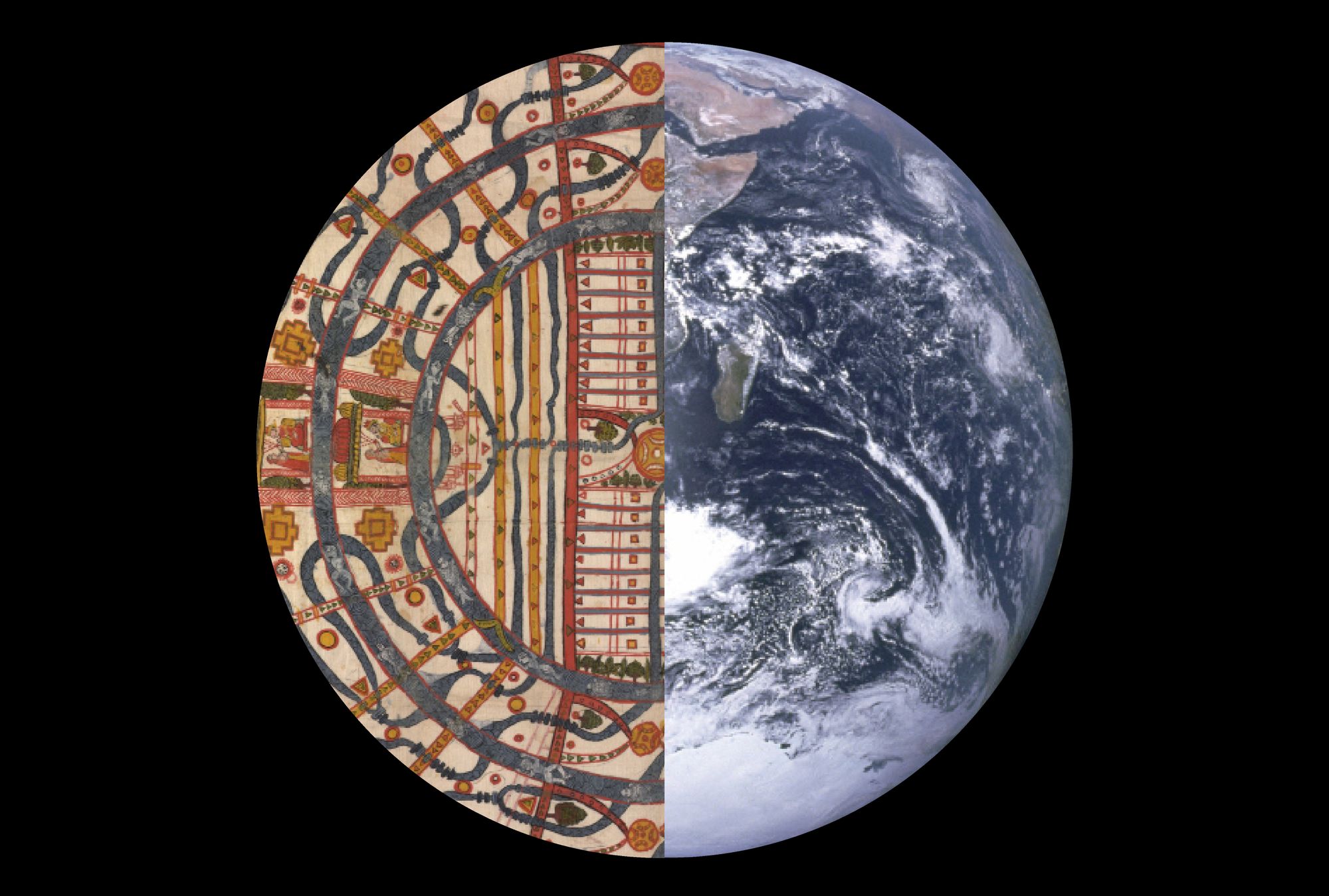
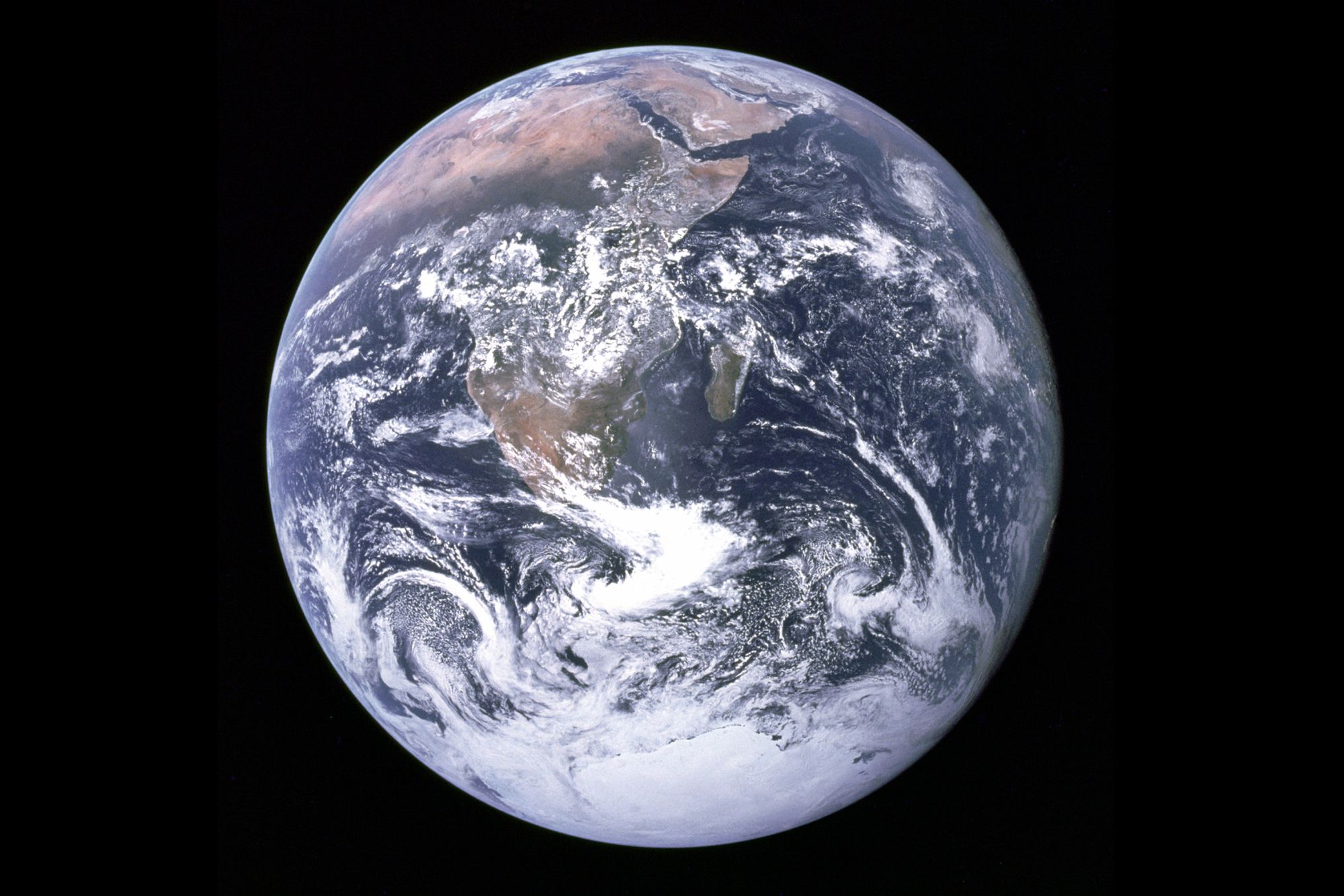
In 1972, when NASA took its famous image of Earth—the Blue Marble—from the Apollo 17, South was up. Yet, if you research the image right now, that will not be the case, for a conscious effort has been made to “fix” it; the Southern tip of Africa now conventionally points downwards. NASA went out of its way to flip our world upside down in order to fit expectations, but would Earth have looked so unfamiliar to the casual viewer had it not?
World maps for general use have a very non-confrontational, peaceful existence in the backgrounds of our lives. They appear on classroom walls, in educational textbooks, and even on wristwatches. This results in a passive attitude when it comes to consuming information on maps, and—with the exception of cartography enthusiasts, perhaps—there is implicit, unquestionable trust. Map-making is a complex process, making it relatively easy to have faith in the idea that those who created it knew what they were doing, and it’s not that they didn’t… but the question is how they were doing it.
In their open access book This is Not an Atlas: a Global Collection of Counter-Cartographies, the editors Severin Halder and Boris Michel (Kollektiv orangotango) write: “atlases proclaim truth, neutrality and objectivity, and consequently invoke authority and gravitas. Therefore, atlases and maps rarely allow for ambivalence or contradiction.” In other words, subjective bias of the map maker can be framed as universal fact.
The relative shapes, sizes and placement of geo-political information on maps have consequences on our spatial perception of the world. Often, you may hear someone referring to a certain region (along with its inhabitants) as being far away, based on their recollection of a general-use map. This may seem insignificant, but its effect is clear when empathy cannot be shown for those that are “far away.”
“The structuring of our world in this way has projected this image of a world of difference, of otherness, backing this illusion with geo-political constructions. The question is, then, is it possible to reimagine the world?”
In his 2008 paper Other/Otherness, Jean-François Staszak writes: “We, here, are the Self; they, there, are the Other […] If this otherness comprises a geographical dimension, it is because cultural surfaces are divided into supposedly homogenous spatial blocs (countries, zones, continents, etc.)” The structuring of our world in this way has projected this image of a world of difference, of otherness, backing this illusion with geo-political constructions. The question is, then, is it possible to reimagine the world?
Subjective Worlds
By examining the Arabic world map found in the 12th century manuscript—or written book—of Al Sharif Al Idrisi (نزهة المشتاق في اختراق الآفاق; The Excursion of One Who is Eager to Traverse the Regions of the World), the world as we know it is suddenly a very foreign place: South is up, the Americas are hidden, no political borders exist, and the African continent twists its land mass, taking up most of the Southern half of the map.
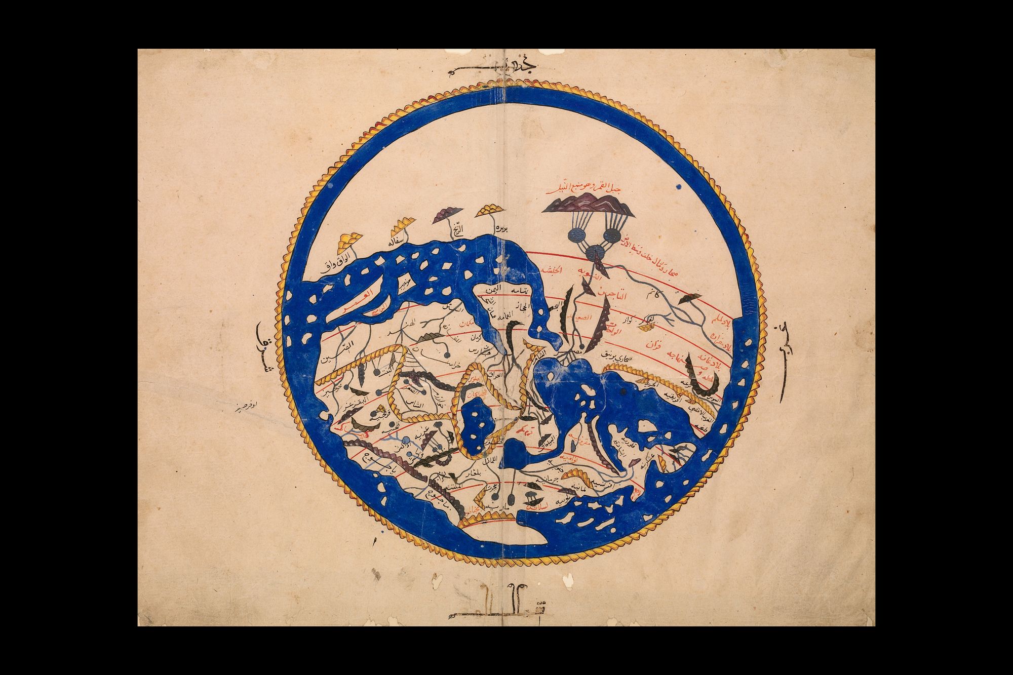
Stumbling upon this map for the first time, I was instantly intrigued, and also quite lost, for it barely resembled what I was used to seeing. Instinctively, I immediately started searching for spaces I recognized, trying to place myself into Al Idrisi’s world. It was only appropriate that the first location I identified was my own home, Egypt (مصر), and then it struck me: the Nile was going upwards… the Mediterranean lay below the Egyptian coastline… the map was orientated towards the South!
It was a concept I had never considered prior to that moment. Later on, the Nile would become my beacon for recognizing the orientation of medieval world maps. Being a native Arabic speaker, I was able to access the information written on this map, and I suspect that the experience of encountering such an illustration for a non-Arabic speaker would vary. I read my way through, identifying other locations, trying to imagine how my perception would’ve been different had this been the only representation of the world I knew. With such an emphasis on the Southern East (portraying regions including Central and Southern Asia), centers of culture, influence and knowledge production—largely neglected in the mainstream present—emerge.
“How would the shapes of geographic features look when (re)collected through in-person observations or oral/visual transmissions?”
This illustration above identifies a mixture of many still-existing Arabic place-names, alongside a few mysterious ones, constructed from a plethora of first- and second-hand accounts from travelers and scholars, handed down through generations. Would such a map be considered invalid?
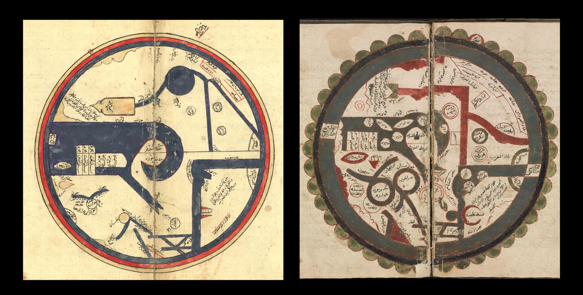
Above are slightly different, and older, takes on the world map, with the copies of Ibn Al Wardi’s illustrations showing the world in geometric formations. The Mediterranean is a thick horizontal line on the bottom right, while the Arabian Peninsula appears to be in the Indian Ocean’s grasp on the left. This makes me wonder, how would the shapes of geographic features look when (re)collected through in-person observations or oral/visual transmissions? In The Journey of Maps and Images on the Silk Road (2008), Dr. Andreas Kaplony theorizes that the specific simple shapes made it easier for copying and remembering, and faster in producing.
Advanced references in their time, the manuscripts mentioned so far were copied and distributed widely for centuries after their completion. This was a world with no satellites. Geographic compendiums or atlases such as these relied on the collective; building on the knowledge of the predecessors and gathering information through personal encounters.
“Each map [is] representing a view of the world centered on the peoples it was meant for, crafted through the ways of knowing by which it was encompassed.”
These maps embrace their subjectivity, and this was evident through the conscious centering on the 20 “regions” of the Islamic-majority lands (as is the case in Ibn Al Wardi’s). The same can be said about the naming of places: such is the case for “the land beyond the river (ما وراء النهر)”, which refers to the Amu Darya river, and roughly represents the lands of Central Asia. This subjectivity, however, was not exclusive to the Perso-Arabic-Islamic cultures of that time. Representations of the world have differed greatly among the ages and with the cultures that produced them. Each map representing a view of the world centered on the peoples it was meant for, crafted through the ways of knowing by which it was encompassed.
The Pre-Satellite Pluriverse
In this example of complex Medieval European cartography, the world map (Mappa Mundi) is circular, with East at the top. The reason for its orientation was informed by the centering of Christianity and positioning of Jerusalem at the centre of the world. It does not shy away from adding Biblical events to their locations, while coloring the Red Sea in, well, red.
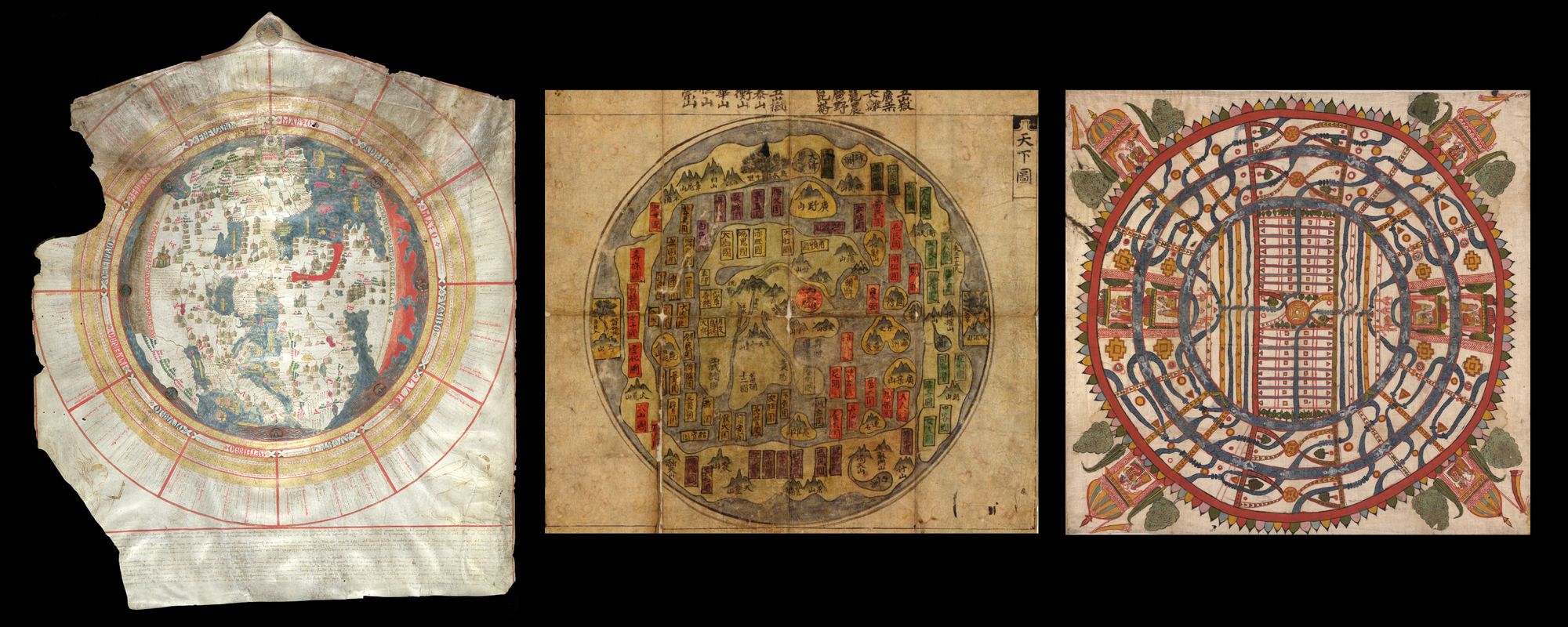
Also circular in shape, the Korean world map shown in the middle is from a Ch’ŏnha chido (Atlas of the world) that was copied in the 19th century. This genre of map-making centers the world around China, surrounded by places and kingdoms floating in a sea encompassed by a strip of land.
Another example (right) shows a representation of the world through Jainism, an Indian religion founded in the 6th century B.C. Its philosophical view of the world is constructed into this 19th century map showing the domain of humans as two continents, one circular and one ring-shaped, surrounded by two ocean rings, followed by the realm outside of mortal activity.
The unapologetically subjective maps we’ve just seen might appear to contrast with the world maps we encounter in our present era, but is this current representation as hegemonic as it seems?
Forget Google Earth
Map projections present a whole set of challenges, for how can one illustrate a naturally spherical body onto a flat surface without distorting it immensely? While the existence of these projections is to serve specific purposes (i.e. navigation at sea), it is still worthwhile to observe them with the eye of a casual viewer; after all, they are still valid representations of the Earth. In the case of the notorious and widely dispersed Mercator, used on sites such as Google Earth, such distortions cause Greenland to be the size of Africa, although, in reality, Africa is 14 times larger. While it is useful for navigational purposes, it massively exaggerates the size of the lands near the poles, causing Europe and North America to look larger than they actually are, and possibly affecting the spatial perception of the untrained eye.
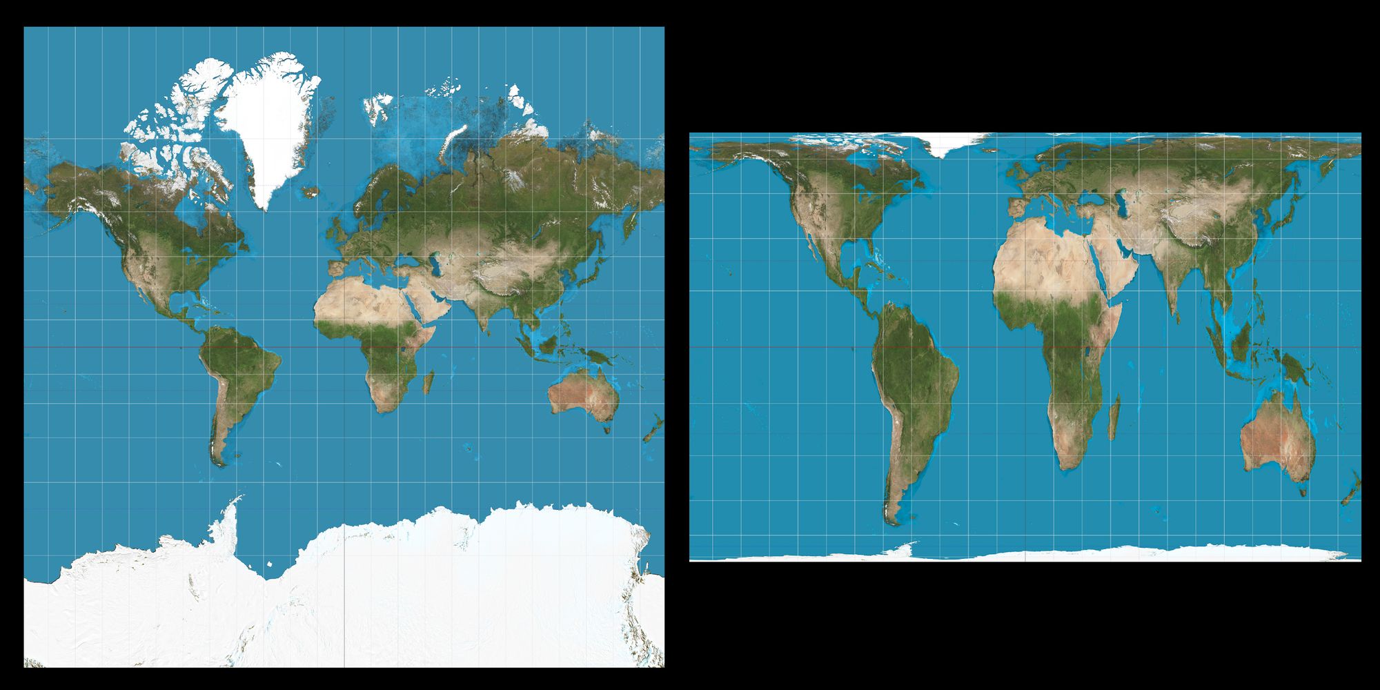
In the case of the Gall-Peters map (right), with it being an equal-area projection, the landmasses are of correct relative sizes, allowing Africa to flaunt its magnitude. This does come at a price, however, as the shape of the continents is distorted. Nowadays, general-use maps are typically those with compromised projections: their aim is to balance between size and shape distortions.
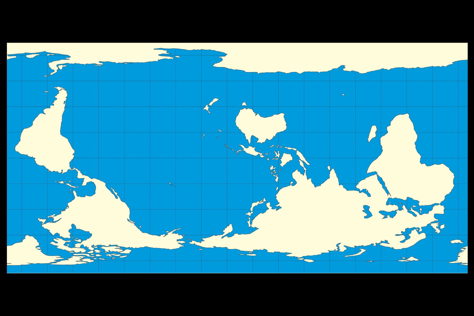
Now, what if these conventional maps were flipped on their head? Some attempts have been made to design world maps with South on top. This simple shift of perspective allows us to reimagine the world with fresh eyes. I invite you to try and locate yourself on the map shown below.
Who’s (not) there?
What about looking beyond landmasses to political borders and names? Who gets to be on the map and who doesn’t? In an article titled Maps, Technology and Decolonial Spatial Practices in Palestine, Palestinian-Iraqi writer Zena Agha outlines how the processes of cultural cleansing and systemic erasure were made tangible through the tools of cartography. In the 1950s, the Governmental Names Commission was established by the Israeli-occupation for the purpose of the Hebraicization of the names of Arab villages, perpetuating a notion that Arabic and Arabness was “foreign” and “alien” to the land: “The ultimate goal was to render Hebrew the only language through which to understand the landscape, thereby erasing the experiences and histories of the original inhabitants.” The article quotes the commission’s 1958 report which states that: “As long as the names did not appear in maps, they cannot take possession in life.”
“What about looking beyond landmasses to political borders and names? Who gets to be on the map and who doesn’t?”
Throughout my childhood, the Arabic maps I came across always had Palestine clearly labelled. (Whether this was an act of solidarity, or a plot by powerful bodies for gaining Arab public favor is beyond the scope of this article.) This was the knowledge that was ingrained in me; this was my reality. However, upon coming into contact with Google Earth and English-language maps, suddenly a different world was being presented to me; a world where Palestinians didn’t own their lands. Questions ran through my mind: don’t world maps show the truth? Are they not supposed to be objective? Who gets to make these decisions? The illusion of the objective map was forever shattered in my mind, and the thought of cartographic injustice remained with me ever since.
It was earlier this year when I came across the Equal Earth map website which boasts the tagline: “A world map for everyone.” I noticed how two options for the Arabic version of the map were presented—one which labels Palestine, the other, “Israel.” It felt almost as if I was being asked: which flavor of reality would you like to participate in today? And yet, the same option does not exist for the English version, which settled for including Gaza and the West Bank.
“Counter-cartographies present us with tools to challenge dominant narratives [...] As with many struggles for land, the map has become a tool for reclamation and resistance.”
The encounters mentioned so far put us face to face with the bleak reality of how maps can be devised to solidify the worldviews of those in power, but they also present us with the possibilities of engaging with the reverse process. To quote Ahmad Barclay in his article Mapping and “Truth”: Communicating the Erasure of Palestine, he reminds us that: “[…] maps, and the power that they represent — can be subverted within any given moment, and that a century of Zionist colonization is just a blink of an eye in the entirety of human history, let alone in the life of the planet itself.” Counter-cartographies present us with tools to challenge dominant narratives, and it is no coincidence that Palestinians (and their allies) utilize the image of the map of Palestine, with the indigenous place-names of their villages, in telling their stories and documenting their realities. As with many struggles for land, the map has become a tool for reclamation and resistance.
Finally...
When I see a world map, I see an image of everyone on Earth. I also see the stories of those who have passed, and those who are to come. It is a portrait of a home experienced in different ways, existing within multiple realities. And although world maps offer a representation of the most objective object of all, they are a fertile ground for silent biases and covertly subjective representations. They shape our worldviews (quite literally), and it is time to acknowledge these subjectivities, embrace our coexisting realities, and reimagine our hegemonic textbook map.
Sherine Salla (she/her) is an Egyptian designer and researcher based in Cairo. Her work explores themes of (Arab) cultural identity through the perspective of design and material cultures, and the lens of decolonization. She is currently part of Archief Cairo; a multilingual lab for research, preservation and communication.
This text was produced as part of the Against the Grain workshop.
Title image: Left side: Manusyaloka Map according to Jain cosomological traditions, 19th-century. Right side: The Blue Marble, photographed by the Apollo 17 crew in 1972.


