If I was told that the design in postcolonial nations was graphic—not “vernacular”—design, how would this have shifted my design educational experience?
My interest in graphic design began when I lived in the Philippines. My work was always viewed as “Art” or “Marketing,” but was nonetheless valued for its aesthetic qualities that aligned with Filipino culture. Only after I began my “formal” design education at the Rhode Island School of Design’s (RISD’s) Graphic Design Department did my Filipino art and design sensibilities get questioned by Bauhaus and Swiss Graphic Design “rules” that are the foundation of the RISD curriculum. For the first two years at university, I completely threw out any Filipino references and aesthetics in my work—I cringed at these epitomes of “bad” graphic design.
A year later, when I again began to produce work from a distinctly Filipino perspective, I was told by a professor that my work was “not that good. Some of it is actually quite bad.” I jumped in and said: “Well, I am leaning into the design vernaculars of the Philippines,” to which the professor nodded, and stopped commenting. Now, reflecting upon this critique, it is evident that this professor had unmistakable expectations for graphic versus vernacular, or good versus bad design. The classification of my work as “vernacular” was the only thing I could say to prevent my professor and peers from being critical of every formal design decision I made, without fully comprehending the function of my work. At the time, I did not fully understand the implications of classifying my work as “vernacular.” I lacked comprehensive knowledge on the term’s etymology and uses.
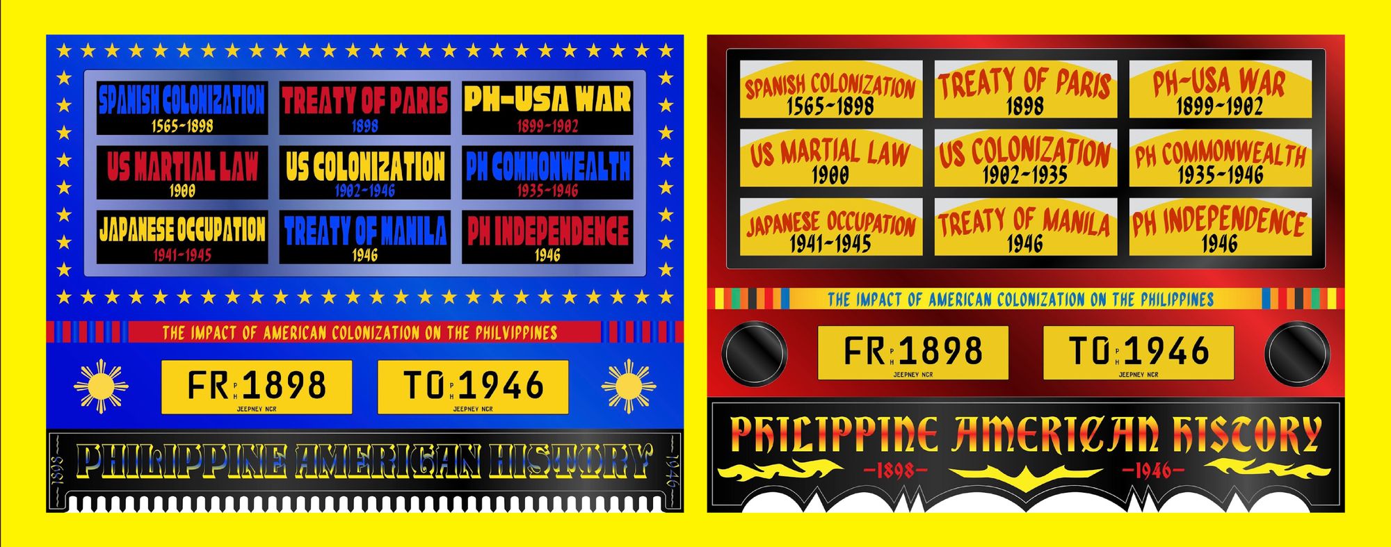
I was first introduced to the term “vernacular design” when I began to research decolonial theory, and how to relate this to my practice as a postcolonial Filipino designer. Many designers and academics based in Europe or North America would refer to graphic design seen on billboards, hand-painted signage, magazines, and storefronts in postcolonial nations as “vernacular design.” When I spoke with peers engaged in similar postcolonial and decolonial design work, I realized we all shared an understanding of “vernacular design” to mean “design languages”—that is, using the definition of the noun vernacular to mean language rather than its categorical definition in design and architecture. For the most part, we were unaware of the term’s etymology and alternate uses.
“In postcolonial Philippines, graphic design—both in and out of the capitalist framework—is not a field that can be placed in a box and defined by institutions. Our design exists for aesthetic and ornamental function.”
According to Dictionary.com, the noun “vernacular” is defined as “the native speech or language of a place.” I found empowerment in using the term, as it uniquely reflected how Filipinos mostly learn to design outside of institutions. Self-taught designers are very common in the Philippines, as there are currently no graphic design programs offered in Philippine Universities—with the exception of a few “advertising” or “information design” degrees that are ultimately tied to capitalism.
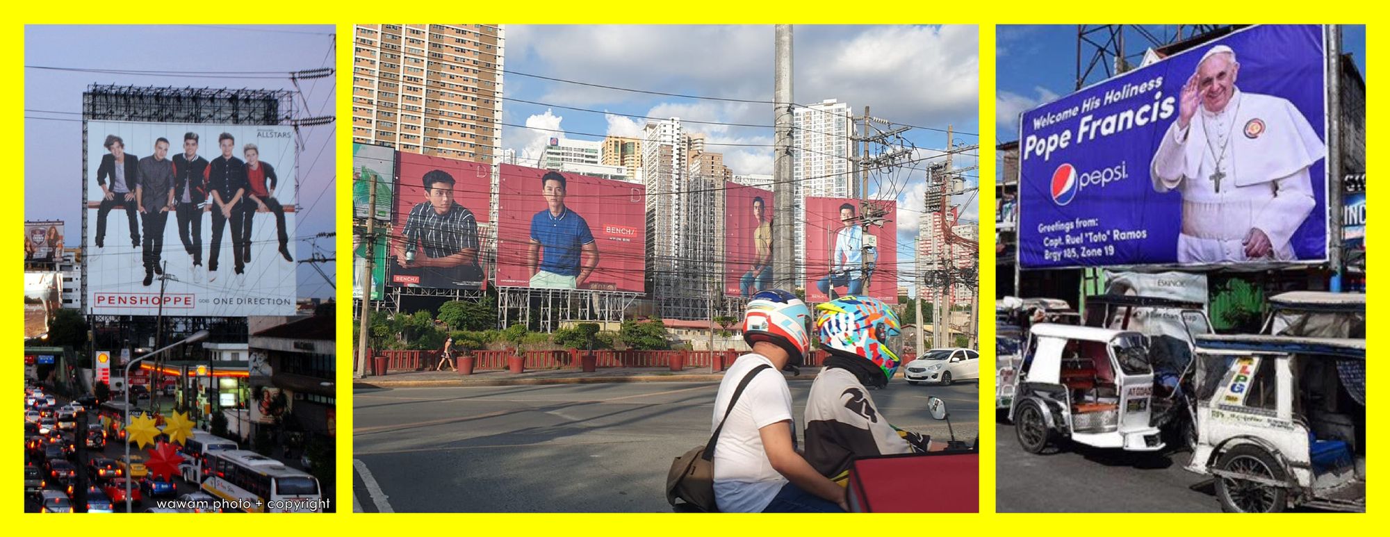
Similar to our native tongues, our design skills are learned by imitating the “native,” established, design vernaculars exhibited across large scale billboards, advertising campaigns, jeepneys, graffiti, etc. in the country. In postcolonial Philippines, graphic design—both in and out of the capitalist framework—is not a field that can be placed in a box and defined by institutions. Our design exists for aesthetic and ornamental function.

Before I knew it, I had excessively littered the term “vernacular” throughout my thesis without realizing how I was actually using the language of my colonizer to describe my own Filipino culture and identity. While doing further research for my thesis and the Futuress Against the Grain Fellowship, I came to understand how “vernacular design” is essentially used to categorize designs that do not fit within the standards of good Euro-American design—namely, designs that are not produced by individuals who were formally trained in Western educational institutions. I began to question: why must we categorize designs produced by self-taught designers versus “formally” trained ones? Why does design from my culture, and that of other postcolonial and diasporic contexts, have to be labeled “vernacular” rather than just being understood as graphic design?
This rude awakening was exacerbated when I learned the origins of the term in Do It Like You Do It, a lecture by graphic designer Agyei Archer. Archer shed light into the deeply disturbing Latin origin of the term vernacular: vernāculus, defined as “belonging to the household, domestic, native” and derived from verna “slave born in the household” added the suffix “ar” (meaning artists and repertoire). Although the term “vernāculus” itself is used to simply reflect something native to a country, such as its language, flora, animals, architecture, art, etc, I argue that its etymology cannot be separated from its intrinsic links to the violent history of framing women in Euro-patriarchal cultures to be tied to the household; to domestic work.
“I was actually using the language of my colonizer to describe my own Filipino culture and identity. [...] I came to understand how “vernacular design” is essentially used to categorize designs that do not fit within the standards of good Euro-American design”
In patriarchal societies, women continue to be overwhelmingly discounted as domestic household workers, whose contributions are devalued as vernāculus. Graphic Design history, and the professional industry we see today, is perceived to be white and male. Women, non-binary, and queer designers continue to be overlooked. Although AIGA Eye on Design’s Laura Bolt reports that women account for over 60% of graduate degrees in design, and 61% of the design industry, only 29% actually hold leadership roles. It is greatly unsurprising when the term “vernacular” is used to describe design that does not fit within the canon essentially established by the men of the Bauhaus.
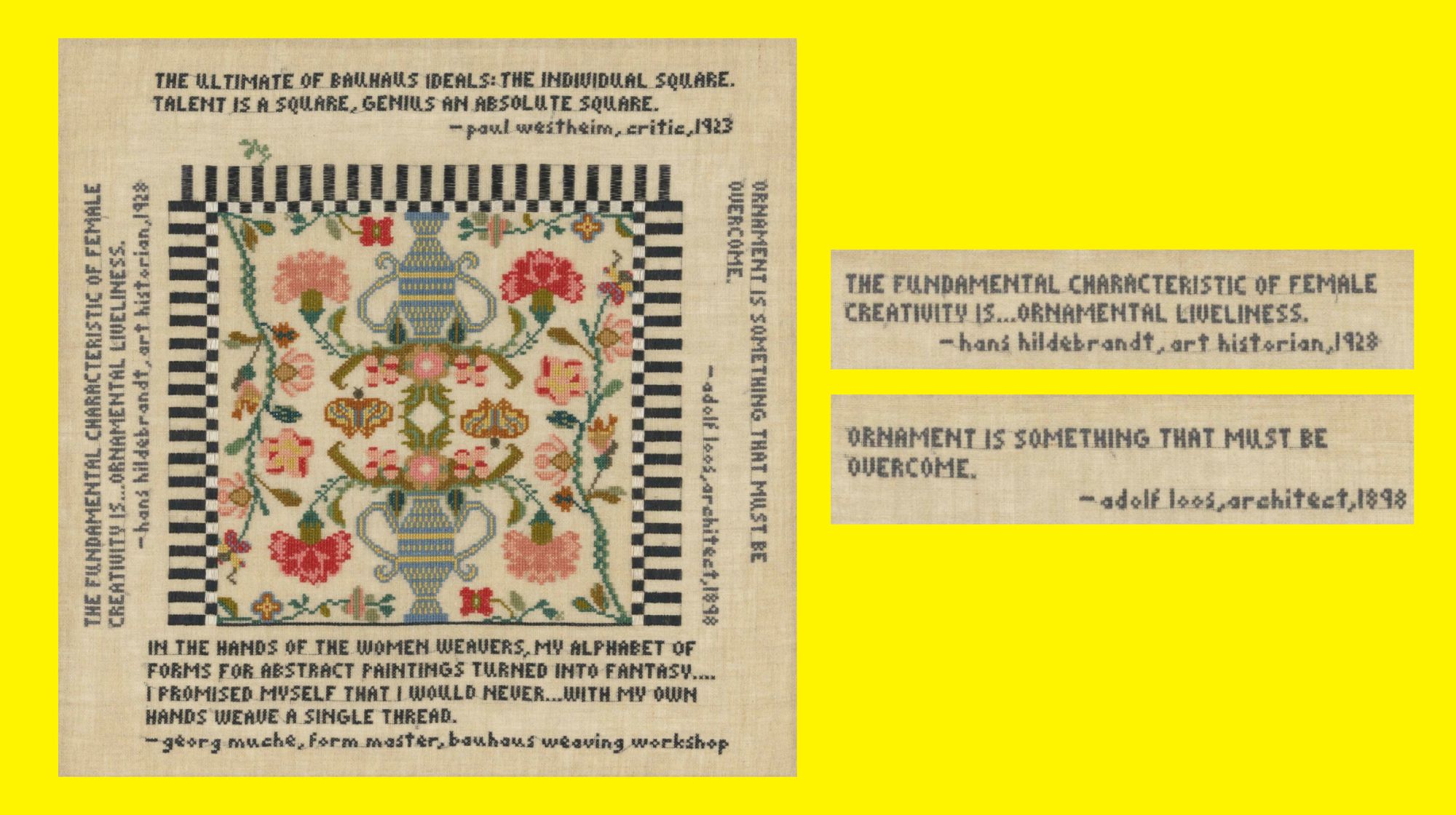
Men continue to hold power and thus dictate what classifies as “good” graphic design, which typically leans towards “clean” Swiss principles. Designs which have a heavier hand—or dare I say (femininely) ornamented—are often classified as “bad” or “vernacular.” Elaine Reichek’s piece, Sampler (The Ultimate), places quotes from well-known European designers and historians on a 19” x 19” linen sheet. Using embroidery—a medium often linked to femininity—Reichek juxtaposes art historian, Hans Hildebrant’s quote that “ornamental liveliness” is the “fundamental characteristic of female creativity” with architect, Adolf Loos’ stance that “ornamentation [...] must be overcome.” Reichek’s piece can be understood as a representation of today’s design industry that maintains patrichiarchical values.
Design histories and contributions from the majority, non-Eurocentric non-Western world are similarly sidelined. Verna, the Latin root of vernāculus, is defined as “slave born in the household.” This further exemplifies how the use of “vernacular” is tied to the (neo-)colonization and oppression of peoples in the majority world.
I am reminded that African American Vernacular English (AAVE), created within Black communities and culture, is reduced essentially to “slang” by non-Black folk. This slang is constantly appropriated, co-opted and turned into the language of global trends, which transforms it into popular culture. The links between pop culture and AAVE are seldom recognized due to this and broader African American/Black culture being devalued, until it is inevitably validated by non-Black Eurocentric cultures. This can be understood as language supremacy, another form of systemic oppression and present day neo-colonization. The violent colonial wound that is the history of the transatlantic slave trade and forceful enslavement of Africans by European colonial powers, particularly in the United States, cannot be separated from the classification of AAVE as “vernacular” English. Grammatical, spelling, and colloquial differences in the English language are already recognized. Dictionaries and languages in software allow users to select between a variety of localized versions of English such as Australian, Indian, Irish, Singaporean, South African, and U.S. Yet AAVE, because of systemic oppression that upholds language supremacy, is discounted as simply vernacular English or slang. This qualification reduces and erases work in the development and growth of this language that comes directly from the descendants of the formerly enslaved or the verna, the “slave(s) born in the household.”
“Working within the vernacular, outside established educational or cultural institutions, may grant a sense of empowerment and legitimacy to our work. However, we must carefully examine the etymology and subliminal meanings attached to the words and language that we use.”
If we are to view “Vernacular Design” in this same framework of language supremacy, it is arguable that it is similarly disregarded as “slang.” As design slang that develops outside of Eurocentric institutions, it lacks legitimacy until a “trained” designer “elevates” it by co-opting and appropriating parts of the vernacular into “trendy” good graphic design—slang stolen from the native. I must recognize that there are multiple definitions and understandings of this word. Working within the vernacular, outside established educational or cultural institutions, may grant a sense of empowerment and legitimacy to our work. However, we must carefully examine the etymology and subliminal meanings attached to the words and language that we use.
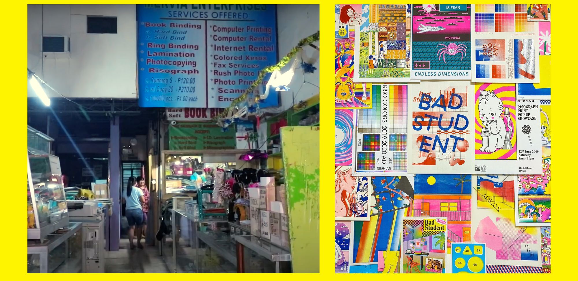
An example of how graphic design trends are picked up from the “vernacular” postcolonial design scene can be demonstrated by the recent resurgence in popularity of the RISO machine. The use of RISO printing for a majority of Filipino publications is not an aesthetic choice, but one of necessity and functionality. It is often the cheapest and fastest mode of production, and while its imperfections are not necessarily valued, they are nonetheless accepted due to its low cost.
Filipino Diasporic group, Hardworking Goodlooking’s (HWGL) 2017 book Filipino Folk Foundry (FFF), received a lot of publicity in the U.S., with many publications applauding their use of RISO printing. The Minneapolis-based Walker Art Center praised its “DIY production values,” without explicit mention of the Philippines’ polarizing social and political state. Other publications failed to highlight the FFF’s innovation in beginning to document Filipino sign-painting, typography, and design history—a field that is not yet widely studied in the local context. There was no reference to the FFF’s intentional subversion of design rules. I noticed that the design community appreciated what they saw as successful, without addressing the FFF’s decolonial content and design decisions. This is a prime example of the fascination of form over content. In this particular case, the lack of understanding of the FFF’s actual function leaves the untrained, colonizing eye with nothing but form to critique. In the colonizing view of Filipino culture as the other, our design languages are only appreciated on the surface level. By being classified as “vernacular design”—design that apparently is not grounded on articulated formal artistic theory—the Filipino graphic landscape is automatically viewed with a colonizing gaze.
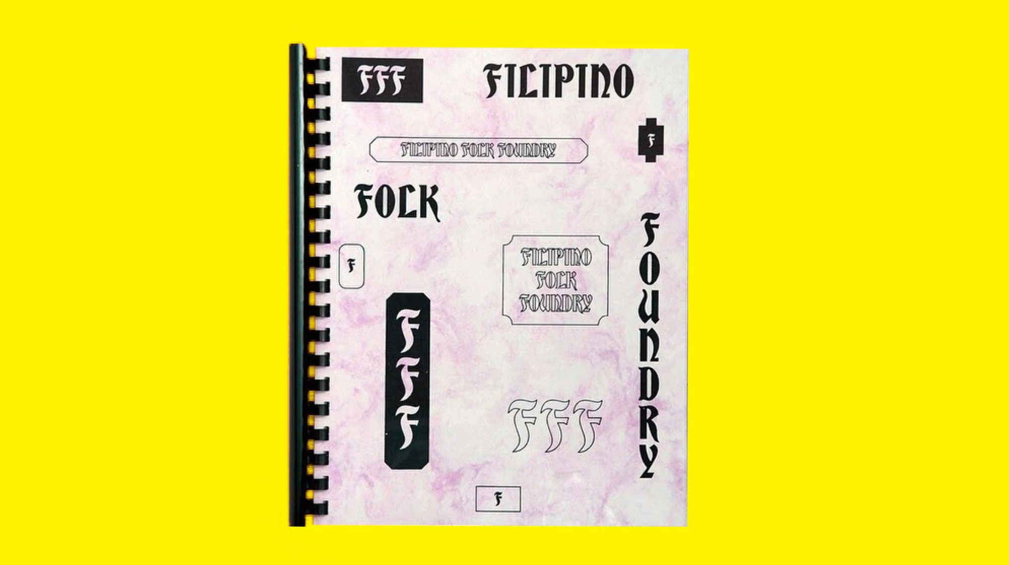
It should be noted that Hardworking Goodlooking has made a tremendous impact on the Filipino design community. When I began my research, they were one of the only resources I had on Filipino graphic design. HWGL’s proximity to institutions allowed them and their work to be viewed in a particular light. The FFF was designed primarily by Kristian Henson and Dante Carlos, who were educated in highly respected U.S. universities. This undeniably allowed the FFF to be “elevated” from vernacular to graphic design, and put it in the forefront of the Euro-American design scene. This situation is identical to how my education at RISD has allowed my work and practice to gain traction and legitimacy in both U.S. and Philippine contexts. Nevertheless, this doesn’t disqualify the FFF and HWGL’s broader practice, which paid homage to Filipino design languages and allowed for the work of Filipino sign-painters and authors to take the forefront of the publication.
Once sign-painting was put in the spotlight by numerous U.S. design publications in 2017, there was a sudden resurgence in an appreciation for Filipino typography in the local design scene. Instagram accounts like FilipinoType and Type63 emerged with the aim to highlight Filipino typographers. In the continual rise of self-taught designers and typographers, there was a concurrent rise in the production of typefaces that directly pulled from sign-painting and hand lettering.
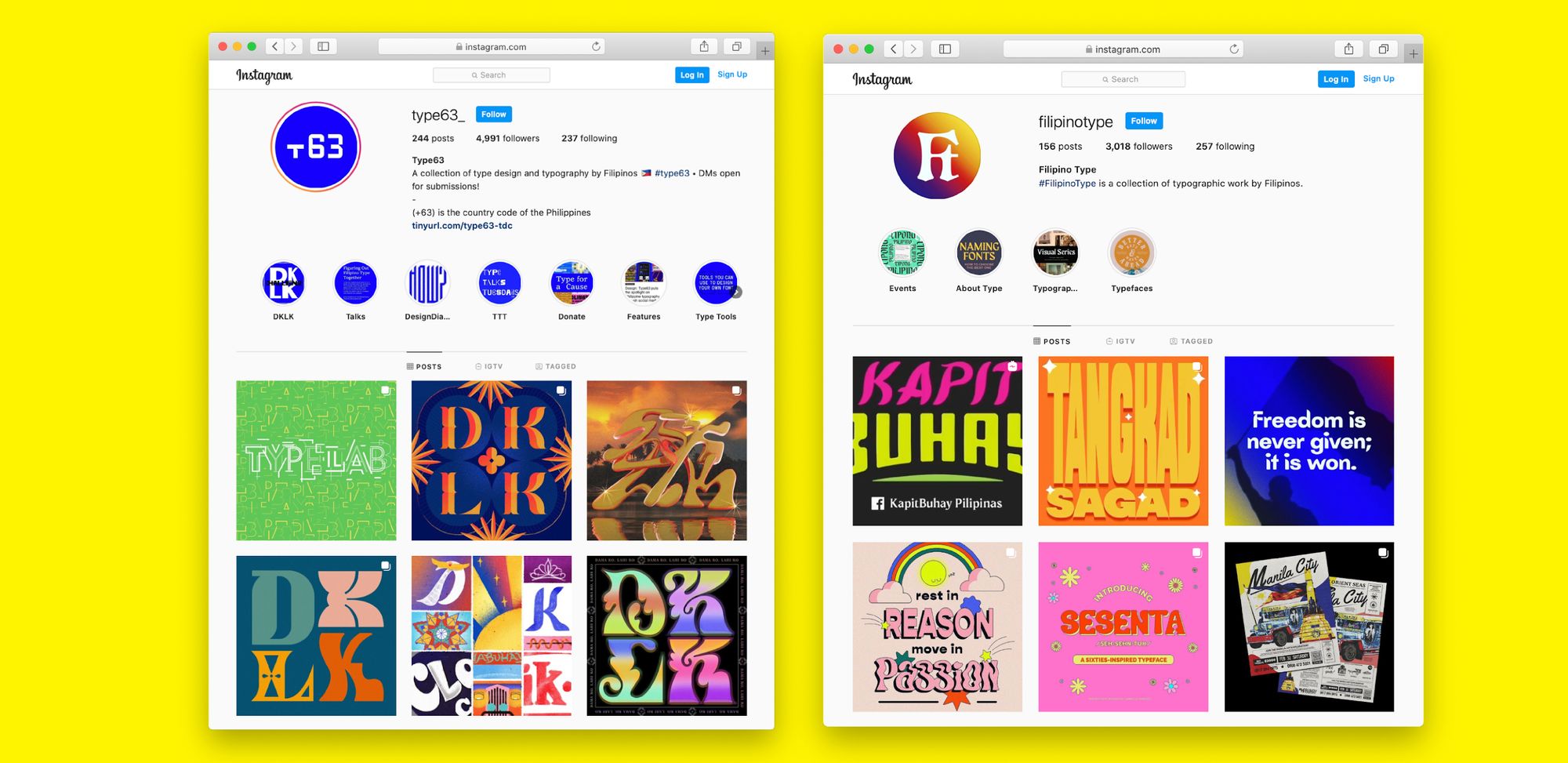
This occurrence can be explained by A.A. Philip’s theory of cultural cringe, which Filipino cultural worker Clara Balaguer defines as the phenomenon “by which the culture produced in an ex-colonial or colonial country is seen as inferior to that being produced in the colonial seat.” In this case, the United States’ fascination with Filipino sign-painting has led to the rise of the local Filipino appreciation for sign-painting. In the cultural cringe framework, we understand that the local Filipino design community does not necessarily appreciate sign-painting; they may cringe at it—that is, until an ex-colonial power, in this case the U.S., places value on that very thing.
The framing of signage, restaurant menus, bumper stickers, decals, memes, etc. in the U.S. and Europe as “unpolished” or “bad” design is innately connected to the classification of postcolonial design languages as “vernacular.” Most “raw” or vernacular signage, especially those of restaurants in immigrant communities, are often the target of criticism by the design community. There is an obsession to dissect design choices that lead to the use of default fonts like Comic Sans, Papyrus, Curlz MT or Arial. This constant overcritical analysis is the underlying foundation for diminishing postcolonial design as vernacular.

The understanding that default fonts and seemingly unintentional design choices are “bad” assumes that all design within this aesthetic can be reduced to the realm of “vernacular” or seen as design that is not professional. In the case of the Philippines, a majority of our visual design shares this same voice: the co-opting of the “default,” and the piling on of our own voices in the most maximal sense until it serves its ornamental and aesthetic purpose. Yet the Filipino voice continues to be discounted with little to no understanding of our unique culture, which continues to be affected by the legacy of Spanish, British, U.S., and Japanese colonization.
In the continual process of decolonizing my design practice and my own mind, I reject the term “vernacular.” I must always question what design canons I continue to operate under, even when I believe I am centering decolonial theory. For a time, I found empowerment in using the term. It provided me with the necessary vocabulary to function within Euro-American colonial education and cultural institutions to validate my own practice before it was discounted. Yet in unpacking its etymology, it helped me understand how I continue to use the language of my colonizer to describe postcolonial and decolonial design. It further provoked me to be critical of the words that I use to describe not only my own practice, but also that of other cultures and peoples. The categorization and quantification of “vernacular” v.s. “professional graphic design” is reductive, and only undermines the deep cultural history of the many design languages exhibited and existing in postcolonial nations. The widespread and misguided use of the term further perpetuates the colonizing notion that other graphic design languages must be categorized to enforce and assert the power of the Eurocentric Canon.
As I continue to realize my dreams for a decolonial future, I explicitly reject the term and actively recognize that—from the immigrant restaurant signage in the United States, to the large scale billboards and fleets of jeepneys in Metro Manila—all forms of visual design languages should be considered “graphic design.”
Javier Syquia (he/him) is a born-and-rasied Queer Filipino graphic designer currently living in the ancestral lands of the Canarsie and Munsee Lenape people (Brooklyn, NY). His practice–as designer and researcher–aims to center decolonial theory and is informed by his identity as a postcolonial Filipino based on the stolen-land of his ex-colonizer, the United States.
Cover image sources: Works by Jasmin Chaves and Kookie Santos (through Type63), Hardworking Goodlooking and Javier Syquia. Photograph by Marcy Vincent.
The title of this vertical, Epistemic Activism, is an homage to the disabled, nonbinary Iranian/SWANA designer and researcher Aimi Hamraie. In their book Building Access: Universal Design and the Politics of Disability, epistemic activism is described as a form of
political action that occurs within academic fields to shape social norms and practices.


