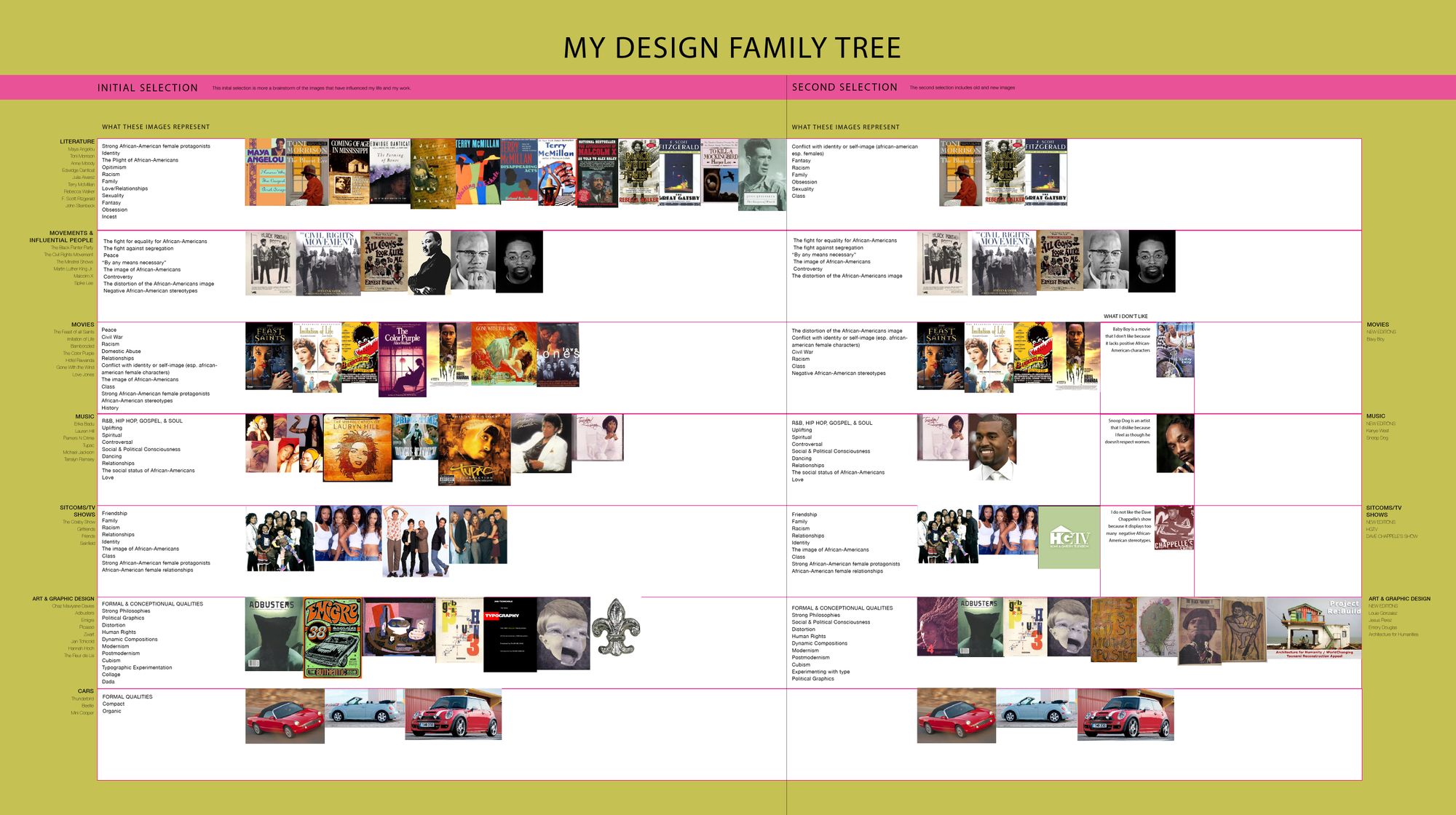
For many of us who take the jump into design research, it starts at the point of convergence, where passion meets obsession—or in my case, as a spark in the classroom. My long-term research journey on the history of Black graphic design began as a class assignment to create your design genealogy. It was 2005, the second year of my graduate degree in Graphic Design at California Institute of the Arts (CalArts), and from that point of origin the project led me on a winding road of introspection and towards a path to discover the Black aesthetic in the design. There were a few tasks, the first of which was to present ten images that directly or indirectly influenced our work. I created an extravagant chart that shared not only my inspirations but also the experiences, stories and narratives that influence my work. It included several broad categories that prominently showcased my African-American identity, culture, and history. But within art and graphic design, it clearly lacked any diversity—there were only white men, one woman, and no African-American influence in sight. This was embarrassing to me, as I considered myself very culturally engaged and connected with my Black identity; yet it had suddenly become evident that in this area, I knew nothing. This was very eye-opening, so I started asking questions.
Is there a “Black aesthetic” in graphic design? Are there visuals or a thread that ties Black design together? These questions haunted me, and my search revealed an essay –“Searching for a Black Aesthetic in American Graphic Design” by graphic designer and design strategist, Sylvia Harris. I was shocked and relieved to know that I was not the only person thinking about this. In her essay, Sylvia shows how the Black aesthetic made its way to the Western world indirectly through Cubism and other movements; from artists like Picasso and Léger, and their later acknowledgement of the significant impact of African art on their work. She went into detail throughout decades of inspiration that African-Americans infused into the design world—jazz as a style in the 1920s within the New Negro Movement; poster artwork around labor during the Great Depression in the 1930s; the commercial art of the 1940s to 1950s in the emergence of the advertising industry; the Black Power and resistance work in the 1970s; and the visual expression of the vernacular, graffiti, and rap music, and about social class and rebellion in the 1990s—the New New Negro Movement. The essay highlighted the visual culture through time of what might be called a “Black aesthetic” created by the collective creative expressions of African-American designers and artists. One of the main points I took from the essay was that the aesthetic is there, but it only emerges when you look at particular things that are part of the Black experience in America.
Finding Sylvia’s essay was a great addition to understanding the questions that arose while working on the genealogy project. Within the project itself, we were to further develop our ideas into a design output from our initial research. I decided to create a series of posters exploring what the history of African-American graphic design might look like. In the first series, I highlighted the fact that the design world was mostly very white and all male. Next, my inspiration came from the works of an artist I admired, the German collagist Hannah Hoch. I wondered “What if Hannah Hoch was African-American?” What would her work look like? My poster was double-sided, with a collage of Hannah Hoch on one side and visual imagery and representation of Black culture on the other. Since I was already interested in collages, I enjoyed discovering the work of Romare Bearden, an African-American artist and designer whose work depicted urban and African-American life in New York in the mid-1900s. This second poster challenged the notion that there isn’t any history or much information known about Black designers.
“Is there a ‘Black aesthetic’ in graphic design? Are there visuals or a thread that ties Black design together?”
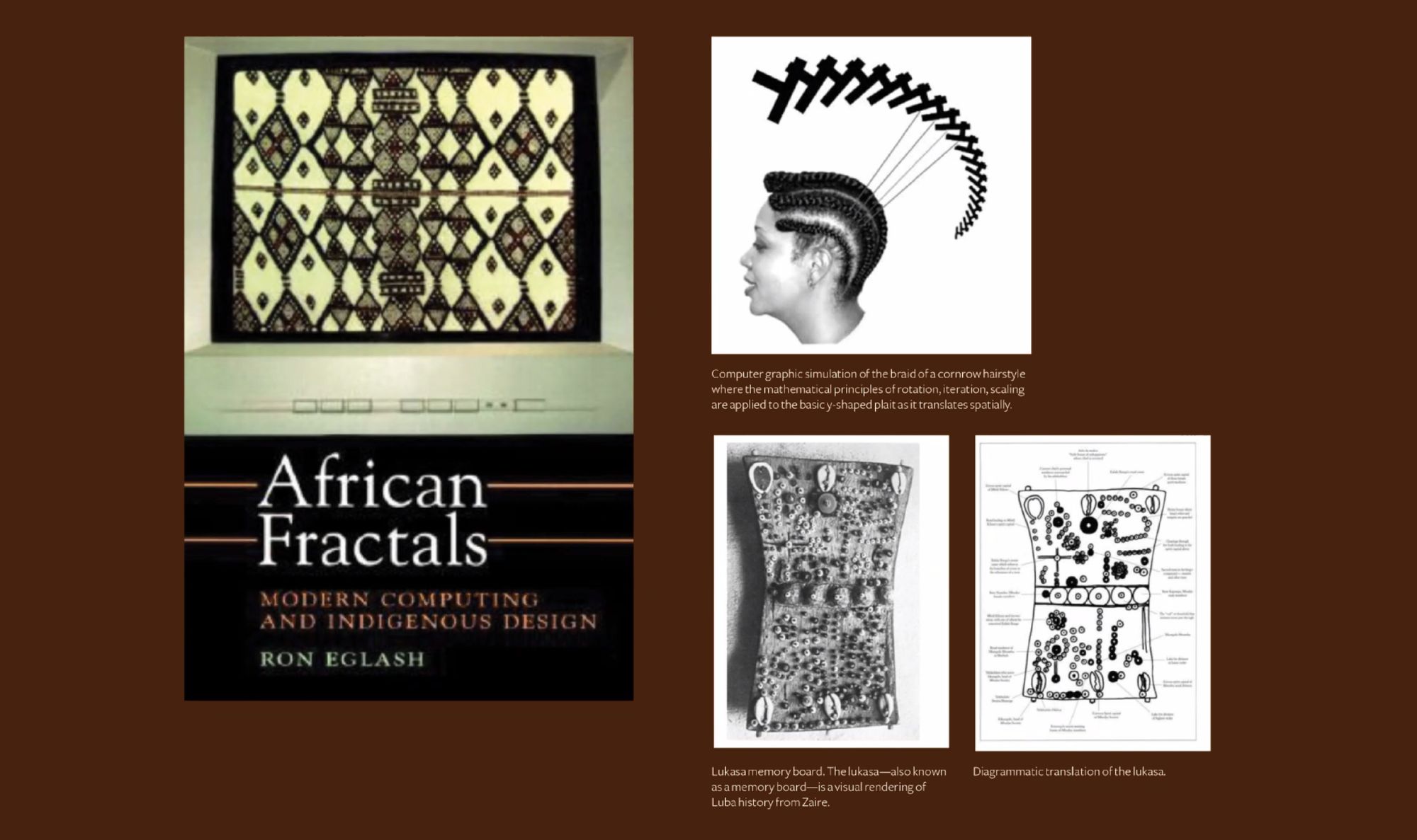
While working on the genealogy project, more questions continued to arise, which fuelled my search. I then stumbled across a 2003 essay by Professor Audrey Bennett called “Towards an Autochthonic Black Aesthetic for Graphic Design Pedagogy.” Bennett researches a wide range of topics from race and aesthetics, technology and inequality, the analysis of images and graphics, and the decolonization of graphic design history, among others. This essay in particular questioned the connection of mathematics to design in African and African-American culture through fractals, creative inspiration for Black graphic designers, testing the design potential of the Cornrow Curves, and cultural grids. Audrey was discussing theories from her husband, Professor and cyberneticist, Ron Eglash. In his book African Fractals: Modern Computing and Indigenous Design, fractals are characterized as repetitive patterns at diminishing scales. He showcases the fractal grids used within African communities which are created more organically compared to those in Europe and North America. Ron made connections with fractals in textile, sculpture, painting, carvings, symbolic systems, traditional hairstyles and other creative expressions. This was exciting for me—I wore cornrows and braids growing up, so it was fascinating to know this could be translated into a graphic language with mathematical connections. This essay showed me topics I’d never heard of, nor considered as part of the Black aesthetic.
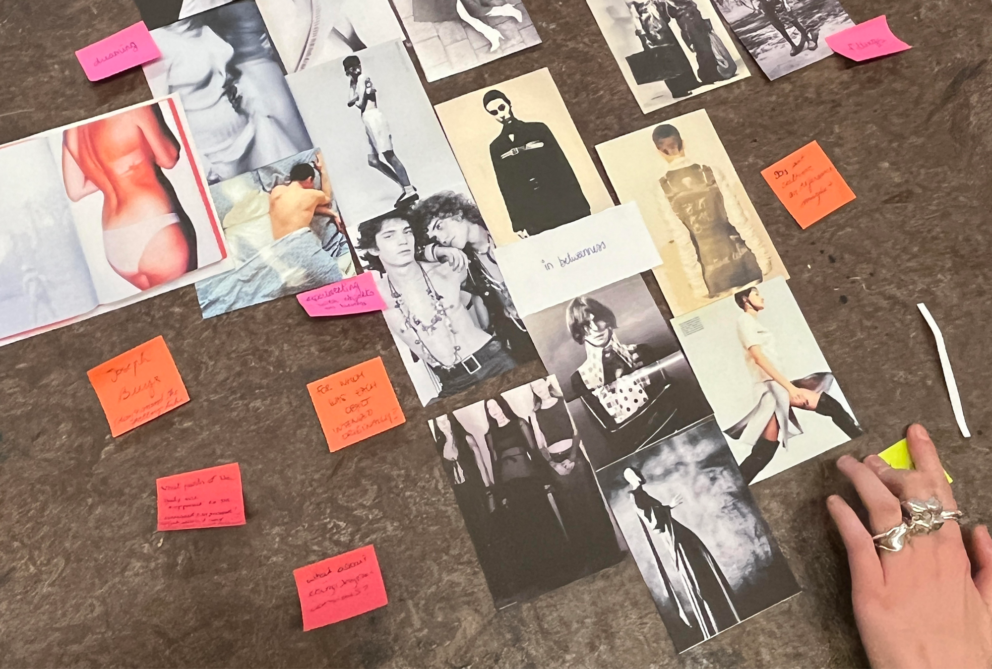
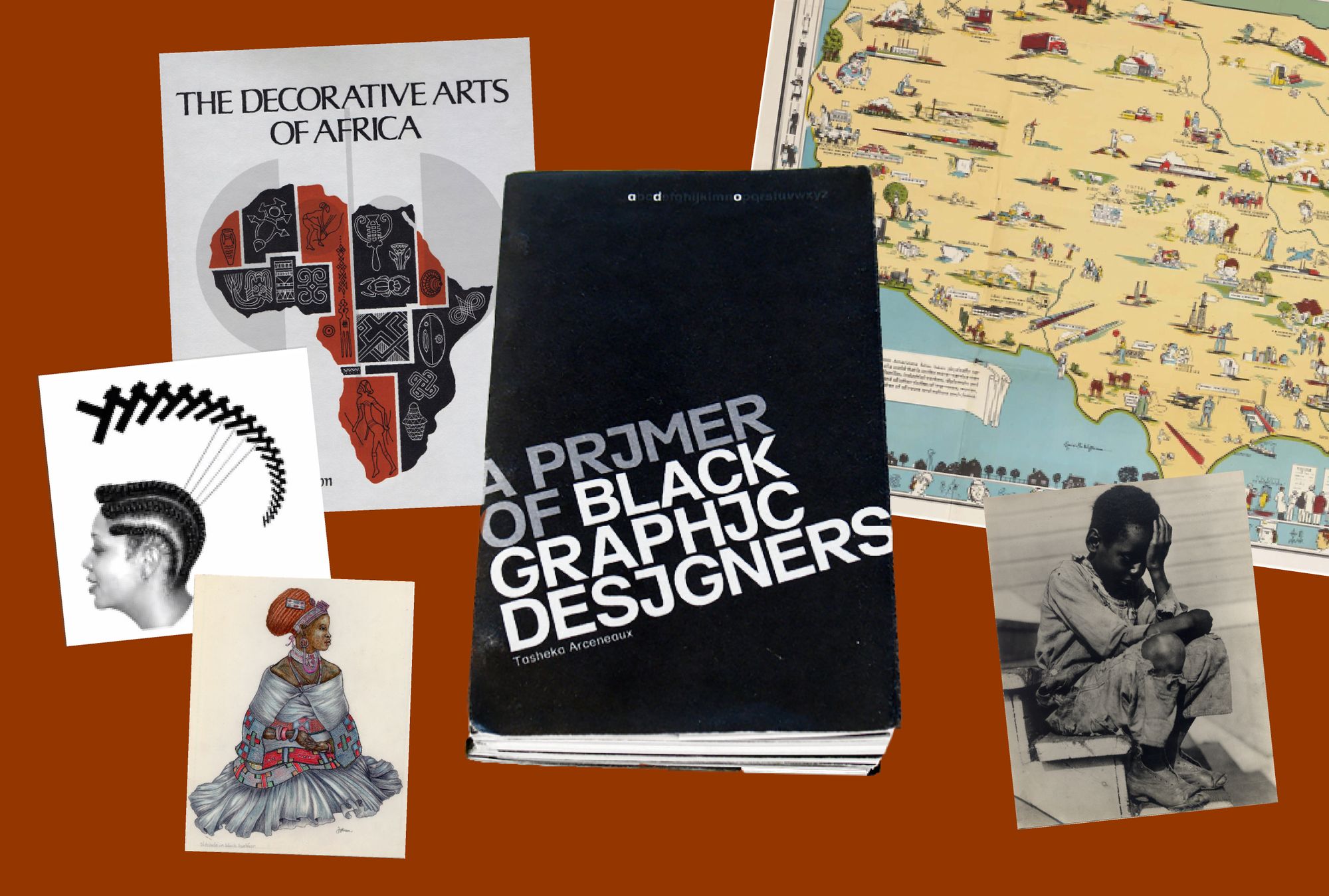
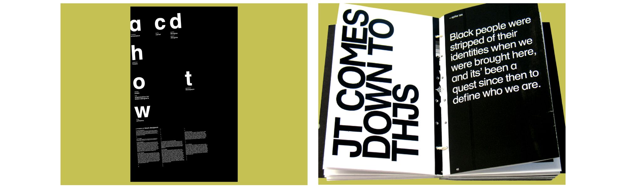
The act of searching for the Black Aesthetic while working on the genealogy project started to inform each other and overlap. In another workshop, I decided to use the research to inform an outcome. I designed a type primer poster that listed the names of designers from my Black aesthetic research, and added additional information about them at the bottom. Discovering these designers made me excited, but it also showed glaring gaps indicated in the missing designers and the blank letters. I was then able to use this poster to inform my book, A Primer of Black Graphic Designers, as part of my final presentation. I expanded the elements from the poster; the letters became page spreads filled in with photos, descriptions and examples of their work. Again, the missing designers for corresponding letters were left blank. At the end of the book, I included the essays that made an impact in my research and blank pages, where I could continue adding to the research. Filling in the blanks and trying to find designers for every letter of the alphabet became a huge part of my research moving forward. The Black aesthetic was still important to me, but I needed to know who were the designers who contributed to this aesthetic in the first place. My first step was to find and learn more about Black design and design history; to start connecting the dots.
After my graduation in 2007, I launched my company Blacvoice and started to work at CalArts, but my research lay dormant. Only after switching jobs a few years later to teach full-time—whereby research became a part of my job—was I able to re-engage with my research. In preparation for a lecture on the Black press, I visited the Amistad Research Center, primarily known for its collection of documentation relating to enslavement in the U.S.A. I also learnt that they had an archive of artwork and design work from Black artists. To my amazement, there was a treasure trove of first issues of Black publications: Ebony, Jet, Essence Magazine, Opportunity Magazine, The Crisis Magazine and one I had never heard of, Fire Magazine. After completing my research, out of curiosity I asked an archivist if there were any other works related to Black graphic design? “Have you heard of Louise E. Jefferson?” he said.
The archivist brought me a binder with the work of this person who was then completely unknown to me. This thick, heavy binder listed boxes rich with information from interviews, essays, publications, photographs, letters, personal documents—the complete estate of Louise E. Jefferson. In 2011, a couple of years before my search at the Amistad Center, this treasure trove was gifted to them by a neighbor or close friend in 2011. I was simply blown away. I was left with two surging emotions: pure elation, to discover and to dive into this jackpot, and a quiet sense of disheartenment. How come I, who had been through undergrad and graduate school to study design, had never heard of this woman?
Finding Louise E. Jefferson
Louise Elizabeth Jefferson was born in Washington, D.C. into a long line of creators, who fostered her creative abilities from a young age. Her family was filled with singers: her grandmother was a famous soprano, and her mother also sang. Her dad, who taught her calligraphy, was a calligrapher for the U.S. Department of Treasury. In the early 1930s, she moved to New York, after dropping out of Howard University. There are two theories as to why: one was that at the time, many young artists moved to New York to find fame and fortune, and she had dreams of becoming a well-known photographer or illustrator. The other reason might have been a bit more about pride. She had gone to New York to visit her friend the activist and writer Pauli Murray, and decided to spend most of her money on a new raccoon coat for her visit—only to have it stolen on the same day. With no money, Lou (as she was known by her close friends), decided not to return home broke and embarrassed, but to start a life there. In New York, she continued her studies at the School of Fine Arts at Hunter College, and then she went to Columbia University, where she studied graphic arts and printing. Like many artists during the time of the Great Depression, she struggled financially and worked many freelance jobs.
One of these jobs was at the Friendship Press, where she was one of the first graphic designers, and within a short time she became the publishing house’s art director. She was the first Black person to have that type of position in publishing, maybe even the first woman at the time (I assume). There, she went on to design hundreds of book covers, many of which included her own illustrations, and she also freelanced at other publishing houses such as Viking Press, Macmillan and Doubleday.
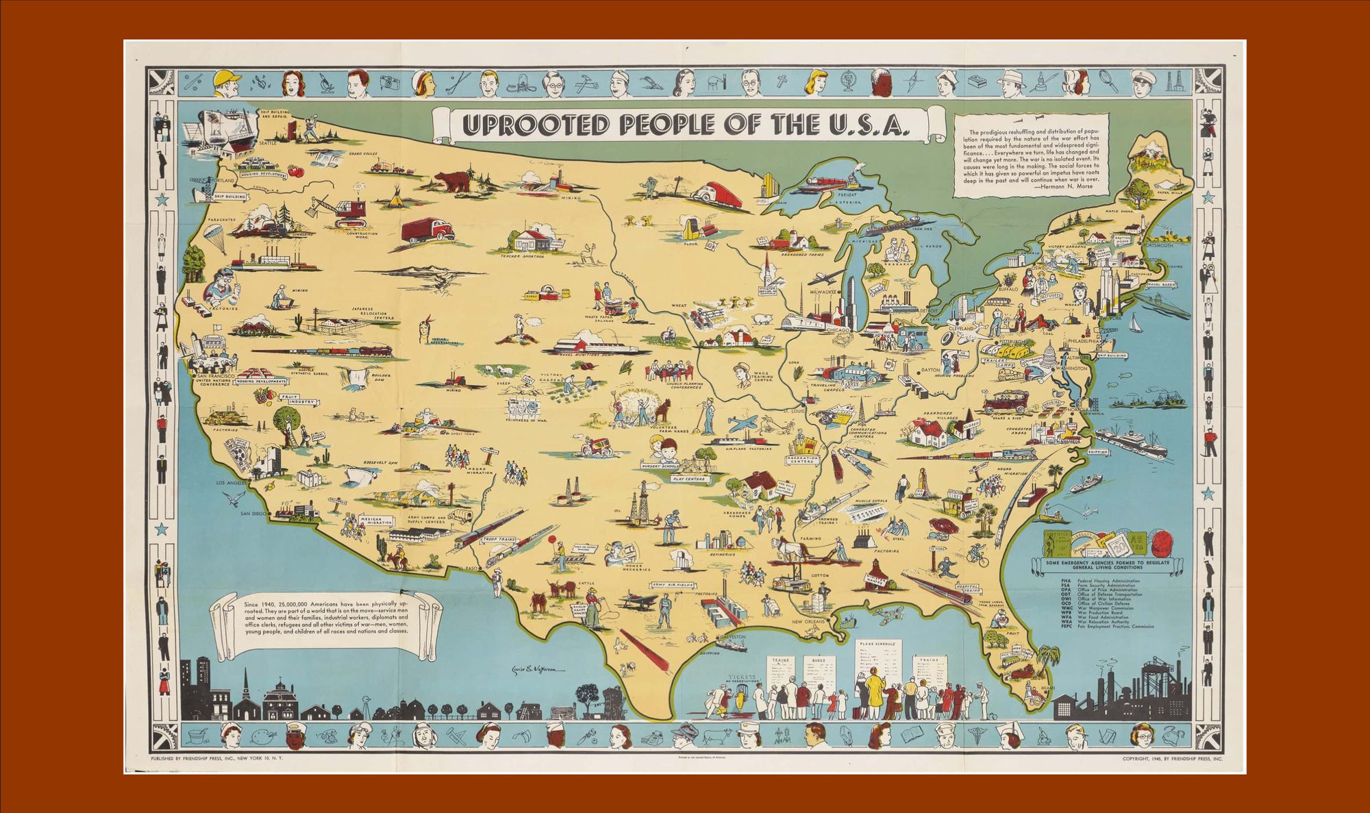
In 1936 her work in We Sing America, one of her first cover designs, featured illustrations showing Black and white children playing together. In Georgia, it was banned and ordered to be burned by the Governor. This was not a wall for her, her success grew despite the difficult times. Her career started to soar in the 1940s and 1950s, which were tumultuous times to be a Black woman in the U.S.A. Outside of publishing and illustration, her work as a cartographer, in which she researched and created picture maps, was deeply meaningful and well sought after. Much of her work was commissioned by several university presses including Oxford University, Rutgers, Syracuse, Columbia. The map “Uprooted People in the US” was one of the first maps to focus on social costs and the impact of the Second World War. Most maps produced during this time tended to appeal to patriotic sentiments to bolster the morale of citizens from the U.S.A. In her maps, she prominently featured themes of dislocation, destruction, or socio-economic implications on diverse people groups. Her maps were said to be creations that gave tools for others to navigate the world around them.
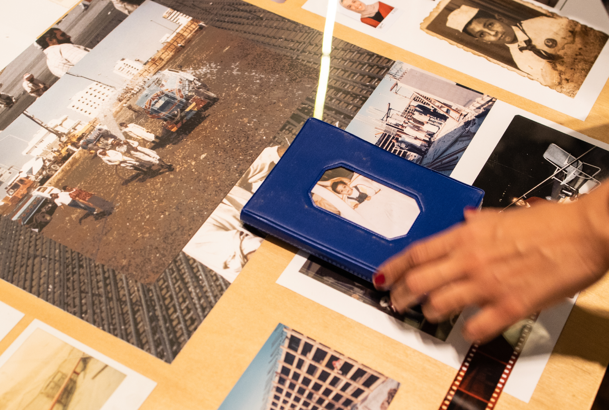
Jefferson had long-standing clients for which she did illustrations, typography, calligraphy and art direction. She created so much work and contributed to so many different areas of art and design that it is sometimes hard to pin down her style. For 40 years consistently, she created the annual stamps for the National Association for the Advancement of Colored People (NAACP), and for 20 years she created the program covers for the National Urban League’s Beaux Arts Ball. Now, that’s what I will call devotion to your craft. She kept many things that were integral to her creative process and was a very meticulous note-taker, with a vast collection of daily planners and paste-ups available in the collection. At first, having access to so much material was a bit overwhelming, until I figured out the best way to handle it: every day I’d approach new areas of interest – design, invoices, sketches, photography etc... Eventually, I started to like the vastness of the material. You gain a sense of intimacy and familiarity with learning so much about a person. Particularly through her photography collection and snapshots, I began to get a glimpse of her life, who she rubbed shoulders with, her friends, and her trips to Africa.
“You gain a sense of intimacy and familiarity with learning so much about a person.”
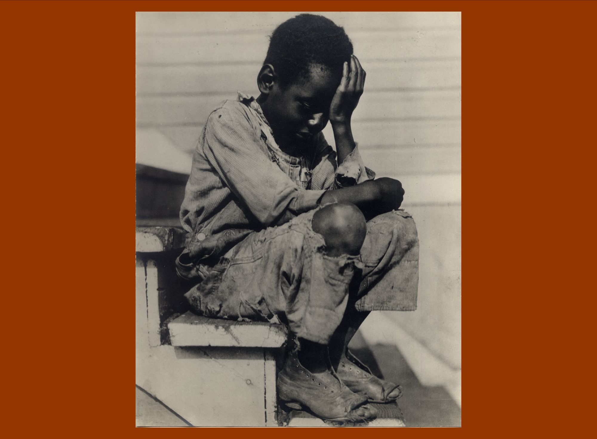
Photography was very important and a pivotal part of documenting her life; after moving from New York to New Haven, she never left home without a camera . Louise is quoted as saying, “I wish people would stop calling me a photographer” which showed how she hated being called a photographer. It’s absurd to think why wouldn’t she be called that, as the centre has over 5,000 photos in their collection. One of her most famous, “Alabama Boy,” is of a crying child who caught her attention when she was photographing a sports event. He was crying, wearing tattered shoes and clothes, you could see the weight of the Great Depression on him. She captured this moment, yet she did not consider herself a photographer.
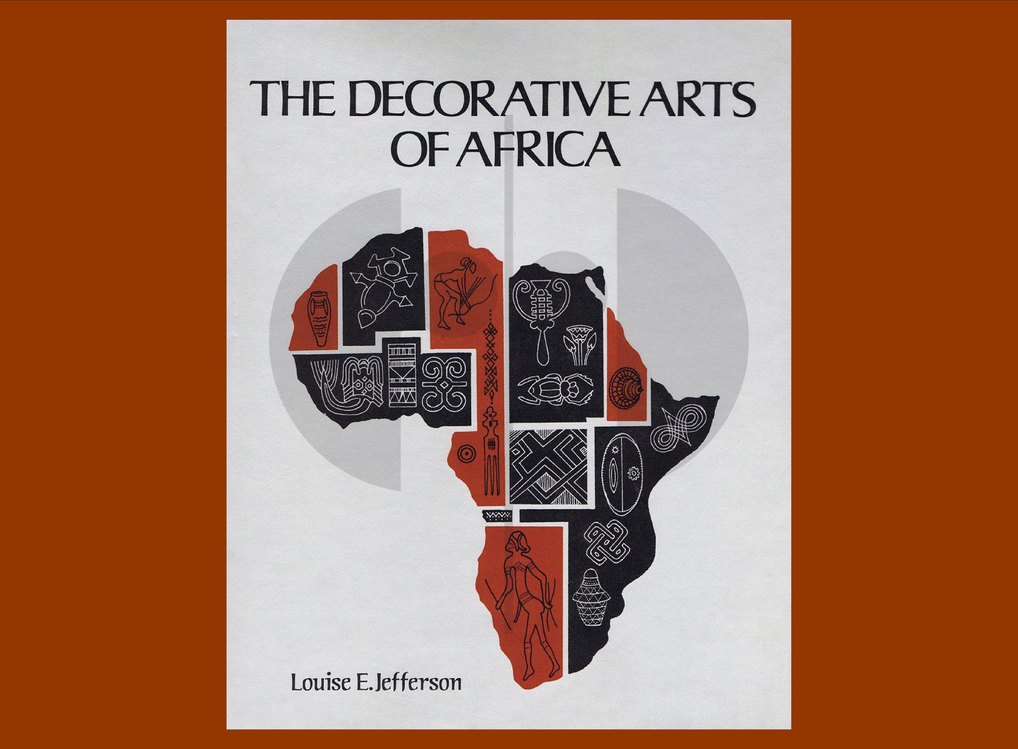
Louise was not a jack-of-all-trades type of creator, but someone who created excellently. She was immensely knowledgeable, and saying she is multi-talented would be an understatement. She once mused in a 1947 interview with Opportunity Magazine, regarding expanding one’s knowledge and skill: “Everything dovetails, you know. You have no idea how many kinds of information, picked up one place or another, will come in handy... A commercial artist must have an encyclopedic mind—for you can never tell what you will be called on to depict or to interpret.” After twenty years at the Friendship Press, Louise retired and made five trips to Africa between the 1960s-1970s. There, she used all of her skills to document the way of life and customs of Africa through photography, her meticulous notes and hundreds of detailed realistic illustrations around culture, and communication symbols of different African languages. She compiled them into her book The Decorative Arts of Africa. She kept all of her process sketches for her book which was available to me, thanks to the archive.
Working with the archives and Lou’s collection, I’ve learnt a lot and probably channel her a little bit more than I think in my own practice. I realized that I am also a collector of not only my own design work but also of ephemera, the work that I have accumulated or collected and the things that inspired me over the years.
Today, because of another awesome black woman in the design field, Ms. Cheryl D Miller, my collection, research and work have been shared with the Stanford Archive. Ms Miller was invited to donate her work and she asked that the invitation be opened to others to also include their work, opening doors to many other designers like myself.
Working together is a great philosophy and practice which bleeds into my work currently. It was a core tenet used for the first edition of BIPOC Design History class: Black Design in America: African Americans and the African Diaspora in Graphic Design. Together with friends, Silas Munro and Pierre Bowins, we co-authored a syllabus to share our research with others in the online course. The course engages with topics like Designing Emancipation, Blackface and Minstrelsy tradition, Black Data, Black Queer stories in print and more. At BIPOC Design History, our vision is to create a learning and research environment that is inclusive and honours the collective work of many BIPOC-design and ally-design educators and researchers.
Tasheka Arceneaux-Sutton (she/her) is an Associate Professor of Graphic Design at North Carolina State University. She has taught graphic design at Southeastern Louisiana University and taught Typography at Loyola Marymount University. She is also a faculty in the low-residency MFA program in Graphic Design at Vermont College of Fine Arts.
Arceneaux is the principal at Blacvoice Design, a studio specializing in branding, electronic media, identity, illustration, print, and publication design, for educational institutions, non-profit organizations, and small businesses. She has provided design services for the Museum of Contemporary Arts (MOCA), HarperCollins, Loyola University New Orleans, Tulane University, and Loyola Marymount University’s LeBand Art Gallery. The use of typography has a strong presence in her work—she is a type enthusiast who enjoys hand-lettering, typesetting, and deconstructing type through a combination of analog and digital processes. Arceneaux has exhibited work nationally and abroad, and in 2013, her work was featured in Idea: International Graphic Art and Typography magazine.
Arceneaux’s research focuses on discovering Black people omitted from the graphic design history canon. She’s also interested in the visual representation of Black people in the media and popular culture, primarily through the lens of stereotypes. She is the co-curriculum designer for Black Design in America: African Americans and the African Diaspora in Graphic Design, from the 19th through the 21st Century—Black Design in America is a series of pre-recorded BIPOC centered history courses. Her essay “A Black Renaissance Woman: Louise E. Jefferson” is a part of a collection of essays in the book Baseline Shift: Untold Stories of Women in Graphic Design History, which was released in October of 2021 by Princeton Architectural Press.
Arceneaux holds an MFA from the California Institute of the Arts, where she also worked as an in-house designer in the Office of Public Affairs. She also has a BA in English from Loyola University New Orleans.
This text based on a lecture that was part of the Against The Grain lecture Serie, an online course fostering critical perspectives on the designed past and democratizing access to design history writing—in a broad sense..
Register for the online course to watch the recordings of all Against The Grain lectures.