Growing up in Stockholm, Sweden, I often felt stuck between two cultures—neither here nor there. As the only Jew in my class, I was always assigned to explain Rosh HaShana, Yom Kippur, Pesach, or any other Jewish holiday, even though I am not religious. Sometimes, I browsed the pages of Etz Chayim and other Jewish literature on my parents’ bookshelves. On cold Hanukkah evenings, I spun the dreidel and stared at the ג Gimmel, ה Hey, ש Shin, and נ Nun Hebrew letters embedded on its wooden sides. From א Aleph to ת Tav, indecipherable yet omnipresent in my home, the Hebrew alphabet captivated me. How could I reclaim this lost, ignored, and disowned part of my identity? If language is a bearer of culture and typography is the body of language, what could emerge from my intermediate position?
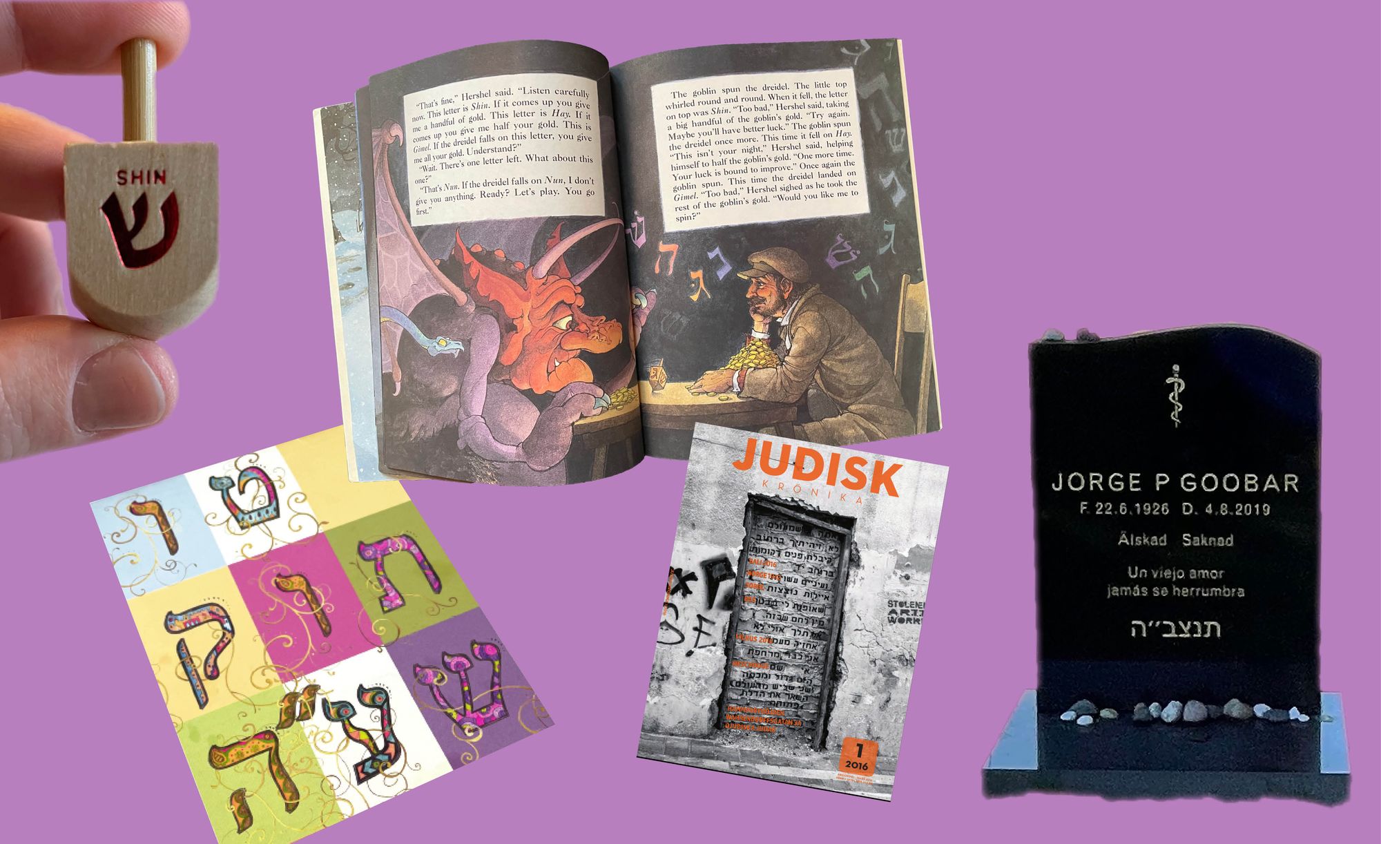
The Jewish community in Sweden dates back to the 17th century. Waves of Ashkenazi immigration before and after the Shoah (Holocaust)—predominantly from Poland and Russia—shaped its current cultural and linguistic landscape. Among roughly 20,000 Swedish Jews, about 1500 are native Yiddish speakers. One of these is my grandmother Chawa, who escaped Poland during World War II to seek refuge in Buenos Aires, Argentina. Unfortunately, this haven came to a swift end. Following the rise of the last military dictatorship (1976-1983) in Argentina, she fled again—this time to Stockholm, Sweden. Although I don’t speak it, Yiddish formed part of my upbringing as a ubiquitous reminder of our cultural heritage. My mother and grandmother sprinkled expressions in their Swedish-Spanish discussions with mishpuche, shpilkes, tuches, mishegoyim, meshuggeneh, and other words. I grasped the sense of the words, but could not spell them or write them out.
“I wondered: what if I let Yiddish enter my body through the tracing of letters with my hands and eyes, instead of the formal logic of learning through listening and repeating?”
Yiddish is closely related to, if not almost inseparable, from Judaism. It is a mix of German, Hebrew, and Slavic languages known as מאמע לשון—mame lushen, the “mother tongue” within Jewish Ashkenazi community. Yiddish uses a modified version of the Hebrew alphabet and—along with Romani, Finish, Sami and Meänkieli—constitutes one of Sweden’s minority languages. However, this heritage has never been part of my practice as a graphic designer. Eager to dive into this dichotomy of known/unknown typography, I wondered: what if I let Yiddish enter my body through the tracing of letters with my hands and eyes, instead of the formal logic of learning through listening and repeating?
Challenging the script
Western belief systems and predominantly Protestant-Christian ideas, values, and societal structures paved my educational framework. This resulted in specific methods, tools, and traditions establishing Latin script as the governing tradition. Let’s consider this from a quantitative perspective: if my exposure to Judaism amounts to 10% of my childhood and current environment, then the same percentage of my practice should reflect this. Thus, out of seven years of design education, I should have spent at least 8.4 months learning type and image-making from a Jewish perspective. However, despite having studied at multiple Swedish design schools, I wasn’t exposed to any other letter-making tradition except Latin, nor did I learn how to work in a reading direction other than left-to-right.
“Despite having studied at multiple Swedish design schools, I wasn’t exposed to any other letter-making tradition except Latin, nor did I learn how to work in a reading direction other than left-to-right.”
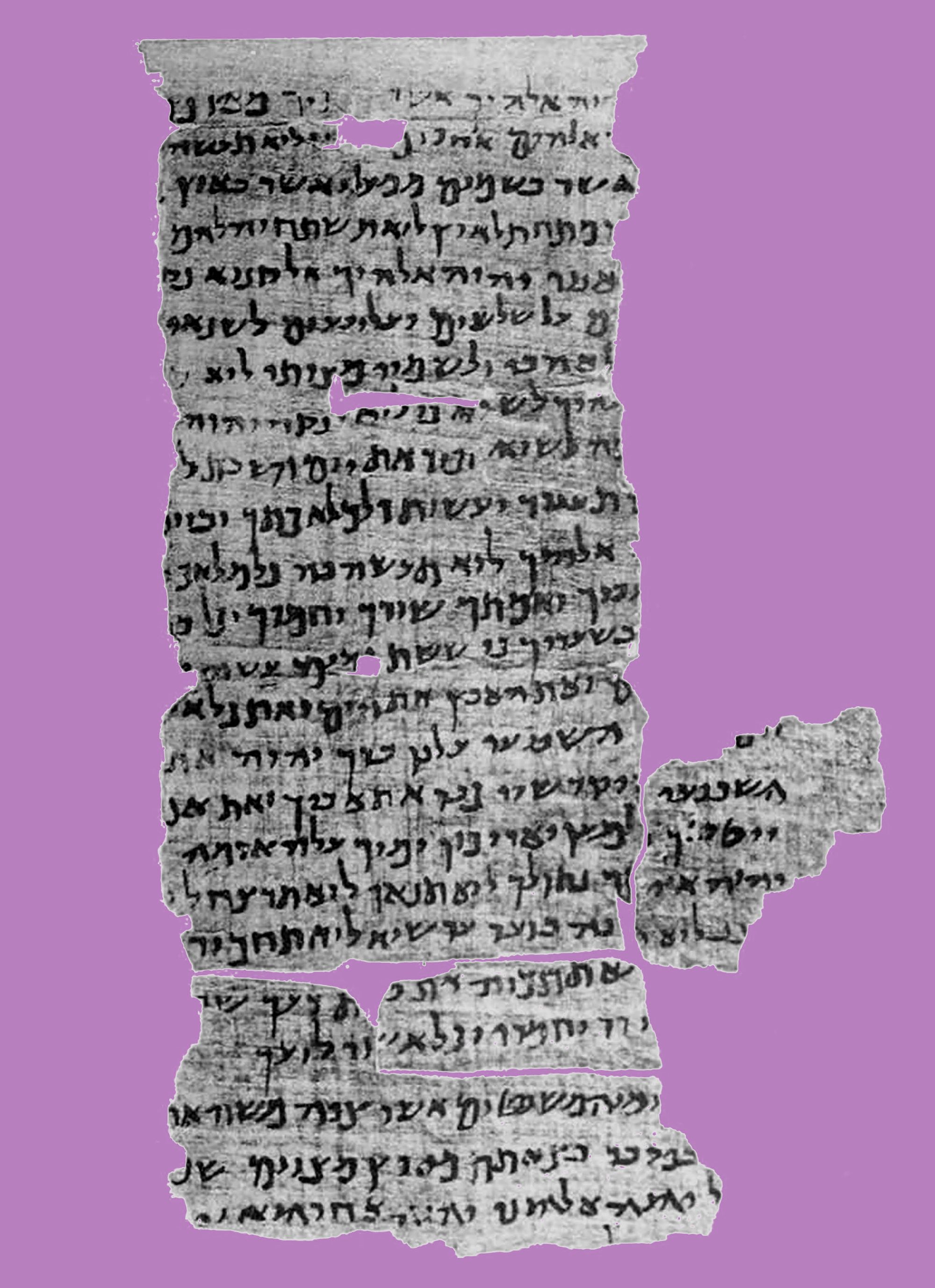
Hebrew was originally considered a Lashon HaKodesh לשון הקודש—the sacred language for religious texts, and the Hebrew letters form some of the strongest symbols of Jewish religion. According to Judaism, the Hebrew letters constitute the original code of the world—the innermost core of reality. The Hebrew alphabet (aleph-beth) consists of 22 letters, five of which have alternate final forms. Each has its sound and numerical value, and together they form the mathematics of spirituality known as Kabbalah קבלה, meaning tradition. The Kabbalistic thought is a linguistic mysticism, expanding the Biblical understanding that G-d created the world through the Hebrew language. Accordingly, every Hebrew letter, number, or word written in the Torah contains mystical meanings. Even though I am not religious, I found beauty in the myriad of meanings behind the script. It also gave me all the more reason for continuing with my task at hand: how can I create a typeface that bridges two contrasting cultures?
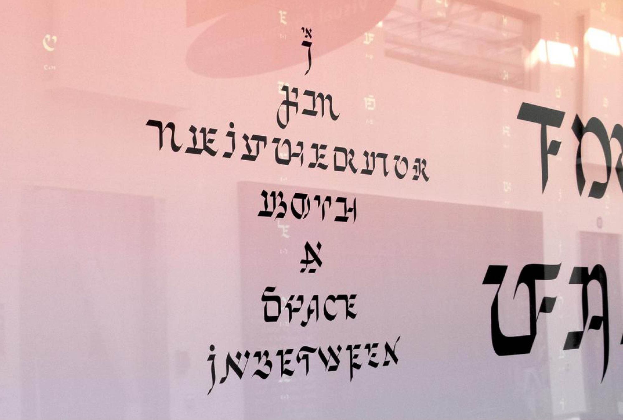
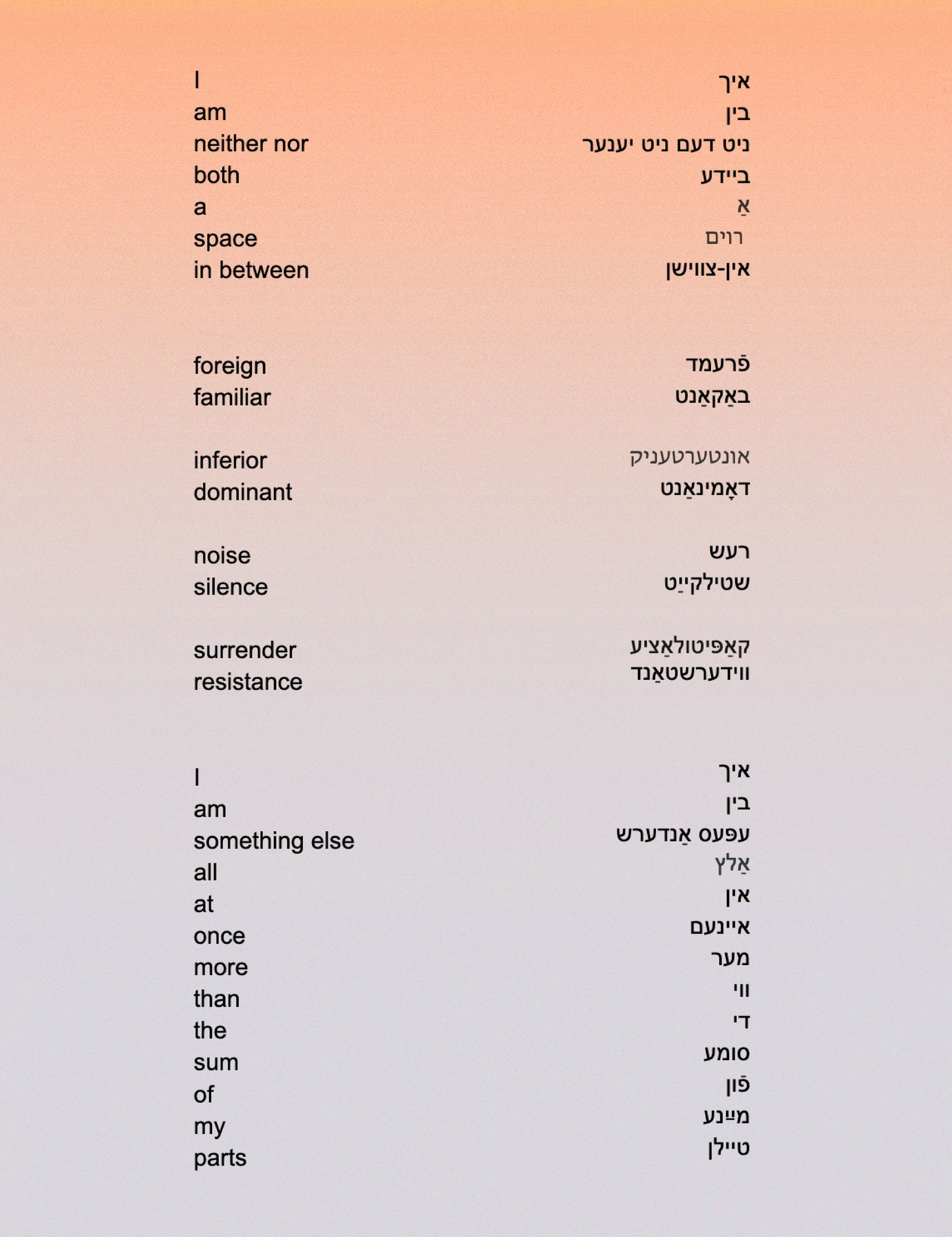
I decided to work with Yiddish and English as the two main languages for this project. I chose English mainly for its status as a bridging language, and Yiddish because of its connection to my homely soundscape while I was growing up, as well as being a representation of the different influences and origins making up the foundation of the Jewish experience. The idea was to create an interscriptual typeface with hybrids of Latin and Hebrew letters that can be read from right to left in Yiddish, and left to right in English. The prefix “inter-” means between, amid, among, within, mutual and together. The noun “script” refers to something written; a style of printed letters resembling handwriting.
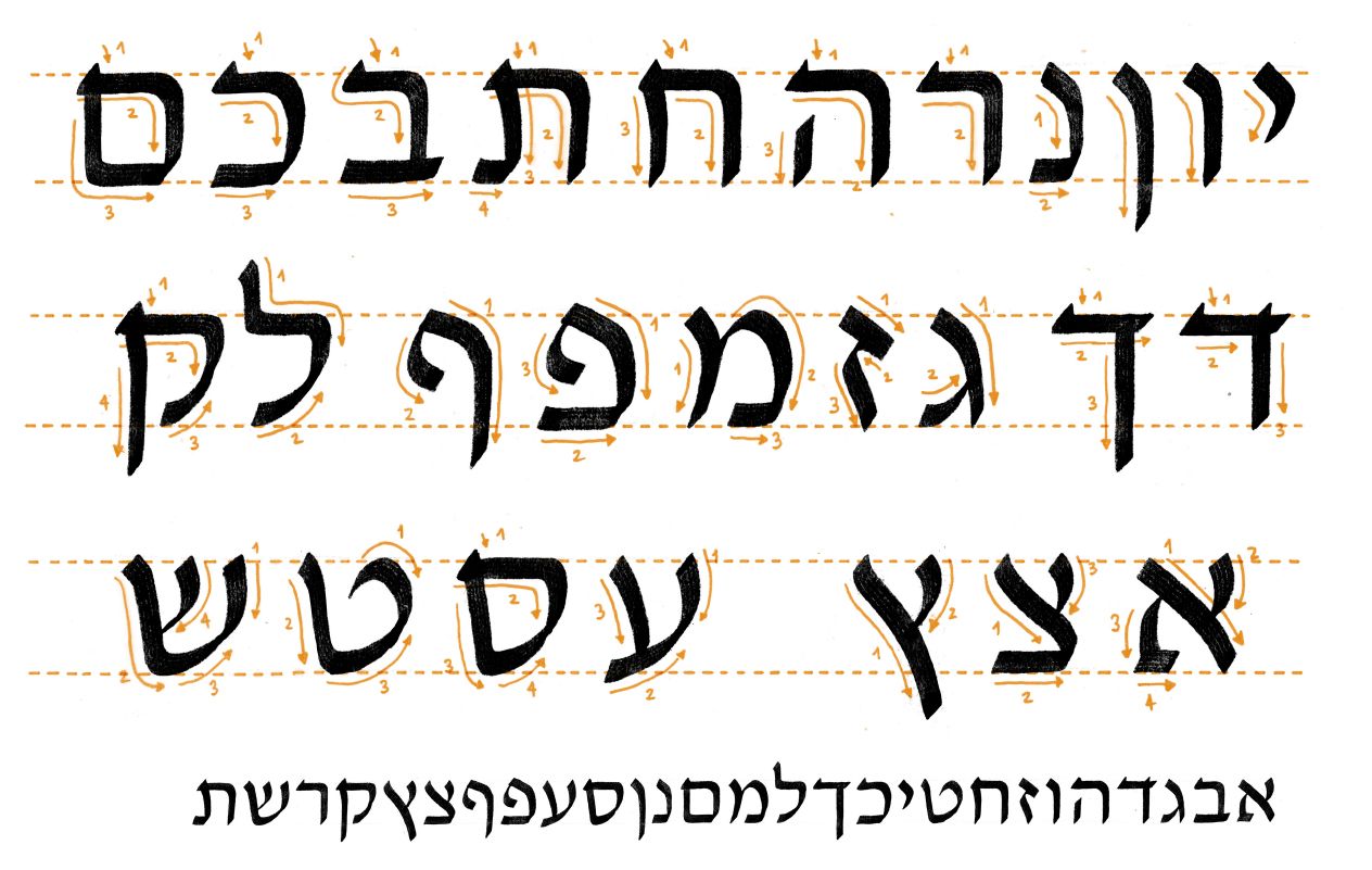
Similarly to Arabic, the Hebrew script has been used for many languages, most notably, Aramaic, Ladino spoken by the Sephardic Jews, Judeo-Iraqi Arabic, Judeo-Persian in Iran, and Yiddish with a vibrant community of around 11 million speakers across the globe before the Shoah. Written from right-to-left, the Hebrew alphabet uses a so-called Ktav Ashuri, a square script emphasizing horizontal strokes instead of vertical ones like in Latin. Uppercase or lowercase doesn’t exist; neither do italics. The letters “hang” rather than “grow” from the base, built modularly, using the letter י yud as the foundation for all the other letters.
Learning through calligraphy
To learn all these complexities, I needed to store the letters in my muscle and cognitive memory—I had to learn the script directly with my hand. So I started looking for a sofer—a Jewish scribe who had mastered the art of calligraphy, writing the Torah, Mezuzot, Ketubot, and other scripts. Unfortunately, I couldn’t find one teaching in Sweden, so I signed up for a remote course in Hebrew calligraphy with Riva Brown from Delaware, U.S.A. Riva grew up as an active member of a Jewish community, but wasn’t allowed to become a Hebrew scribe. In the early 1970s, only men could follow this career, monopolizing the knowledge of the many rules within this traditional craft. Gender inequality forced Riva to become self-taught; she studied art and copied traditional Hebrew texts found in the library. One day, her community rabbi asked if she wanted to write a ketubah—a Jewish marriage contract. Unlike other scribal documents, ketubot may be handwritten by anyone regardless of gender.
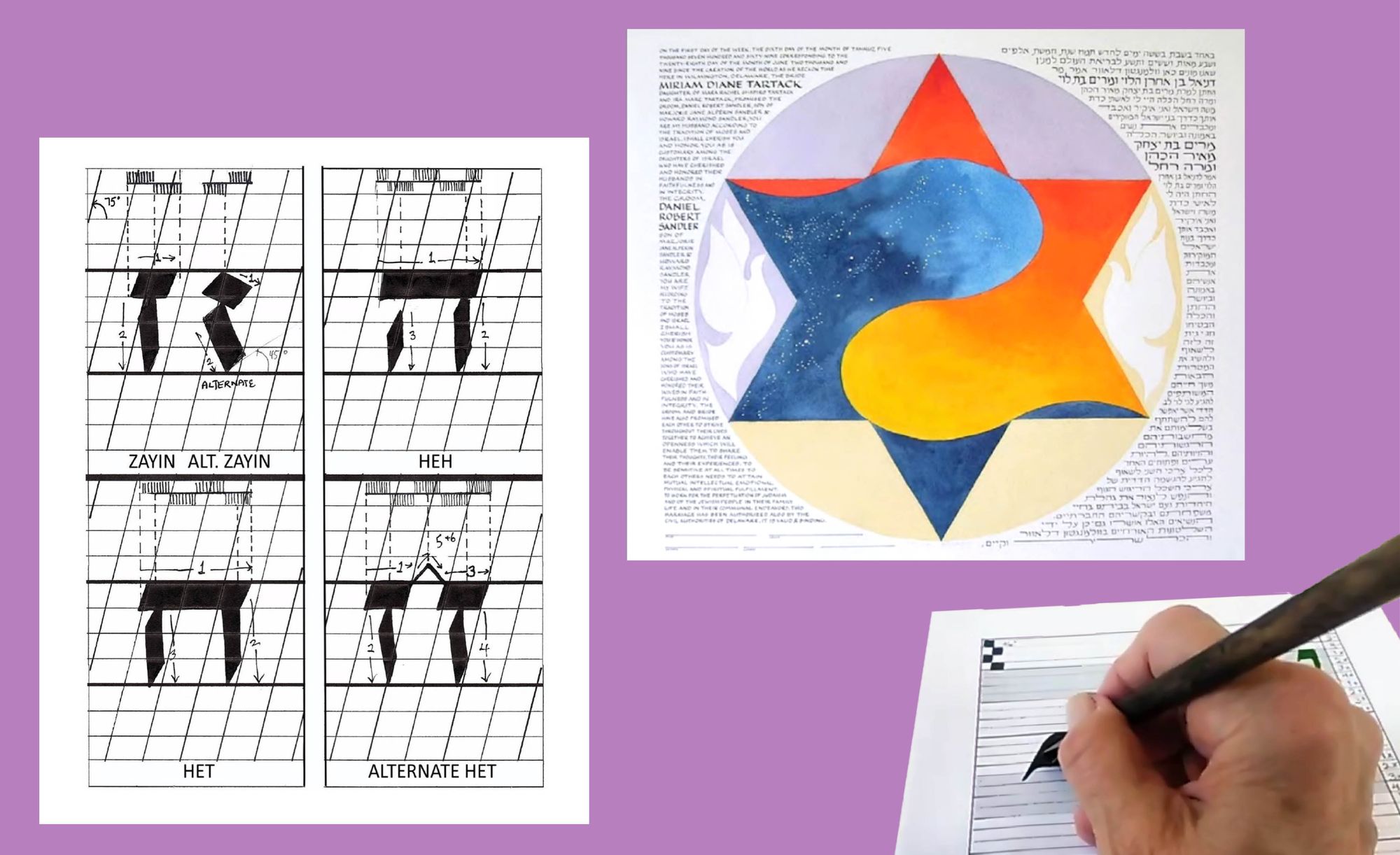
Next to the Aramaic text of the marital agreement, ornamental motifs and embellishments decorate the certificate. As with any religious document, the ketubah must be perfect and entirely legible, and letters cannot touch each other. During the course, we learned the same script Riva created for these documents. Still, she somewhat simplified it, with a Western writer in mind—marrying two people, scripts, languages, and cultures. We worked in small groups, three students at a time, and Riva taught us a new set of letters for each class. My eclectic bunch of classmates included a retired engineer and a schoolteacher, among others who were interested in Hebrew calligraphy as a hobby. Equipped with the proper calligraphic pens and ink, we filled out grid-lined exercise sheets, held them up to the camera, and listened to her feedback.
We often sat silent, muttering when we failed to draw a complicated letter, such as mem מ or ף pey sofit. Riva often reminded us of the proper angle of the pen, paper, and body—how to allow the movement of the entire arm to create the strokes while the wrist remained sturdy. Eventually, we progressed to writing longer sentences. Like in school, we devoutly plotted every stroke with great care, almost religiously. The privateness of the online course suited the craft of calligraphy, as it is done in solitude by paying complete attention to the body, the materials, and the inky shapes appearing on the paper. In a way, it is an agreement entirely between you and the letters. Similar to painting a portrait, the outcome is dependent on your relationship with the subject of your attention.
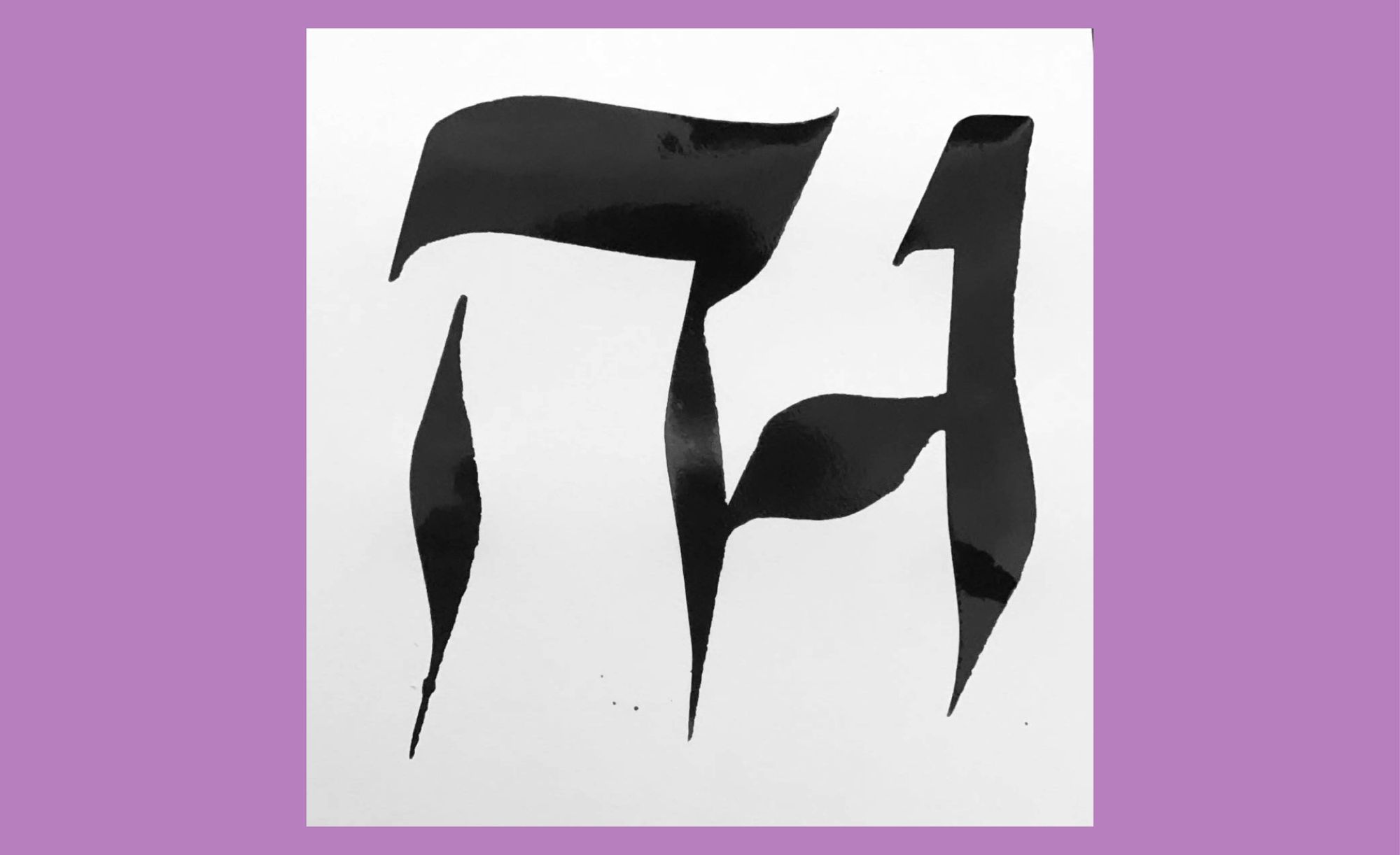
Sketching the first hybrids, ה H, א A or ל L, two seemingly contrasting and incompatible parts of my identity finally began to merge. Holding a nib pen felt liberating as I developed an intimate connection to the letters. Following the strokes of black ink, I slowed down to observe the details of their construction—a flag on the top of the letter ל lamed, the seal line at the upper left part of the מ mem, or the tiny decorative line on the top of the letter נ nun. As a result, I learned to recognize and memorize the letters more easily; my visual and kinesthetic memory began to align. However, I still needed a text to convey the feeling of “in-betweenness” and a starting point for creating the ligature script. Following a rich tradition of Yiddish poetry expressing complex experiences and emotions of Jewish authors across the centuries, I put my feelings into a bilingual poem, which became a specimen for the typeface. Katka Mazurczak, a Warsaw-based Yiddishist, translated it. My English words returned to Poland, my grandma’s birthland, and came back in mame-lushen Yiddish. My grandma Chawa and her sister Raquel gave it the final seal of approval. Eventually, I could fill the letters with meaning beyond their symbolic value: the poem turned into a typeface, and the typeface became the poem.
Reclaiming the Schwabacher blackletter
However many Latin typographic genres and styles I tried, I was constantly drawn to the Schwabacher blackletter, which in German refers to a style of blackletter dating back to the 12th century that is derived from the Gothic type. It was common for many centuries until the rise of the Nazi regime. In 1941, Martin Bormann, head of the Nazi Chancellery, wrote to Adolf Hitler demanding to ban the Schwabacher style, claiming that gothic typefaces were not “German” but rather “Jew-letters.” Furthermore, he requested to replace all typefaces with antiqua. The Nazi regime later became synonymous with their updated version of the blackletter, exemplifying how this type of genre became intentionally used as a pawn in the Nazi aesthetic to fuel antisemitic propaganda.
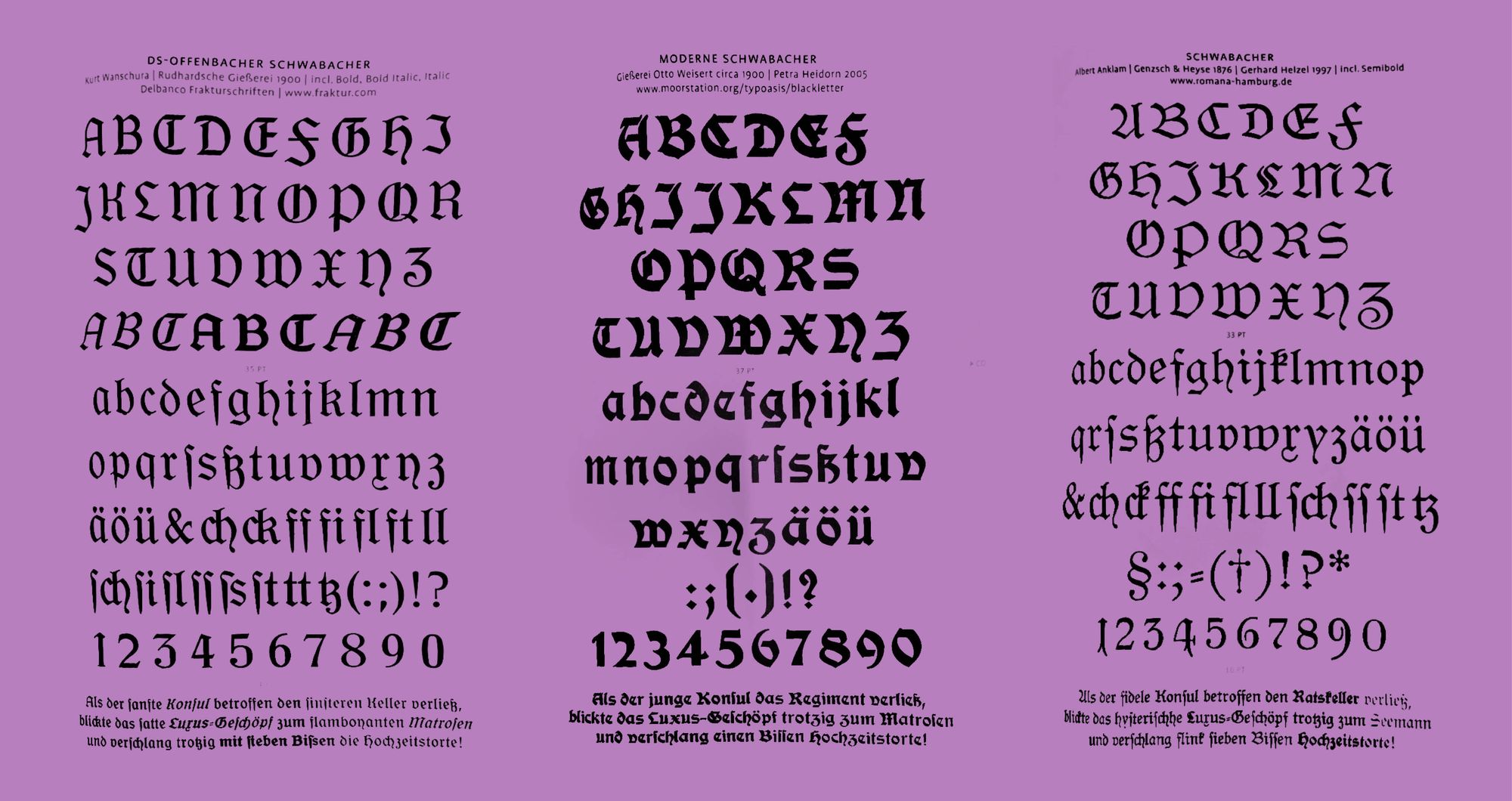
The blackletter attracted me mainly for structural reasons, opening many possibilities within its design. Drawn with a broad nib pen, the Schwabacher bears many similarities with conventional Hebrew block letters: high in contrast, modular, and including a variety of angles and fluid strokes. Despite its controversial history, I decided to reclaim the blackletter in this project. It solved many practical issues, for example, merging a round and a straight letter—like O and ד. For that reason, the Latin base became the capitals of the Schwabacher blackletter.
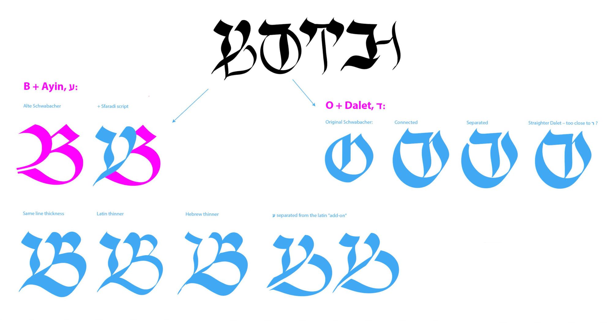
Due to the hegemony of the Latin script in typeface design, multiscript usually derives from Latin to draw the Arabic, Hebrew, Devanagari, and other scripts. To avoid this Latin-centric starting point, I began with the Hebrew letter. Riva’s calligraphy for the ketubah laid the ground for the design. Only when Hebrew letters stood independently, I moved onto the Latin ones, which then became added ornaments to the Hebrew base. My lack of literacy in Yiddish or Hebrew posed a problem from the beginning of the process, as typeface design requires high familiarity with the letterforms, proportions, details, and overall linguistic fluency. I needed professional help, and a community to turn to for support.
Between community and legibility
The collective is an integral and almost default part of Jewish life, as the community forms its primary organizing structure. Over centuries, the golus (exile) led to the rise of the diaspora: wherever Jewish people moved, they established communal governance and organizations. They built mikvos (ritual baths), shuls (synagogues), andxw chedarim (elementary schools), set up gmachim (free-loan funds), and extended practices of giving according to the halakha (Jewish religious law). I haven’t actively been part of any kehilla (Jewish community) throughout my life. However, through working on the typeface, learning, and reconnecting with my heritage, I found a vibrant but extremely hidden community connected either through the same ethnic and cultural background, or by a sheer interest in and passion for the survival of the Yiddish language.
Historian and theologist Mallin Norby at the library of Bajit: The House of Jewish Culture and Education, in Stockholm, Sweden, granted me access to their collection of Jewish books. Yiddish-activist Tomas Woodski helped me navigate through the thousands of Yiddish, Hebrew, Swedish and English volumes, and loaned me The book of Hebrew Script by Jerusalemite paleographer and artist Ada Yardeni. Her book constitutes a bible for anyone who wants to understand and learn Hebrew typefaces. Liron Lavi Turkenich, an Israeli typeface designer, became my mentor through the program by Alphabettes, a typographical network for women and nonbinary people. Through regular Zoom meetings, she corrected the construction of my hybrid letters and guided me patiently through the structure and characteristics of Hebrew, pointing out legibility issues or conflicting forms.
“Could we question the standards of both type-making and legibility to allow for a more expansive visual vocabulary and visual readability?”
While discussing typefaces, the practical aspect of linguistic legibility normally trumps visual expression. It is expected of a typeface to provide a quick and effortless reading experience to communicate efficiently, as the needs of a capitalist society dictate. Compendia on typeface design contain more rules than the statute book, leaving little space for interpretation and visual expression, and reinforcing the almost holy status of typography within visual communication. Traditions, customs, and conventions make communication between two people easier. However, always using the same methods and tools doesn’t generate a different outcome. Could we question the standards of both type-making and legibility to allow for a more expansive visual vocabulary and visual readability?
I didn’t intend to merge two script systems and cultures to make them coexist flawlessly. Such a full-fledged type would only focus on the possibilities and omit the difficulties of a bi-scriptural existence. The challenges and compromises in legibility within my script from both ends became a visual representation of the hardship and obstacles I had tried to overcome when merging two different cultures. The design didn’t put a softening filter on this attempt, but became a visual testimony of the struggles. In that sense, one could argue that legibility can obscure, whereas the resistance of a script can reveal and signify in a more meaningful way. Norms become visible when they are broken; where there is friction in the process, a reader has to stop and think.
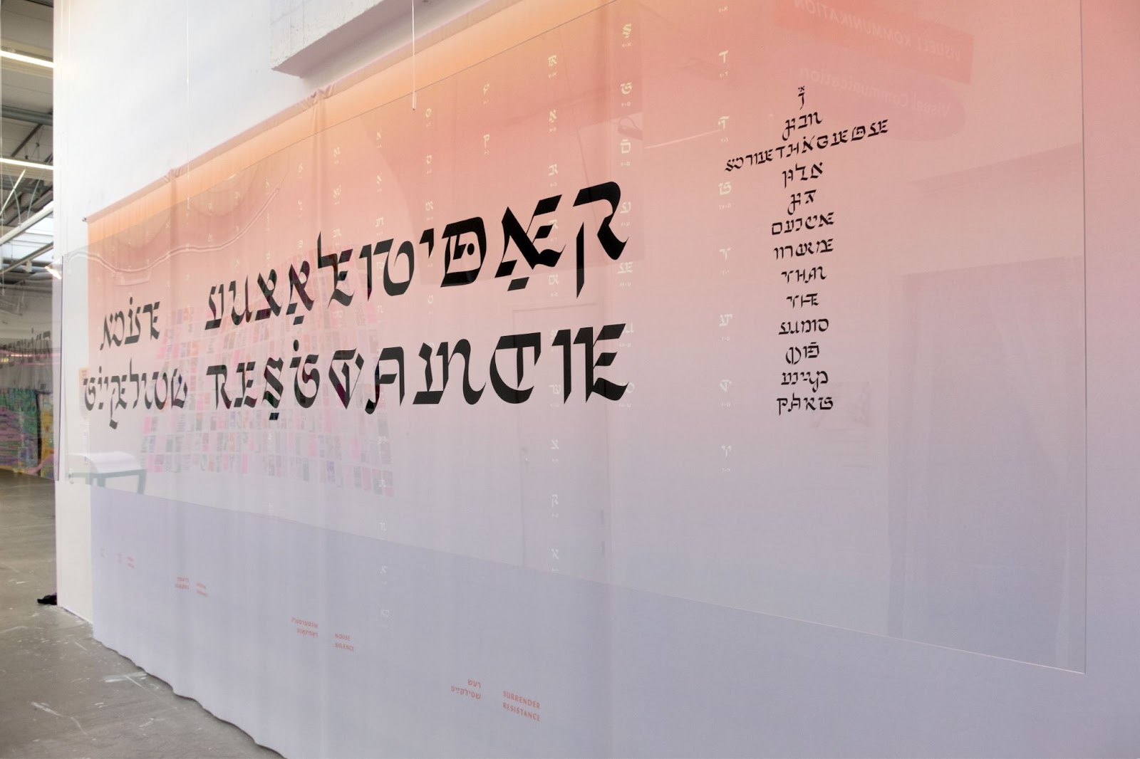
An interscriptual typeface calls for a different way of reading. We can’t just flip through the text rapidly, without putting any effort into the process. Reading the intertwined Yiddish-English text of the poem requires time, patience, and an open mindset to decode it. It can remind us of the script as a visual form and extend its signifying capacities beyond the standard categories of logo-, ideo- phono-, picto-, manifesting the script’s integrity as a signifying system. To me, that is what a complex-natured visual expression does: it considers both sides, not shying away from hardship nor painting a picture of a solution that isn’t truthful. My grandma Chava stared at the printed specimen at my graduation show and affirmed: “You really have to think!” Yiddish activist Tomas Woodski exclaimed: “My brain is burning, and my eyes hurt, but I can still read even though it is hard work!”
Veronika Larsson (she/her) is a Stockholm-based graphic designer and writer. She has extensive professional experience and holds a BA and MA in Visual communication. Her practice deals with language, text, and typography, and how to expand ideas of communication through craft.
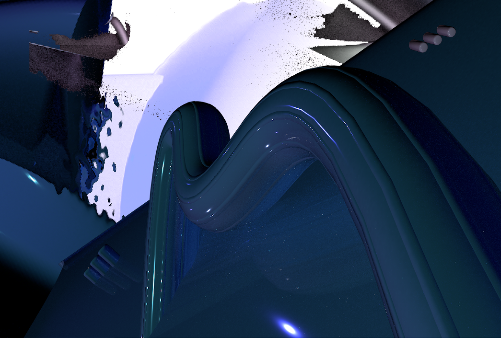
Title image: Final display of Veronikas graduation project “MOTHER TONGUE / מאַמע-לשון / MAME LUSHEN” at the MA exhibition at Konstfack University of Arts, Crafts and Design (Photo by Veronika Larsson)