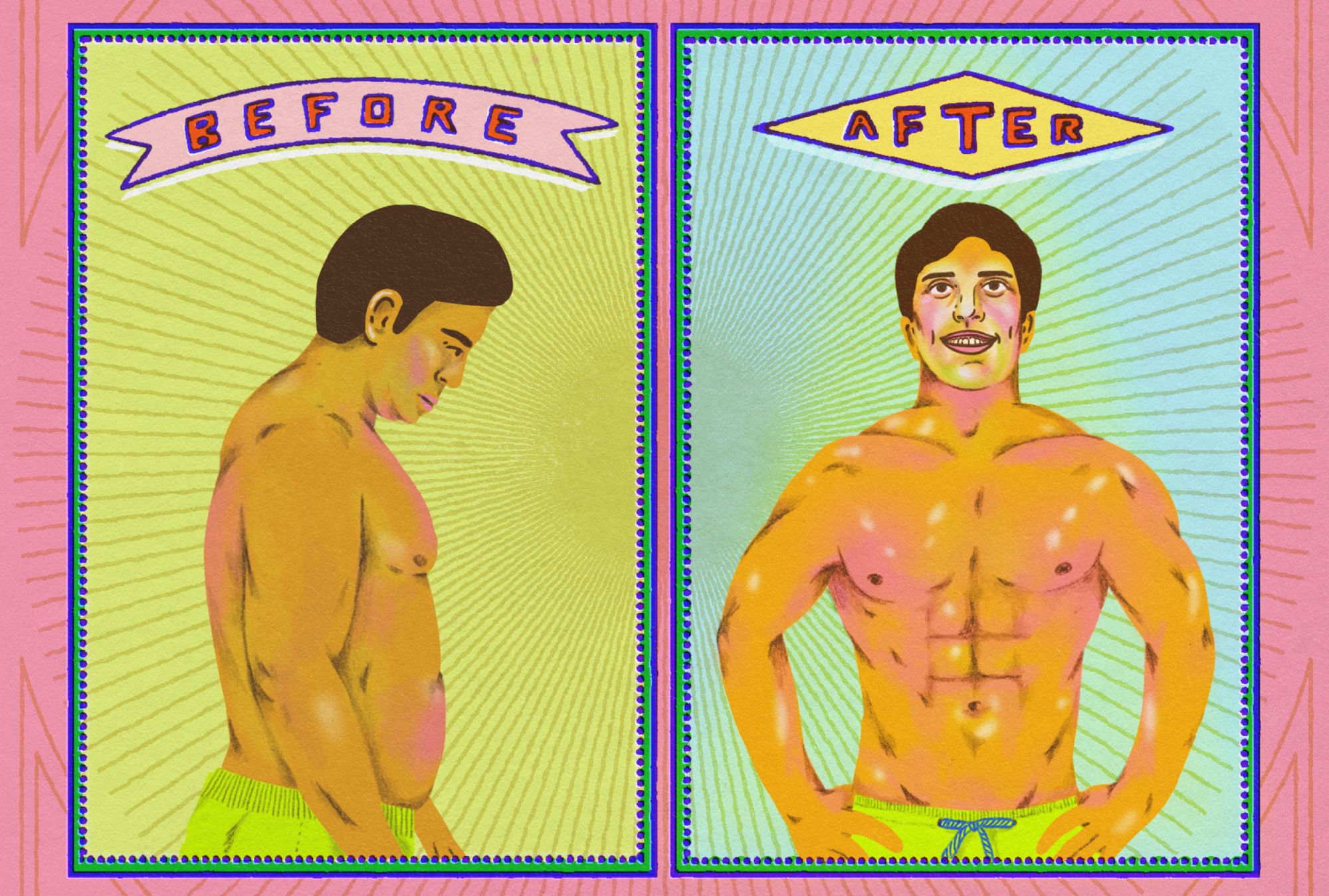
Most people have at some point been exposed to advertisements for beauty procedures, with promising Before and After images presenting radical—and sometimes unlikely or even laugh-provoking—effects of treatments such as teeth bleaching, hair growth or removal techniques, diets or workouts. In these ads, typically, a bland face turns into a smiling one with a straight row of shining white teeth, or a weary bald man turns into a confident man with an impressive haircut, and so on.
The same kind of image principle has also become common in the area of home styling, proliferated by home improvement TV shows such as “Extreme Home Makeover” and fuelled by a growing market for interior design and refurbishment of real estate. In fact, a Google search of “before after interior design” gives almost 2 billion image results. But there’s another, less known yet more public area where the “before and after” principle is taking hold: the city and the field of urban design.
Over the last few years, I have been researching urban renewal projects in the southern suburbs of Stockholm. I have collected and observed a variety of design and policy documents both from a Swedish context and other countries. In these documents for planned city renovations or urban renewal projects, as well as in presentations of results of already implemented ones, I have often found image couples showing a street or a facade in two different conditions. As is also the case in the above mentioned more well known examples, image manipulations may sometimes be detected in such visualizations, for instance, when a different angle or even image retouching was used to improve the impression of the After result, compared to a more documentary and supposedly unflattering Before.
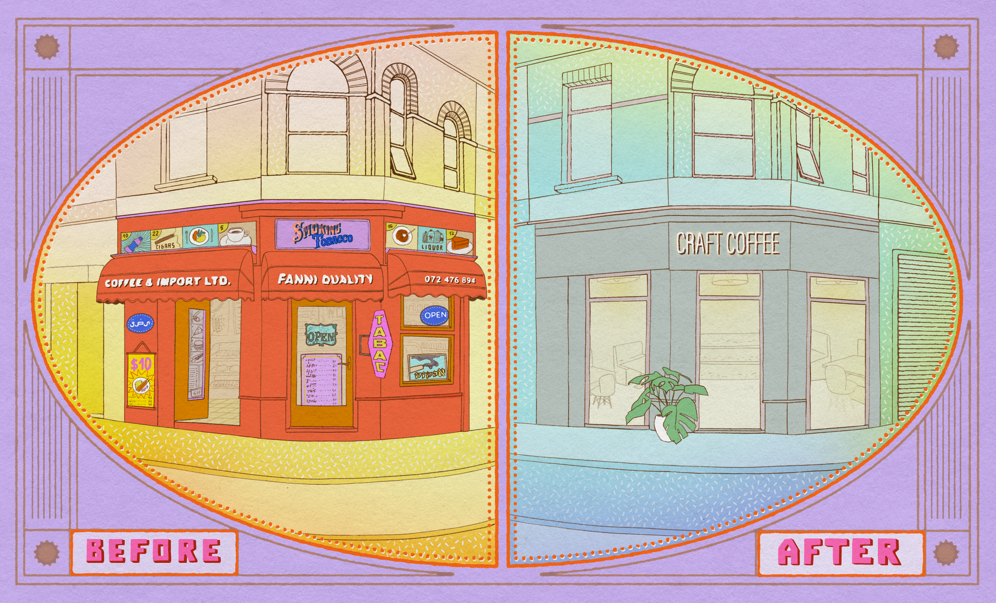
These proposed or documented transformations on paper are of course mirrored in the actual cities themselves. In many urban neighborhoods, in the Global North as well as in the Global South, citizens witness how their local environment changes character. Public spaces, high streets, shops, and streetfronts are renewed or replaced, often as a result of more or less explicit urban renewal programs initiated by city governments, property owners, and investors. With help from designers, architects and sometimes even artists, such strategies aim to reinvent or control the atmosphere of the place and the activities taking place there. In my hometown of Stockholm, for instance, this is a widely seen phenomenon, with certain areas being more affected than others, and people’s approaches to and opinions about these processes varying. While some are optimistic about such changes, others fear or already face increasing social segregation.
Each city, place, and case would of course need to be studied, observed, and described based on its unique historical, cultural, and social conditions. However, many activists and researchers have observed an increasing tendency towards an aestheticization of public space and the urban in order to make cities more consumable and attractive on a global market where they compete in attracting capital. The documents and presentations of urban development projects with their Before and After pictures seem to be an expression of just that.
“The Before and After figure is a powerful rhetorical device and design tool. The words ‘device’ and ‘tool’ underline the operational properties of this recognizable model of juxtaposing images.”
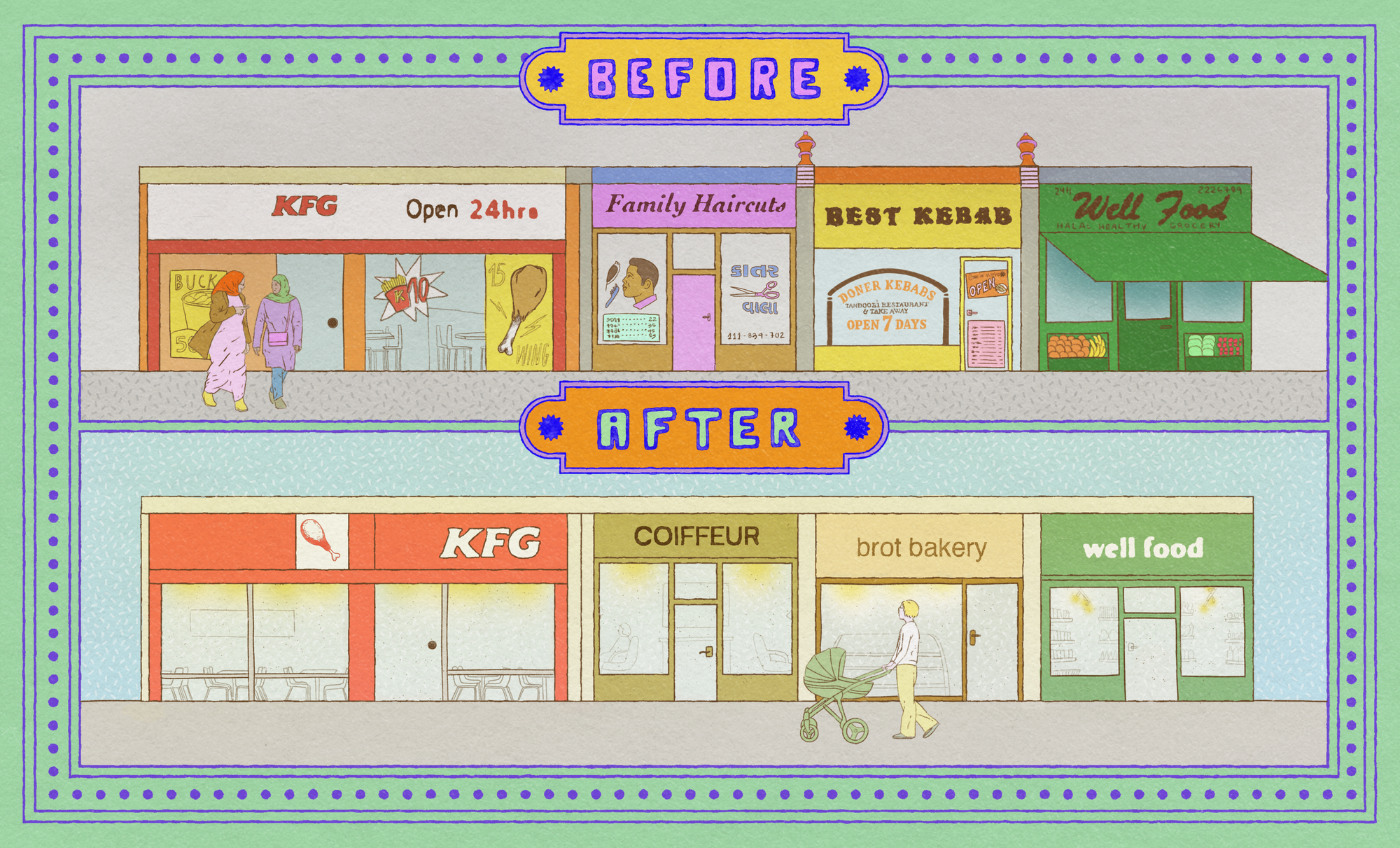
Whether in cosmetic commercials, home makeover shows, or urban planning contexts, the Before and After figure always follows the same basic principle. It promotes and argues for a product in a simple and easily understandable form that doesn’t even need captions: two photos or video shots repeating the same object, but with some obvious differences, are coupled together to narrate a move towards a visually convincing aesthetic improvement. In art theory, this would be called a “juxtaposition”—a term used when meaning is produced between two combined images presented next to each other. The Before and After figure is a powerful rhetorical device and design tool. The words “device” and “tool” underline the operational properties of this recognizable model of juxtaposing images.
If the Before and After image is a design tool and not just a visual convention, then we also have to ask ourselves how it is used and where in the design process it is located. This surely varies. For example, in one of the cases I study, in Stockholm, architects have conducted field observations, created image archives, made an analysis of a site, and delivered a guide including imaginary Before and After images back to the commissioner. And so, on the one hand, the Before and After figure is a result of a design process, meaning that it is the outcome and summary of research and analysis. On the other hand, from that point onwards, the Before and After figure also marks the beginning of another design process, which was what happened in the case I studied, where those juxtaposing images then became part of an instruction manual for how spaces were to be designed.
“All Before and After figures juxtapose a binary. Problem–solution. Past–future. Reality–promise. Unwanted–desired. Dualism is thus a central feature of the Before and After figure.”
Apart from these two concrete locations of it in a conventional linear design process, Before and After figures, more importantly, design our perception, thinking, and being in more general terms, just by their presence in our cognition and minds. As such, it is not only the actual images contained and the meanings they convey in each particular case that should be studied. More importantly, it is the very possibilities of meaning production this figure allows by how it is constructed that need to be considered. Because, the Before and After figure is in and of itself discursive—and thereby limiting.
Flawed Dualisms,
or the problematic promise of progress and development
All Before and After figures juxtapose a binary. Problem–solution. Past–future. Reality–promise. Unwanted–desired. Dualism is thus a central feature of the Before and After figure. This can be traced back to how dualism is reflected in Western conceptualizations of design, as well as more generally in Western Modernity—the constitution of a universal world based on colonial, patriarchal and capitalist logics of development. Looking at the dualist logic in a larger context might illuminate some of the darker mechanisms of the Before and After figure as they share features and are related.
Already in 1971, in his book Design for the Real World, first published in Swedish, designer Victor Papanek expressed worry that “designers have become a dangerous breed” as a result of industrialism and “Third World development”. His observation concerned a dominant concept of design as a problem-solving activity, making positive impact, centered around progression and development, being exported globally from the West. Papanek was critical about this tendency in terms of its inattentiveness to ecological and social qualities being violated by growth-driven Western actors.
The mainstream understanding of design, that also underlies Papanek’s critique, implies a dualist separation between planner and producer, which gives design professionals more legitimacy at the expense of producers. According to scholars Yoko Akama, Penny Hagen, and Desna Whaanga-Schollum, this creates a “designer persona who solves problems for people and speaks for the ‘other’,” a role that is increasingly being contested by theorists and practitioners who are influenced by feminist and decolonial ideas. What is more, this dominant conceptualization of design, is in turn a product of Western Modernity being fundamentally based on a series of binaries, the most central ones being: Nature–Culture, Us–Them, and Subject–Object (or Mind–Body). Again, dualist ideas that need to be looked at critically.
In his 2018 book Designs for the Pluriverse, for instance, anthropologist and design theorist Arturo Escobar argues that “the problem is not that dualisms exists […] the problem is with the ways in which such divides are treated culturally, particularly the hierarchies established between the two parts of each binary, and the social, ecological, and political consequences of such hierarchies.” Escobar further proposes that such hierarchization of binaries can be referred to as coloniality, and that a central feature of coloniality is its approach to difference—in terms of categorization and establishment of hierarchical classification.
The core narrative of a Before and After image is one of difference. Or more precisely, difference in value, with the After image being the preferable category and the destination of the move. The Before and After image thus is a model for presenting and establishing value hierarchies.
One-fits-all Fallacy,
or why the ordering of public space undermines democracy
The Before and After figure provokes the idea that there is a one-size-fits-all solution, it points out one ideal. The Before seems interchangeable but the After is what all Befores are striving towards. It entails a linear movement, in one direction, towards progress. Not a circular movement, back and forth, that would entail simultaneity, relationality, interconnectedness, negotiation and dialogue. This way of seeing and understanding the world is problematic on many levels and in any context, also within urban design, and one of its main tenets, that of public space.
Public space is often routinely claimed to be a cornerstone of democracy. However, it is misleading to think of this relation as in such a simple, essentialist way. Instead, we need to pay attention to how public space supports democracy, as well as how it risks circumscribing it.
In his 2018 book Building and Dwelling sociologist and urban planner Richard Sennett suggests that a housekeeper should be able to shop in the same store as the woman she works for. Because then both would get exposed to other social classes than the ones they belong to.
“Public space ideally reflects society, and allows for the conditions of society to become visible in an unavoidable manner and thus politicize them.”
On the one hand, Sennett’s example reflects a slightly romantic idea about the public space as enabling random encounters between strangers across different social boundaries, and a belief in the power of dialogical meetings that would just magically lead to harmonious coexistence and tolerance in society. On the other hand, the example does illuminate an important function of public space, namely that of providing an arena for exposing and making visible the socio-economic structures of society. Public space ideally reflects society, and allows for the conditions of society to become visible in an unavoidable manner and thus politicize them. Privatization and spatial segregation, however, minimize the exposure of people to the realities of others.
A related function is that the accessibility of public space allows for political action, such as protesting, for groups that do not necessarily have access to other politically influential arenas. In this regard, the “openness” of public space, in terms of accessibility and visibility, holds another important democratic function.
“This idea that something is ‘for everyone’ is, in that sense, utopian and obscures existing conflicts and inequalities that must always be considered and navigated.”
This notion of the public as essentially open—in the sense of a limitless place where exclusion is not possible—is problematized by philosopher Nancy Fraser, as being an idea stemming from a patriarchal point of view. This idea that something is “for everyone” is, in that sense, utopian and obscures existing conflicts and inequalities that must always be considered and navigated. Fraser’s contribution is a more complex view on publics, opening up an imagining of a diversity of simultaneous publics, and a reminder of relationality, in terms of necessarily conflicting existences and positions coexisting in a complex web of power relations. In this regard, Fraser’s perspective connects back to how differences can be approached: she acknowledges difference as positions to be negotiated rather than sharp and fixed categories.
If inclusion exists, exclusion does too. And with that, responsibility must be taken for whom public space is designed for and what parts of society are reflected in it. The openness and democratic functions of public space are not to be taken for granted. Especially as we today see sanitization practices and privatization processes regulating and circumscribing public life. To borrow from art critic Rosalyn Deutsche: “Conflict, division, and instability (…) do not ruin the democratic public sphere; they are the conditions of its existence.”
If public space is to be considered a cornerstone of democracy, we must challenge ourselves to think about it in a dynamic and expanded manner allowing for multiple layers and acknowledging conflicts, because distribution of resources in our society is unequal. An approach that embraces such complexities, however, stands in stark contrast to the clear cuts and sharp divide of the Before and After binary and its success stories of progress.
Consider the Gap,
or how the Before and After figure obscures our being in the world
What the dualist figure of Before and After skips is the step in between; where and how a transformation takes place. It renders the acts and moments of the actual making of the improvement invisible and mystified. However, this gap entails practices that should not go unnoticed and unconsidered. We need to look at it and ask: What is being done, and by whom?
The gap usually represents a product or a professional service with a promise of progress, which the Before and After figure promotes. But the gap also obscures the embodied practices and social and cultural contexts of the improved object. Instead it reduces the object to a flat surface, reaffirming a binary of “Form and Content” and paying attention only to form.
“The behaviours, procedures, relations, and more that make up the practice of designing are reflected in the designed object as well as in the designing individual and community.”
Design theorist Anne-Marie Willis argues that there is a “double movement” in the acts of designing: we design the world and it designs us back. And it is not only the objects we design that form us, but the act of designing itself does so too. The behaviours, procedures, relations, and more that make up the practice of designing are reflected in the designed object as well as in the designing individual and community. Exactly because of that we need to be attentive about the tools and ideas we use. They are part of determining our being in the world and our acting upon it.
Material practices, such as the aesthetics of public space and shopfronts, can either be understood as insufficient and in need of improvement by professionals, or as cultural expressions that are constantly being made by a diversity of people and producers.
The latter perspective is one that suggests a more respectful approach towards the local community and asks for responsibilities to be taken by designers and other professional fields. Such a circular and relational design approach encourages designers to reframe and rethink their role in terms of service- and/or solution-provider, and to unlearn the skills of delivering aesthetic improvements. Rather they would learn how to recognize and acknowledge a vast scope of material practices, and contribute to related fields of architecture, urban planning, and governing organs to do the same.
Once we put away the Before and After-glasses, which tint and limit our view of the world in a divide between a messy unwanted past and an ordered desired future, we might be able to see and acknowledge a flora of simultaneous aesthetics in the urban public space that reflect and refract, rather than polish, society.
Maryam Fanni (she/her) is a graphic designer, educator, and researcher based in Stockholm, Sweden. Her works often engages with public space in the urban and rights to the city issues. She is currently a PhD student at HDK-Valand Academy of Art and Design, University of Gothenburg.
This text was produced as part of the Troublemakers Class of 2020 workshop.

