Arabic typography is booming. The rise of the Gulf Cooperation Council (GCC) as an economic giant, with Dubai as a hub for commerce, media, and advertising, generated a global spike in demand for Arabic design and typography. Facing limited technologies for Arabic font design and a shortage of Arabic type specialists, a wave of Euro-Anglo-centric graphic design programs began to emerge in the region. Add to this mix a host of communication agencies on the lookout for the “global modern look,” and you’ll get the perfect storm for oversimplified, Westernized Arabic typography in strictly apolitical mode.
“Much like the diverse cultures of the region, Arabic type was reduced, Orientalized, fetishized, vilified, and colonized.”
This “apolitical” stance is, of course, highly political. Design is by no means alien to the context in which it is produced. The Arabic-speaking region is marked by a violent history of colonial exploitation, sectarian divides, and profit-driven economies. While native Arabic speakers were battling an overall lack of resources and structures to design Arabic typefaces, non-natives remained comfortable doing the job—a common practice since the historical onset of “Arabic” typefaces, which were produced in Europe. Much like the diverse cultures of the region, Arabic type was reduced, Orientalized, fetishized, vilified, and colonized. Through this limbo, it, too, became a homogenized category in need of deconstruction.
Who gets to design Arabic typography? Whose bodies labor behind this wave of Arabic typefaces? Is literacy a prerequisite for designing a script? Are thorough research and technical knowledge enough to engage with a certain culture? When does the fascination with a foreign script become problematic? How should we reposition Arabic type design within its historical and cultural context? To address some of these issues, I spoke with several type designers who are either from or have been operating in my home country, Lebanon. Although this tiny specimen of voices is not representative of the whole Arabic type design field—far less of the region’s diversity—it sheds some light on these issues.
Manufacturing the apolitical stance
Complementary to Egypt’s historical dominance over the music and film industry of the Arabic-speaking world, Lebanon took the lead in the professionalization of graphic design. In 1992, the American University of Beirut (AUB) opened what would become the first institutionalized graphic design program in the Arabic-speaking region. It was followed by dozens of technical and university-level courses across the country, all of which (except the public program offered by the Lebanese University) are private and charge costly tuition fees—one year of tuition at the AUB costs around US$34,000. This reality emphasizes the classist and extremely exclusionary infrastructures of the Lebanese higher education system. In the past thirty years, Beirut generated a substantial number of successful graphic designers, some of whom went on to direct multinational agencies or co-develop design programs across the region. I studied at the American University of Science and Technology (AUST), a private mid-range university in Beirut. Like many colleagues, after graduation, I worked for communication agencies in the Arab Gulf.
In the late 1990s, when Abu Dhabi and Dubai first emerged as economic powers attracting global corporations, the United Arab Emirates (UAE) started legally requiring Arabic-and-Latin versions of a commercial logo. This policy led to what Lebanese type designer Dr. Nadine Chahine labeled “Arabic Frankenstein:”the practice of deriving Arabic logos from cutting and pasting parts of Latin letters without a proper understanding of how Arabic letters are shaped. This first wave of Orientalist logos was followed by a demand for Arabic versions of popular Latin fonts used by global corporations. In early 2010, Linotype added Arabic “companions” to Helvetica, Frutiger, and Univers, all designed by Chahine, with other Western type foundries soon following the same path. In hindsight, Chahine acknowledges the challenges of that era, especially the lack of resources and research, and admits that today, she would tackle those designs differently.
“The common thread I have heard of among professional Latin type designers wanting to make Arabic type is [that they want] to broaden their market.”—Lara Captan
Arabic type design is a laborious undertaking. An average Arabic typeface that covers Arabic, Farsi, and Urdu, amounts to 262 glyphs plus an indefinite amount of ligatures, and glyphs that combine multiple characters. Nevertheless, the rising demand and the limited supply made Arabic type design an attractive field to non-Arabic speakers. “The common thread I have heard of among professional Latin type designers wanting to make Arabic type is [that they want] to broaden their market,” explains Lebanese type designer Lara Captan, who studied and taught at the AUB before obtaining a Master’s of Arts (MA) in Advanced Typography from The Autonomous University of Barcelona (EINA) in Spain. Captan points to a general Western conception that Arab countries have a lot of wealth, which could be one explanation for the desire to breach into the region.
For Kristyan Sarkis, Lebanese type designer and co-founder of TPTQ Arabic, this, of course, has always been the case. After all, the first Arabic metal type was cut in Europe by non-Arabic-speaking Europeans. After studying at Notre Dame University (NDU) in Lebanon, Sarkis pursued The Master Type and Media from the Royal Academy of Art in The Hague (KABK) in the Netherlands, and has since released 10 typefaces including Greta Arabic and Teshrin. Acknowledging the rising interest in Arabic Type, Sarkis is not opposed to the contributions of non-natives “as long as they immerse themselves in the culture and develop a high sensitivity to the [Arabic] script.” Sarkis, however, stands more critical of oversimplified contributions by native Arabic speakers, who, according to him, have done more Westernization and oversimplification to the Arabic script than any Westerner. “This tendency to Latinize is partly due to the postcolonial status of the Arabic-speaking world, leading to an identity crisis amplified by the sudden economic boom in the Gulf,” he argues, using Dubai’s international outlook as an example. “Just like any other form of culture, typography suffers from the same Westernization challenges.”
“While designers blame other designers for oversimplification, one of the most important roots of the problem lies in design education.”
What Sarkis refers to as an “identity crisis,” I would dub as cultural hegemony. It is precisely why we should rethink the political angle from which we perceive, practice, and teach design. While designers blame other designers for oversimplification, one of the most important roots of the problem lies in design education. Established within colonial institutions historically founded and run by Christian missionaries and adopting Eurocentric curricula, design education in the Arabic-speaking region rarely refers to the histories of colonialism in its ties with the sociocultural present.
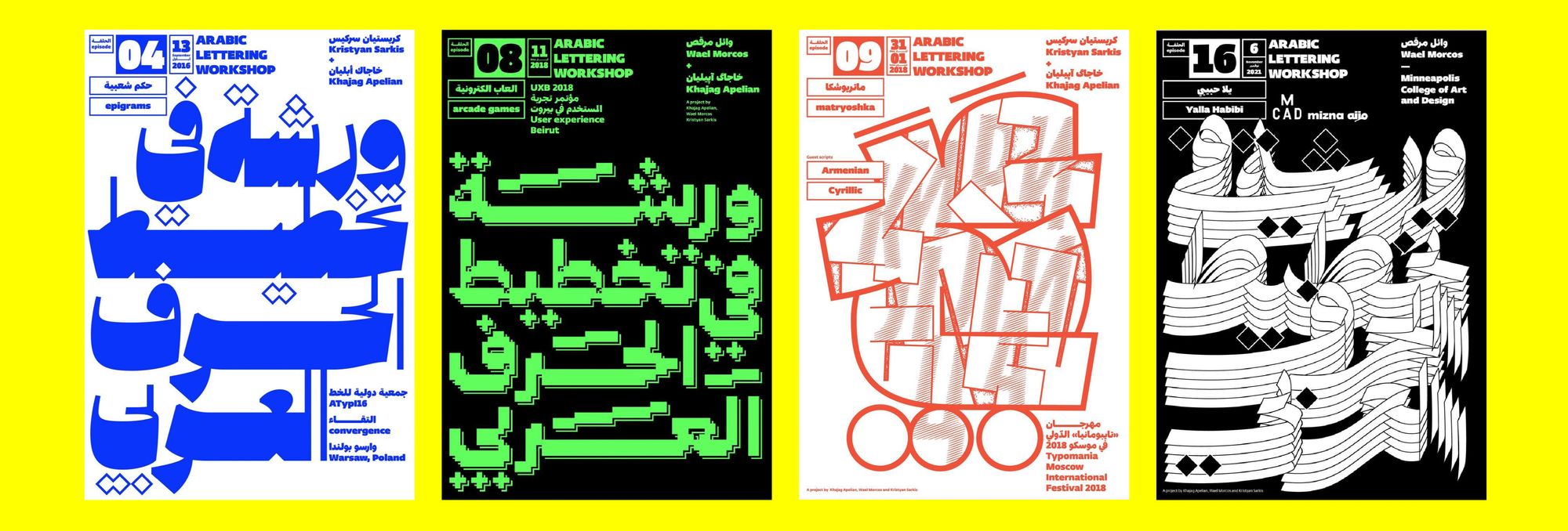
Sarkis, who teaches for the Master Type and Media at the KABK, is critical of type design education as a Western, Eurocentric white-male-dominated context. In 2016, together with Lara Captan, he co-founded Arabic Type Design: Beirut, an intensive foundational program in Arabic type design, hosted by the AUB. While the program responds to an urgent need and high demand, its access is limited due to the absence of scholarships and cultural funding. Since its onset, efforts have been made to make it more accessible: the tuition fee was reduced from US$2850 to US$400, and the duration from six to only two weeks; however it still remains out of reach for many. Although the AUB plans to eventually launch its own MA for Arabic Type Design, beyond this short course, there are no institutionalized options to study type design in the region.
To become an Arabic type designer, one has to either follow the difficult path of self-education or migrate to pursue an MA, which is the case for most of my interviewees. In Europe, there are currently two programs with a multi-script approach providing some skills in Arabic type design. The first is at the University of Reading in the U.K., and the second is at the KABK in the Netherlands. Both offer limited seats every year and require pre-existing knowledge of type design. Non-European students are further hampered by high tuition fees, lack of scholarships, difficult visa procedures, and the generally high costs of living abroad—all in all, ultimately rendering these programs exclusionary by design.
Once abroad, students might face problematic assignments. At Reading, for example, students have reportedly had to design a Latin script plus one other script they did not speak or understand, generating oversimplified and Latinized outcomes. Staying in Europe after graduation certainly provides better access to research opportunities, public and private funding, archives, and of course, salaried jobs in type design, but designers will most likely face systemic racism and discrimination. One type designer I spoke with, who chose to remain anonymous, described the burden of being the only Arab on the team: “They would not listen to me though I was the expert on the table. I had to push my ideas through my white colleague.”
Untangling technology and quality
One of the major barriers to designing Arabic typefaces is technological. In her 2018 Typegeist article, Iranian type designer and researcher Sahar Afshar explains how some of the most basic requirements for Arabic type were only met recently with the development of OpenType features—additional functionalities of the typeface that can be activated, which, for example, allowed for contextual alternates and cascading/slanting baseline. Still, mainstream typesetting software lacks some of the most essential tools for recognizing and typesetting Arabic, which is why it is not uncommon to see Arabic text written backward or with disconnected letters.
One of the first solutions to these problems was Tasmeem, an Adobe InDesign plug-in launched in 2006 by WinSoft International in partnership with DecoType, the practice of Amsterdam-based type and technology specialists Thomas Milo and Mirjam Somers. Tasmeem, which was finally discontinued in 2021, provided functionalities such as calligraphic spacing and word-shaping, and cost up to US$799. It came with its own set of historical revival fonts designed by DecoType using their trademarked technology Arabic Calligraphic Engine (ACE). According to its online manual, its mission was to bring a “new generation of high-tech savvy designers” back “to the sources of the Arabic script traditions”—a recurring thread in the slippery discussions around typographic quality.
“Don’t underestimate the intelligence of your predecessors. Designers should study the rules of a script before they make changes,” argues Thomas Milo, who designed multiple Arabic typefaces based on historical revivals since the early 1990s. To explain his point, Milo draws an analogy between pop and classical music, claiming that the best pop musicians are those who fundamentally understand the late-Baroque composer Johann Sebastian Bach. It begs the question: who is granted access to Bach? Circling back to my initial concern: who gets access to type design education and training?
“Quality [...] symbolizes a construct of Western modernity perpetuated into the present, which requires a level of education and training only accessible to a privileged few.”
Amidst debates on tradition versus modernization, designers tend to agree on one thing: it is all good if the quality is high enough and the outcome is beautiful. “It doesn’t matter where the designer is from as long as the design looks good,” says Dr. Nadine Chahine. “We shouldn’t ask designers to pass a citizenship test before they can design a typeface. I want those designing Arabic typefaces to be good designers. It is important to be pragmatic and knowledgeable about the topic rather than to take an ideological stance on things.”
Not taking an ideological stance on things is, of course, highly ideological. The obsession with quality makes for a core problem. Quality, in that sense, symbolizes a construct of Western modernity perpetuated into the present, which requires a level of education and training only accessible to a privileged few. If you cannot afford to study and live in Europe, you will be unlikely to fulfill the criteria of quality to therefore become a recognized Arabic type designer.
Chahine—who studied type design at Reading and holds a Master’s degree from the University of Cambridge in the U.K., and a Ph.D. from Leiden University in the Netherlands—distinguishes between two attitudes. First, there are those who design for the Arabic-speaking region by trying to speak on its behalf, whose attitude she deems very Orientalist. The second group stems from “honest intentions” or what she calls the “love of the script”—designers who have a genuine interest in the script, invest time and resources in research, and show respect to the region it comes from. Again, this calls into question: who can afford to invest time and resources in research? Sarkis, on the other hand, calls for a case-by-case assessment: “We still publish good typefaces by non-native designers if they are really good, but the perspective has to stem from the characteristics of the Arabic script, committing to a non-Orientalist approach.”
“Nothing exists in a vacuum,” says Lebanese designer Wael Morcos, who studied graphic design at NDU-Lebanon before obtaining a Master’s in Fine Arts (MFA) from The Rhode Island School of Design (RISD), and currently runs a practice in New York, U.S.A. “You don’t want to be repeating the past,” he says, referring to the violent histories of colonization that continue to impact the Arabic-speaking region. “It is hard to take it all out of context and say if it is technologically up to the standards then it is good enough, because you are ignoring the cultural context around the story.” Morcos advocates for giving Arabs a platform to collaborate and craft their own stories in their own scripts and language, which was the driving force for him to co-found 1on1.projects.org, a website devoted to highlighting the narratives of U.S. Arabs and Muslims. “In developing countries, a lot of these narratives have been told by colonizers,” he states. “There is not enough consideration for people being in charge of their own stories.”
“The system of stacked privileges and access (to prestigious type design programs) makes me prioritize working with those who don’t make up part of that system.”—Kristyan Sarkis
Sarkis, on the other hand, tries to counteract systemic injustices through hiring practices. “I would rather give my training/supervision time to those who are not benefiting from structural privileges: designers based in the Arabic-speaking world,” he says, adding that his first employee was Maha Akl from Egypt. “I wouldn’t have employed a non-native,” he says. “Type design students are often talented, good researchers and they draw very well. But the system of stacked privileges and access (to prestigious type design programs) makes me prioritize working with those who don’t make up part of that system.”
Native vs. non-native contributions
One major barrier to Arabic typography is a lack of literature on Arabic typography, which has been continuously evoked by all my interviewees. Lara Captan calls for thorough research, testing, and discovery before designing any typeface, and highlights how the absence of guidelines makes Arabic type design a particularly challenging field to enter. A crucial aspect of designing for Arabic is generated through lived experiences, memories, and familiarities, but such constructs are often conditioned by “the colonized mind,” a product of colonial education discussed by several theorists such as Frantz Fanon. As I have argued elsewhere, spaces of colonial education and classist/sectarian segregation such as Lebanon, often produce self-Orientalist approaches to design.
“A non-native contribution to Arabic might miss out on a lot of cultural cues, which can be detrimental to the project.”—Wael Morcos
Evoking the everyday, Wael Morcos stresses the importance of cultural specificities and lived experiences. “Where designers have lived, what streets they encountered these scripts in, and what it meant to them,” he lists. “A non-native contribution to Arabic might miss out on a lot of cultural cues, which can be detrimental to the project.”
Lara Captan considers that non-natives may face additional challenges in designing Arabic type, for example: “How does one embrace a different set of aesthetics and undo one’s own, in order to be culturally relevant within the target geographic space one is designing for? What is the honest drive behind wanting to design Arabic typefaces, and what is the impact of one’s design amongst the script communities who use it?”
Chahine, however, identifies reductive attitudes from both natives and non-natives. “No matter who has it, a reductive attitude is problematic in any field.” Often, non-native contributions manifest through revivals, that is, typefaces drawn closely based on existing historical specimens. Chahine observes that non-native designers tend to adhere closely to pre-existing specimens, making them less innovative. She sees the display typefaces of Kristyan Sarkis, such as Thuraya and Kanun stencil as an exciting emerging new genre in Arabic type design. “The risk-taking approach to design would be more pronounced with native speakers. I expect it’s because we feel at home and we are more comfortable pushing the envelope. However, if you are new to the script, you would be a bit more hesitant to experiment,” she explains. “It would be like visiting someone’s house and rearranging their furniture. Difficult on the first visit, but later when you’re good friends, it’s easier and might be fun!”
Lebanese-Armenian type designer Khajag Apelian talks about a distinction between information about the script as a whole versus that of type design as a practice, leading to relative visual risk-taking. In that sense, Arabic-speaking designers tend to stay safe when designing Urdu glyphs for example, which can lead to flawed products. Apelian consolidates the need for language natives who are engaged in extending their practices beyond the generalities of the script: “In the same script, languages differ and we stand very careful not to alter them. It is important for a native speaker to make those decisions and advance that knowledge.”
Asking “Who gets to design for Arabic?” is not a simple question. For Thomas Milo, the deconstruction of the Arabic script culture today is “ironically, mainly the work of Lebanese ideologists.” Milo served in the Dutch Army deployment for the United Nations Interim Force (UNIFIL) in South Lebanon between 1980 and 1983. During that period, he was commissioned by the Dutch Ministry of Defence to produce a manual of the local Arabic dialect, which he insisted should be set in ruq’ah, the script that was most common around the southern borders. “Even with a robust budget, it was impossible to get Arabic typeset in a form that matches its great tradition,” he recalls. A couple of years later, together with Mirjam Somers, he produced a fully comprehensive ruq’ah typeface. Since these early engagements, Milo claims a scientific approach to Arabic typography: “I am not interested in all this colonialist bullshit, I am just a scientist working with a robust analysis of the script traditions. Orientalists build bridges, they are not instruments of colonialism—though some of them obviously were.” When talking about his earliest pursuit in Decotype, he claims his Amsterdam-based team was the only group approaching Arabic scripts “scientifically.” “There was no one in the Middle East actually doing it,” he says. “They were repeating existing Western designs primitively.”
“Scientific versus primitive”—what a telling pairing of terms! Shortly after, Milo dodges my question about Orientalism, the term by Palestinian scholar Edward Said to describe the racist characterization of the East by the West. According to Milo, studying the Orient has nothing to do with robbing Arabs of their power. “Edward Said didn’t know anything about the academic study of anything. He turned a completely regular justified field of study into some kind of conspiracy,” he expresses, blaming Arabs for not taking a closer look at their own culture.
When asked if designers should restrict themselves within a set of rigid rules or use their agency to produce contemporary versions of a script, Milo answers: “I’m not doubting the need for what they are doing, but they are mainly in lettering. Not a single work of Arabic learning or literature has ever been published in those ‘Mickey Mouse’ typefaces. You use them to sell Mercedes and Porsche limousines.” In the end, he acknowledges his identification as an outsider: “It is not my position to change the script. I’m not living in their world, and I am not going to design that world for them. I am restoring the script to its original glory, or at least bringing it to the age of digitality without unnecessary damage. If you want to change the script, you have to be an Arab. It is the role of someone like Kristyan Sarkis. It’s not my role; I don’t touch it.”
Politicizing the Glyph
In politically charged contexts of wars, occupation, and displacement, obsessing about quality transmutes into classist gatekeeping. Non-native type designers producing typefaces they cannot read—and getting praised for it—not only overshadows the work of local designers who lack access to research, education, and publishing, but can result in overly simplified designs that reproduce colonial power dynamics. Heterogeneous engagements across cultures require problematizing all culturally situated arguments, including that of quality. My point here is not enforcing any essentializing or nationalistic ownership over Arabic typography, but underlining the importance of a primarily political approach to design.
We need politics in type design. A commitment to a political approach may begin with amplifying local productions no matter how “low quality” or “primitive” they might seem when measured against a long history of cultural hegemony that produced those very colonial categories. Natives and non-natives must acknowledge it, defy it, and work against it by adopting a self-reflexive framework centered around decolonial ethics. If we truly aspire to equitable type design futures, a political framework should commit to the entangled schemes of class, race, gender, history, geography, ability, cultural representation, and power dynamics. This piece is a radical pledge—a pledge for Arabic-type design to extend beyond the quality argument into subversive productions by and from its own users, primarily those who cannot afford an MA in Europe or invest years designing a typeface. A critical approach can often inflict discomfort, but we must invite critique into Arabic type design, sit with it, work it, and draw from it. This piece is a radical pledge for critical discomfort.
Imad Gebrayel (he/him) is a Lebanese designer, educator, and researcher based in Berlin. He has produced visual and theoretical works around identity representation and self-Orientalism in Arab* design, counter-mapping, and archiving. He has lectured at several academic institutions including Humboldt University of Berlin, Berlin University of the Arts, Hochschule für Künste Bremen, The University of Art and Design Linz, and Design Akademie Berlin. Imad has co-founded cultural and urban projects centering Arab-migrant experiences and is currently undertaking ethnographic research on the negotiations of Arab-Arab identifications in Sonnenallee, Berlin, as part of his doctoral project at the Humboldt University of Berlin.
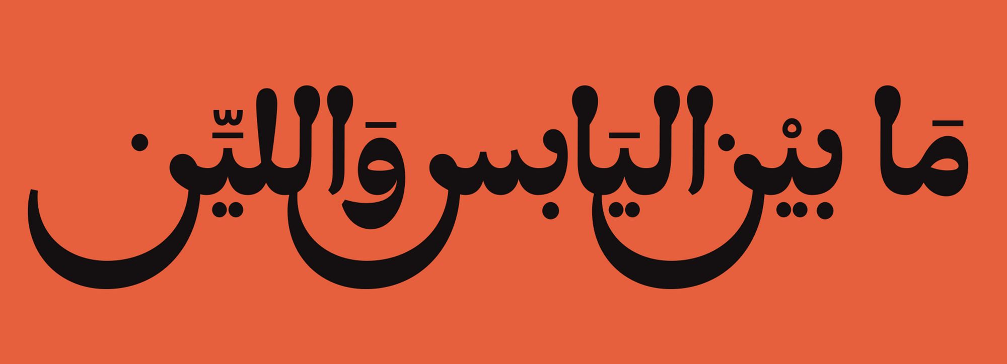
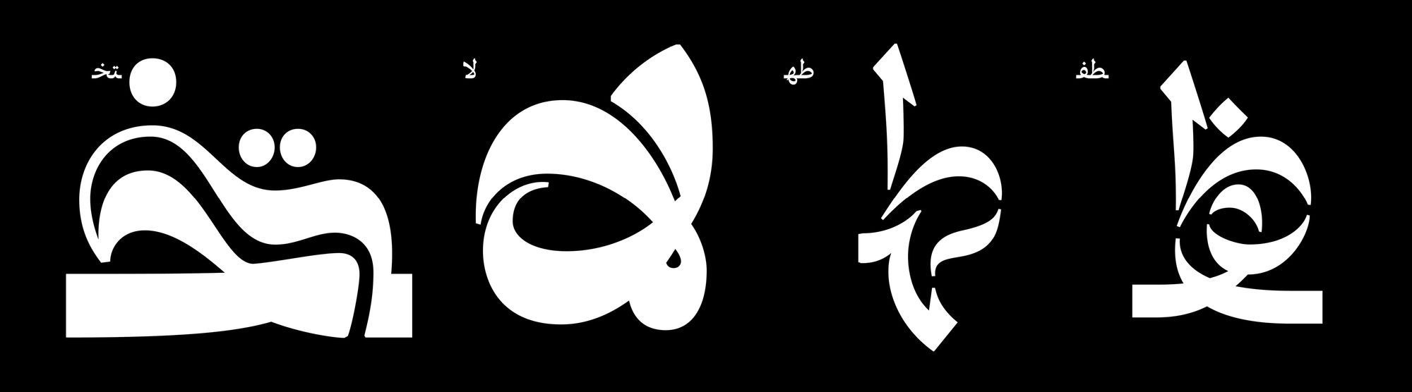
Title image: The visual is Arabic lettering for the terms “righteousness/eligibility, classism, quality.”
Credits: Imad Gebrayel, based on “Mada,“ a display typeface designed by Sayed Kammoun for Mojo Ink.