
Not much has been said about Norwegian graphic design history, and much less has been written about it. No published books are specifically devoted to Norwegian graphic design trajectories, and only one ongoing academic research project focuses explicitly on graphic design history within the Norwegian context. Is the lack of formal discourses and documented accounts a testament to the absence of a Norwegian graphic design canon? The fact that a canon is not explicitly declared as such doesn’t mean there isn’t one. Specific aesthetic principles, forms of practice, and design narratives are legitimized and promoted against others in various ways beyond the written form, such as design awards and exhibitions.
Klassikerprisen (The Classics Prize) is a yearly award given to those who have “contributed significantly” to the Norwegian graphic design and illustration field—an assumed national consensus on which designs and designers are most valuable and representative of the country. Many of the current most celebrated Norwegian graphic designs follow modernist principles that were introduced after the Second World War as a marketing tool under the guise of “Scandinavian Design”—a term coined and a project founded on the desire for a broader Nordic cooperation between Norway, Sweden, Denmark, and Finland. This project was based on mixing modern design with homogenizing stereotypes and myths related to Nordic traditions, nature, culture, and democratic values. Since then, Scandinavian Design is often associated with sophisticated, modest, and restrained aesthetics affordable for all—a “democratic” design that would fit the image of the Nordic social democracies. In interior and product design, this was often expressed through the use of durable materials such as wood and stainless steel, simple shapes, and little use of decor. Contemporary Norwegian graphic design is also marked by these modern ideals of sleekness, minimalism, and “neutrality,” which translate into the consistent use of sans serif fonts, a rigid adoption of grids, and sober, flat colors.
“[A ‘Messy History’] would mean changing the focus from individual to collaborative practices and from institutionalized productions to small-scale design work.”
During the 20 years that Klassikeprisen has been running, only four women (of which only two are graphic designers) have received the award. Notably, many of the practitioners who have contributed to the few books and articles that have been published within a Norwegian context are male graphic designers who have frequently won design competitions, including the Klassikerprisen. Although their contributions to the field have been of great importance, there is a general tendency to present and discuss design practices from a western, patriarchal lens, and, as a consequence, they have helped crystallize the modern and minimalist tradition of Scandinavian Design as a Norwegian canon in current design discourses and practices. The lack of a written history that does not follow this canon or features almost exclusively male designers represents an opportunity to revisit the past and think and act differently. This has prompted some (though very few) designers, researchers, and curators to investigate less traveled routes from anti-hegemonic perspectives and secret archives. What can a feminist approach to history and turning to personal experiences and underground hidden collections tell us about what Norwegian graphic design was, is, and can be?
Questioning the collections
In “Messy History vs. Neat History: Toward an Expanded View of Women in Graphic Design,” U.S. design historian Martha Scotford argues that in singling out individual designers and works, one may lose sight of the range of communication, expression, concepts, techniques, and formats that make up the wealth of graphic design history. “Neat History,” she explains, is the conventional history that focuses on the mainstream activities and works often done by individual designers and for a client, with a precisely defined audience and a predictable response. This way of looking at history contributes to creating and reproducing a design canon based on “heroes” and “pioneers” that responds to Eurocentric, masculine, and modernist ideas of what “good” design is. As an alternative, Scotford proposes “Messy History,” a methodology that seeks to include a wider range of design and practices that “describes alternative conditions, many of which are more true of women’s practice and conditions than [of] men’s.” This would mean changing the focus from individual to collaborative practices and from institutionalized productions to small-scale design work for local causes that are not part of the mainstream culture but are often “organized around family life and personal issues.” While many feminist design scholars, predominantly from the U.K. and the U.S.A., have questioned the “neat” monographic approach to design history solely defined by acclaimed design figures, Norway has no similar tradition. Within the Norwegian art field, however, such a shift is being nurtured by the consistent and collaborative work of feminist art historians, curators, and artists. What lessons can be learned from them?
Women in print
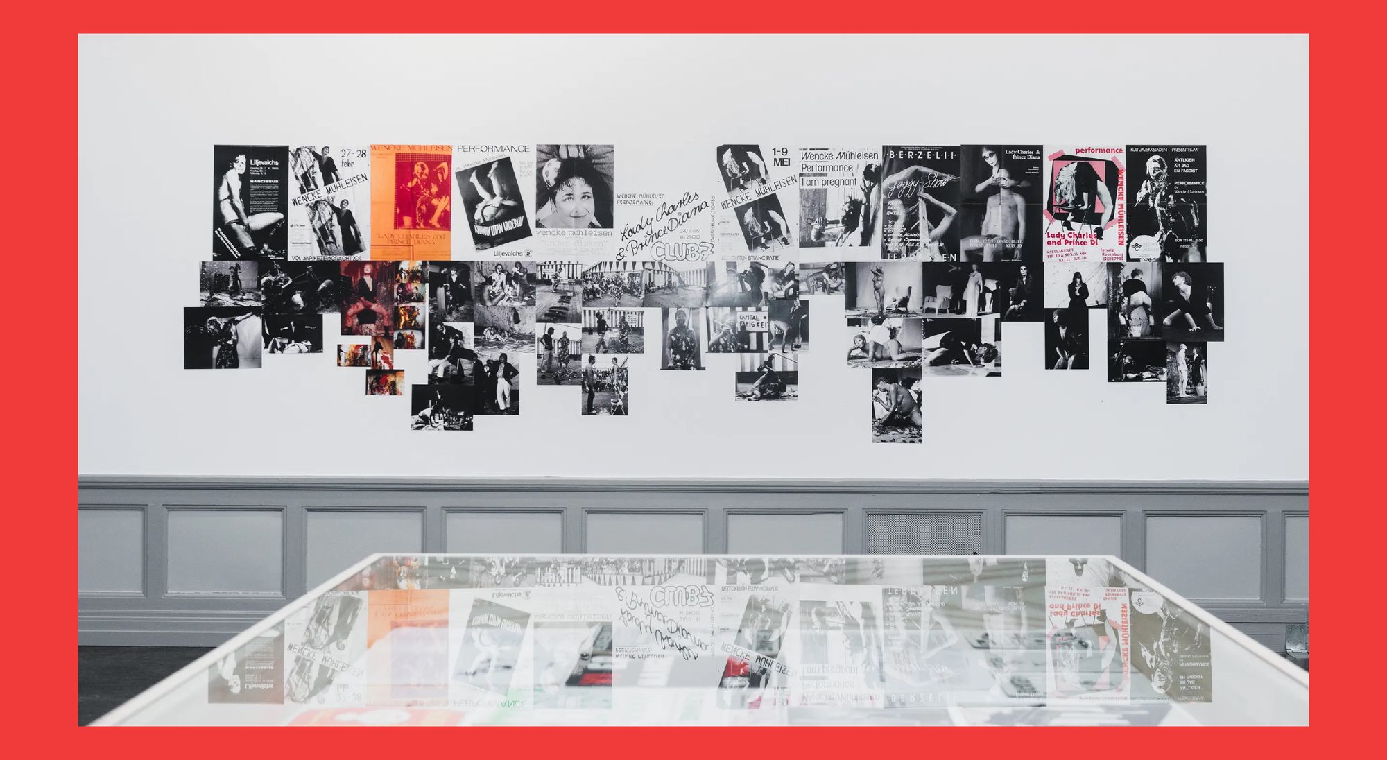
Inaugurated in 2013, Hold stenhårdt fast på greia di: Norwegian art and feminism 1968-89 was the first major exhibition to demonstrate how second-wave feminist ideas contributed to the Norwegian artistic field. It also contributed to the public representation of female artists and feminist art collectives from 1968 onwards. The exhibition was curated by Kunsthall Oslo in collaboration with Norwegian artists Eline Mugaas and Elise Storsveen and the assistance of art historian Jorunn Veiteberg, among others. Driven by a desire to shed light on artists and works that were not yet part of art history—especially those of women—the team followed what they described as a “wide open approach” to research. In practice, this meant being vocal about their purpose and plans for the exhibition and being transparent about their political views when posting on social media and other channels to seek information on the personal experience of those who worked or knew someone that worked within a feminist context during that particular time period. In addition to revisiting the archives of different art institutions, this approach to gathering histories and stories led the curators to obtain much of their material through conversations with friends and relatives of unrecognized female artists who opened their basements and storage rooms.
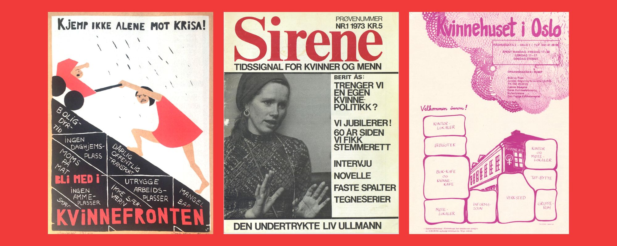
A significant portion of that material included printed matter from feminist collectives, such as the radical feminist organization Kvinnefronten (Women’s Front), which was founded in Oslo in 1972 and is still active today. Kvinnefronten, historically associated with the now-defunct Workers’ Communist Party, produced a vast number of posters and pamphlets. Printed on an offset press or with silk screens, the motifs were often composed in red, black, and white to illuminate topics related to women’s rights, such as the need for daycare, equal pay, and abortion. The exhibition also featured printed matter from Sirene, a magazine initiated by several members of Nyfeministene, another feminist movement founded in Oslo in 1970. Sirene discussed menstruation, cystitis, pornography, and many topics that had been ignored by Norwegian media. It also featured the work of prominent international feminist writers and activists. The magazine was a total success, selling out its 1973 trial issue with a print run of 35,000 copies.
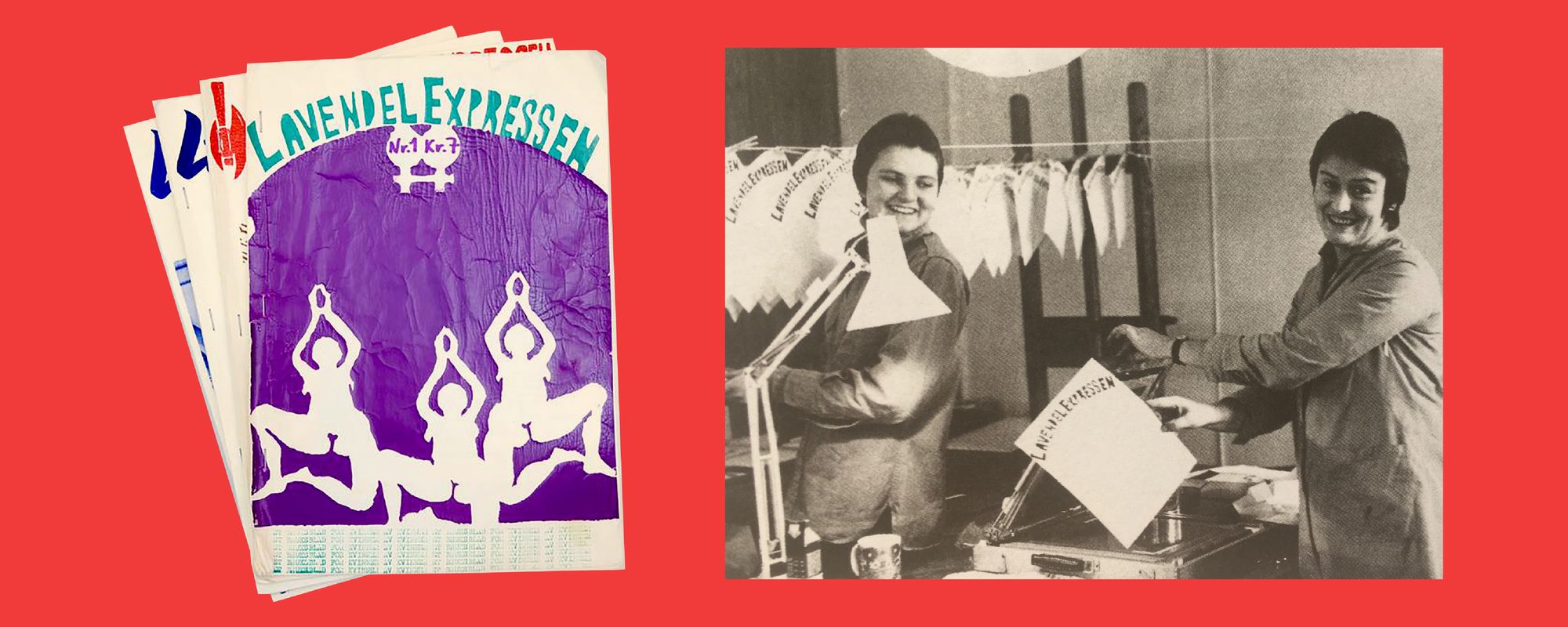
Five years after Nyfeministene was founded, they opened the doors of Kvinnehuset (The Women’s House), a meeting place for the women of their movement. There, women would engage in various activities such as political meetings, planning activist actions and manifestations, and cultural and creative initiatives while also offering legal advice to women in need. One of the groups that met in the house was Lesbisk Bevegelse (the Lesbian Movement), and its members set up a printing collective called Sfinxa – Lesbisk Trykk (Sfinxa - Lesbian Print). Sfinxa produced magazines, political posters, illustrations, poems, stickers, buttons, and collages. Their graphic expressions were more mythical, emotive, and organic than the posters of the aforementioned Kvinnefronten. The first editions of Sfinxa’s publication Lavendelexpressen (The LavenderExpress) were printed by hand: the cover was an elaborated two-color silk-screen illustration, and the content was printed on stencil machines, a technique similar to mimeograph printing. Later, Sfinxa got hold of an offset press, and after collectively learning how to maneuver the machine, the members also worked with offset printing. In 2020, through a private initiative by one of the founding members of Sfinxa, the collective published Vi spiste, sov og drakk feminisme (We ate, slept and drank feminism), a book that sheds light on the radical lesbian feminists in Oslo from the 1970s and 1980s and features their graphic production.
Although several posters of Kvinnefronten, some of Sfinxa, and almost every issue of Sirene have been included in the National Library’s archive, the graphic work of feminist collectives and their contribution to Norway’s popular culture and politics still goes unrecognized. What does it take to be included in records and considered part of graphic design history? And who gets to write graphic design history?
From academia to exhibitions and back
Norwegian Ph.D. fellow Thomas Nordby is one of the few, if not the only, academic researcher specifically investigating Norwegian graphic design history. His ongoing research maps the trajectory of graphic design as a discipline and a discourse since it first appeared in Norway in the 1950s. In order to do this, Nordby avoids subscribing to a particular definition of “graphic design”; instead, he examines the multiple ways in which the term was understood and defined by those who self-identified as “graphic designers” as the field developed. Although seemingly thorough and plural, Nordby recognizes that his historiographical approach is sometimes limiting regarding whose voices and perspectives are included in his research. Indeed, if one’s research only includes those who perceive themselves as “graphic designers,” it risks not only omitting the remarkable printed matter of many feminist collectives that do not fit these categories but also replicating a canon that continuously centers the work of renowned (mostly male) designers—in the words of feminist scholar Sara Ahmed, “the more he is cited, the more he is cited.”
“The absence of traditional historiographic methods [...] is an opportunity for practitioners to write graphic design histories from within and capture many aspects that might escape to a design historian.”
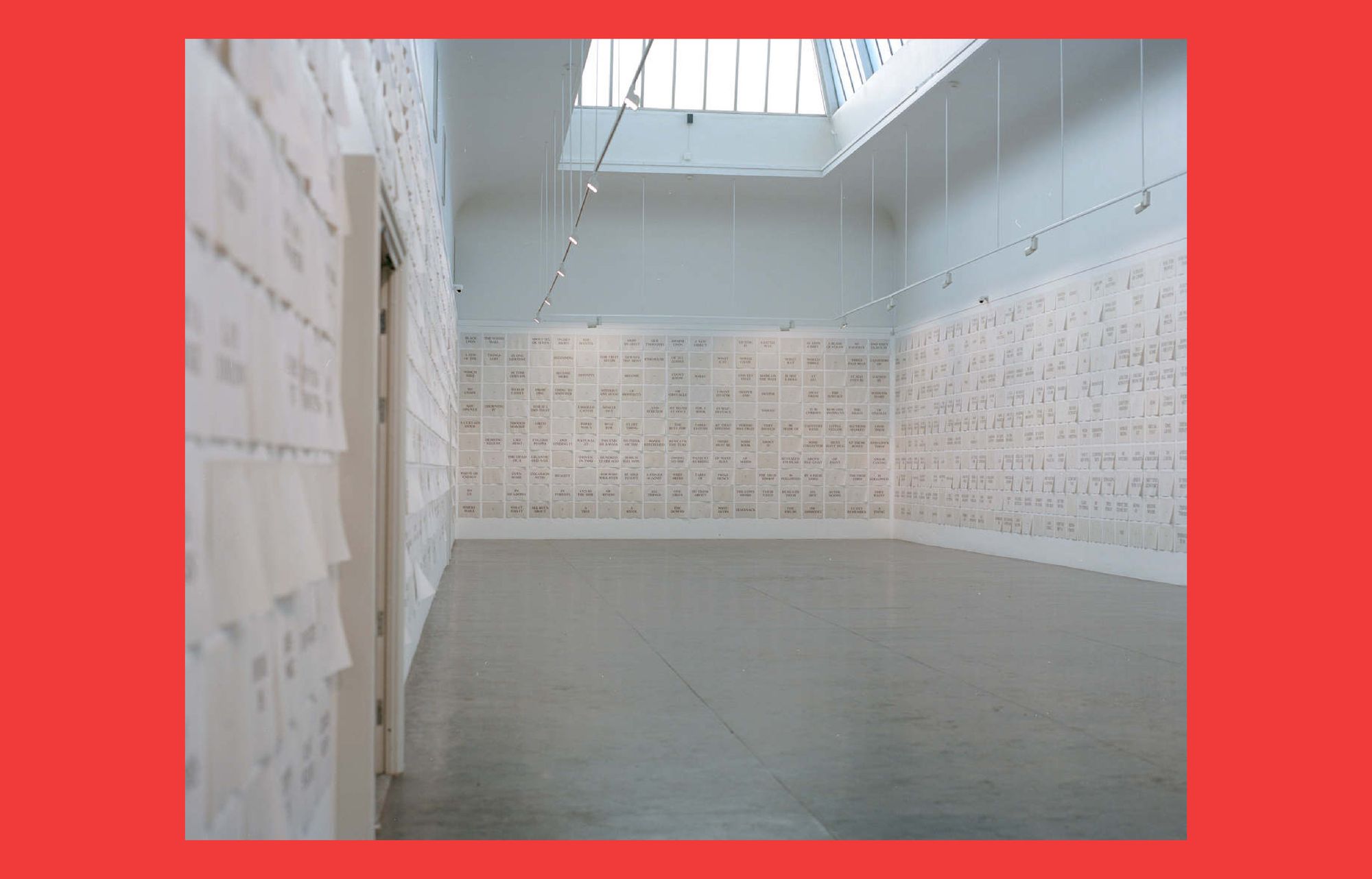
Another example of academic research in graphic design is Norwegian designer, artist, and associate professor Ane Thon Knutsen’s Ph.D. thesis En egen trykkpresse (A Printing Press of One’s Own). Her research examines English writer Virginia Woolf’s work as a typesetter to discuss the conditions of artistic practices and freedom of speech as they relate to women’s role in the history of the graphic industry. Like Woolf, Knutsen set up her own printing press to experiment with typesetting. Researching Woolf’s practice as a typesetter and a publisher, Knutsen’s focus shifted from industry and technology to examining the art of letterpress from a more conceptual, feminist approach highlighting the importance of having one’s own printing press. The final result of Knutsen’s practice-based Ph.D. was The Mark on the Wall, an installation that reproduces Woolf’s short story of the same name consisting of 1837 letterpress prints covering a gallery room and inviting the viewer to a different reading experience while challenging the understanding of linear narratives. Knutsen’s research includes the process of bookmaking and printing to reflect on the politics of who and what has been included in graphic design history and offers a broader, more inclusive understanding of the role of the contemporary graphic designer as well as of graphic design history within the Norwegian context.
The absence of traditional historiographic methods (i.e., “neat history” writing) is an opportunity for practitioners to write graphic design histories from within and capture many aspects that might escape to a design historian. A practitioner-historian might be more aware that material conditions influence not only the outcome but also the design process. In this way, they would not only be able to reveal interrelated aspects, such as the relationship between precarity and collaborative processes, but also value them as a design activity, like the work of Sfinxa and Sirene. Still, most independent research in Norway has been conducted by male practitioners who often center the work of other male practitioners. In “Graphic Design History: Past, Present, and Future,” U.K. design writer and educator Teal Triggs argues that “graphic design history in the present is looking for its past; in doing so, it paves the way for the future of graphic design.” By this, she means that when re-examining the past and including non-traditional historiographic methods, we can expand our understanding of what graphic design holds today and might hold in the future.
No established graphic design critique
Norway does not have a strong tradition of design critique. A search for designkritikk in the Norwegian encyclopedia does not produce any results but instead suggests: “Did you mean: Design rights (law)? Designers? Designer dogs?” Norwegian design critic, curator, and educator Kristina Ketola Bore argues that the word “critical” has negative connotations as it is often associated with “tearing something down.” In Norwegian, kritikk can refer to both “critique” and “criticism.” This leads one to not only avoid using the term for fear that it will be understood in the latter sense but to refrain from the practice altogether. This is also the case within the graphic design field, where commentaries and discussions about the practice have historically leaned towards praise and validation of a few practitioners rather than a broader critique of the field. When imagining ways to establish and promote debate around graphic design in Norway, Ketola Bore points to the importance of looking at what is happening “right now and a second ago.” This does not mean that we are to neglect the importance of looking at history but rather focus on the interconnection between past and present. In this way, to examine and critique contemporary graphic design is to look at oppressive narratives from the past and simultaneously envision other ways of thinking and doing by “breaking, rebuilding, and communicating structures.”
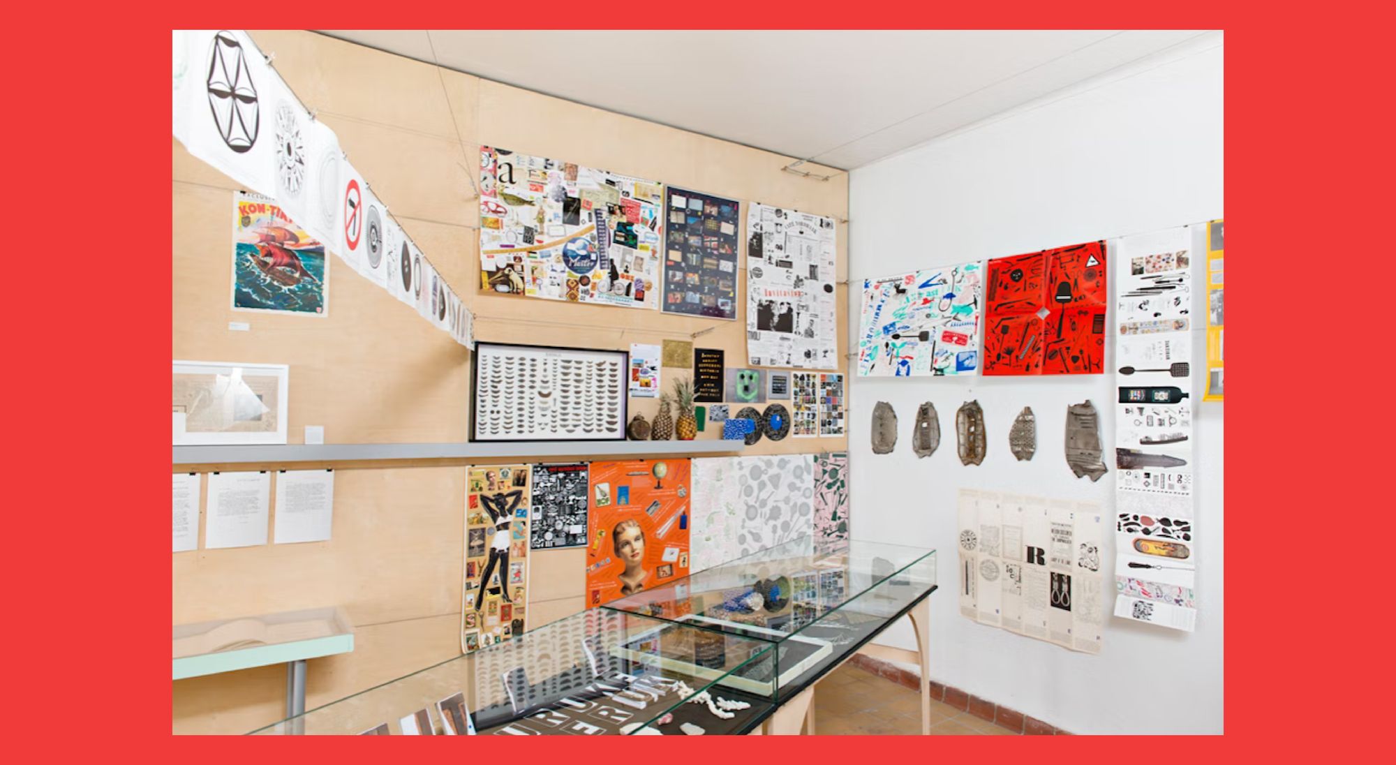
In “Løse typer: En samtale om samling” (Loose types: A conversation about collections), Ketola Bore examines the 2017 exhibition Løse typer to reflect on the lack of feminist perspectives in graphic design exhibitions. Regardless of the exhibition’s broad understanding of what a collection of objects and printed matter relating to graphic design could hold—spanning from rusty metal signs and posters to newspaper cutouts and artifacts—the materials exhibited came from the private collections of three White Norwegian male graphic designers and only included works by two women. In fact, “Løse typer” is a wordplay between the three “guys” (typer) whose collections were exhibited and a movable (loose) set of led types (løse typer). In her review, Ketola Bore raises the critical question of whether one chooses to confirm the current canon or actively search for other perspectives and stories when putting together exhibitions.
Against Norwegian exceptionalism
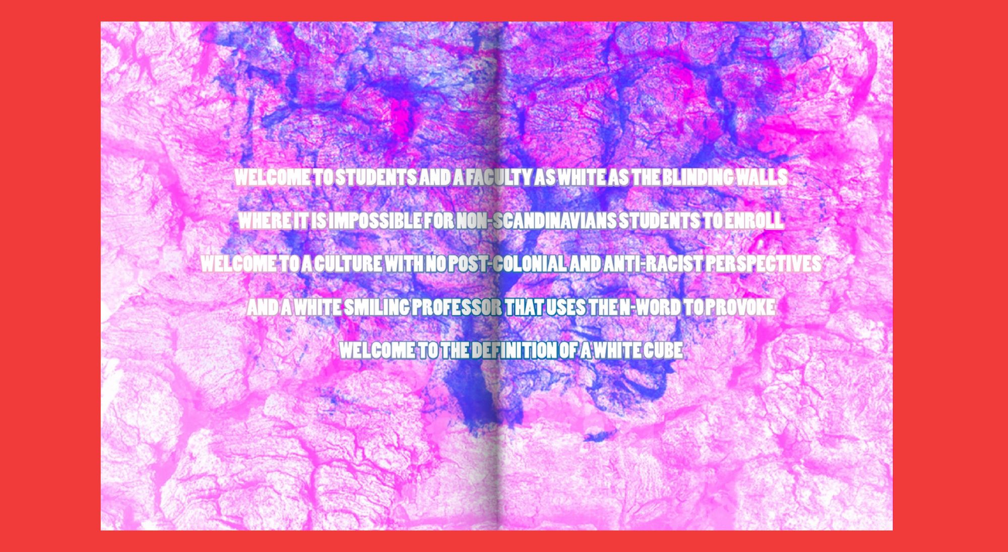
In her Bachelor of Graphic Design thesis “Filling the White Space,” Iraqi graphic designer Neslihan Ramzi reflects on her experience as a graphic design student of color at a Norwegian Art and Design Academy that adhered to modernist traditions. These, she argues, create a restrictive esthetic of what is deemed “good design” by excluding any visual language that differs from the Scandinavian norm. In the words of graphic designer and writer Abirami Logendran, Ramzi’s book “encourage[s] others to speak their mind through a voice that shouldn’t be silenced and to yet again fill that fucking white space with beautiful colors, both literally and metaphorically.” What Ramzi observes and experiences is, unfortunately, neither unique nor new and can be traced back to a nationalist project of ethnic assimilation that began centuries ago.
Norwegianization (Fornorsking) was an official policy carried out by the Norwegian government from the 1850s to the 1960s , specifically addressed to indigenous peoples and national minorities of Northern Norway, mainly Sami. The goal was to assimilate non-Norwegian-speaking native populations into an ethnically and culturally uniform national (i.e., Norwegian) population. This affected, and still affects, the Sami and Kven peoples, their languages, customs, cultural expression, and representation. Norwegian designer Anna-Lisa Johannessen-Rhea examines graphic design’s role in the ongoing Norwegianization of Sami products. She emphasizes the importance of awareness, especially from the majority of designers’ positionality and unconscious bias. This is the case of Sami’s vivid patterns and colorful visuals deemed “too Sami” (i.e., undesirable) because they do not subscribe to the minimal and sober Scandinavian design norm—even when designing products meant to represent indigenous or minority cultures. In addition, Johannessen-Rhea emphasizes that Sami design products should be marketed without the expectations and the othering gaze of non-Sami consumers.
In a recent conference about the importance of queer history at the University of Bergen in Norway, professor in Culture Studies and the initiator of the Queer Archive (est. 2015) Tone Hellesund drew attention to the struggle to collect and archive queer histories. She attributes this to Norway considering itself already “progressive” and “inclusive” enough and therefore being “over and done” with queer issues. Norwegian exceptionalism, she explains, is the—although inaccurate—“general consensus” that Norway has reached a high level of tolerance and acceptance for historically “othered” groups and individuals. So how can we make the invisibilized visible?
“We must continue to roam the archives, share the stories, and question the status quo as we collectively create a multitude of histories, past and present”
In “Design History, Interrupted: A Queer-Feminist Perspective,” Turkish design researcher Ece Canlı states that “history is already being written; it is not an irreversible past, but an extricable today.” Echoing Scotford, Canlı argues that we should make design history “even messier” by adding queer-feminist approaches to design discourses and criticisms as we discuss and write design history—both past and present. It is not about a lack of materials but rather about examining, expanding, and subverting the boundaries of what constitutes Norwegian graphic design and who its constituents are. The lack of an established, written Norwegian graphic design history represents an opportunity to both revisit the past and think and act differently in the present. Great queer-intersectional-decolonial-feminist design scholars from all over the world are paving the way. We must continue to roam the archives, share the stories, and question the status quo as we collectively create a multitude of histories, past and present—before writing them down.
Karoline Buer (she/her) is a Norwegian designer, researcher and educator. At present, her work is centered around identity, language and social structures—and their direct impact on how design is understood, taught and practiced today. She is interested in how creating spaces to exchange knowledge can expand the current design discourse in Norway. Since 2022 Karoline has been teaching Design Critique at Kristiania University College in Oslo.
This text was produced during the Against the Grain Fellowship and is a part of an independent research project started in 2020. The investigation was partly supported by a research grant from Grafill (Norwegian organisation for visual communication), the research remains independent.
Title image: edited detail from a photograph of two members of “Sfinxa - Lesbian Print” printing their magazine “Lavendelexpressen” (Original image by Marianne Rovas Olsen)
The title of this vertical, Epistemic Activism, is an homage to the disabled, nonbinary Iranian/SWANA designer and researcher Aimi Hamraie. In their book Building Access: Universal Design and the Politics of Disability, epistemic activism is described as a form of
political action that occurs within academic fields to shape social norms and practices.