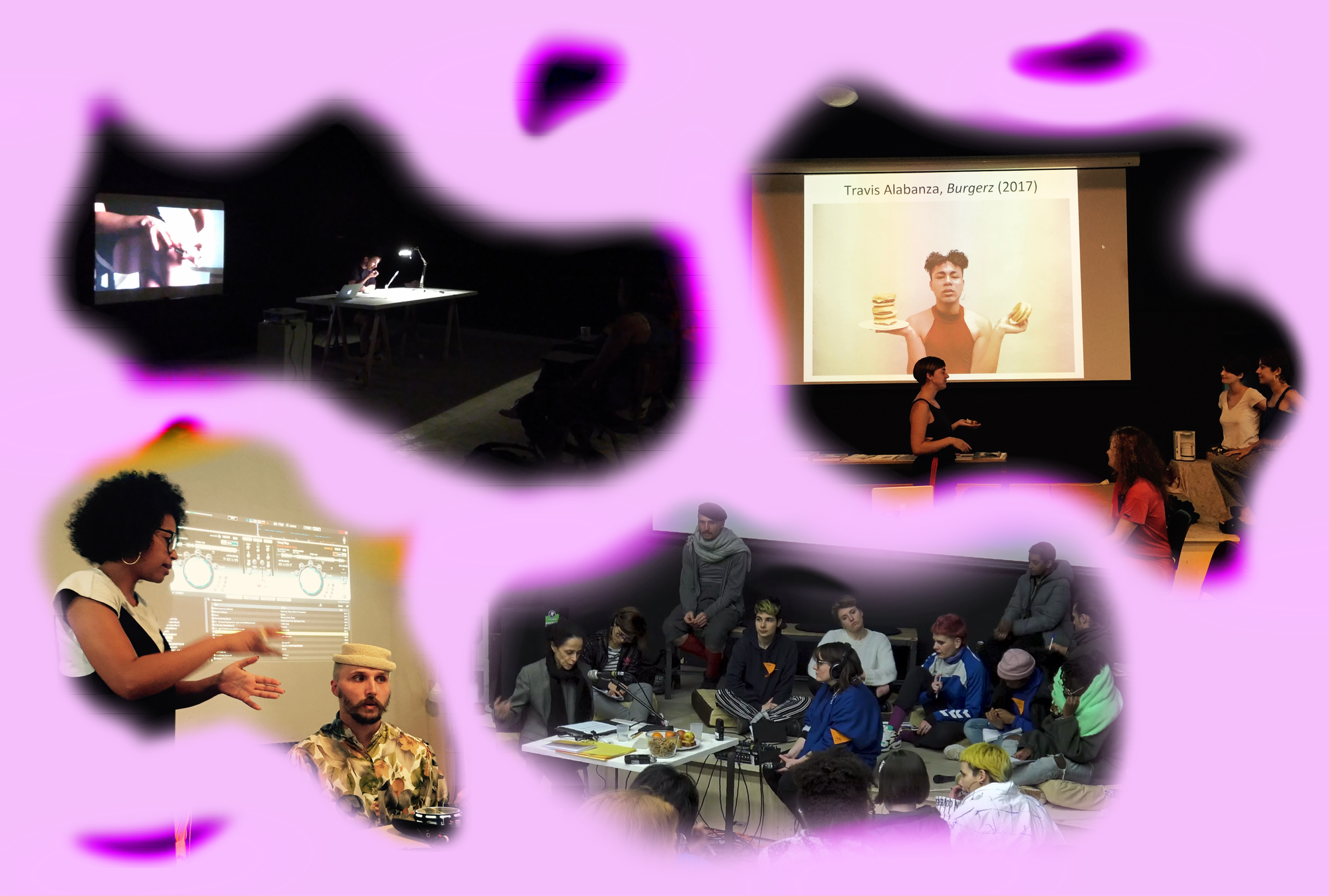
In June 2022, over 140 people—stretching from Indonesia to Sri Lanka, through the United Arab Emirates and Palestine, to Brazil and Chile—logged in to participate in “Educators in Correspondence: Decolonizing Typography.” This conversation between design educators Aasawari Kulkarni and Naïma Ben Ayed explored the struggles and hopes of decolonizing typography, understood as disrupting the Eurocentric status quo in type design education and practice. As the discussion unfolded, our chat started exploding. Participants generously shared links to resources that challenge the modernist and Latin-centric type design canon. Then, suddenly someone proposed: “Let’s make a list!”
Today we bring you these collectively gathered resources. The presented listicle reflects the interests and situatedness of the online session participants. It is by no means complete; instead, it serves as an ever-growing, living document from within and for the Futuress community, which will periodically be updated. Feel free to suggest any new entries via this form. The whole collection can be found in this Google Doc.
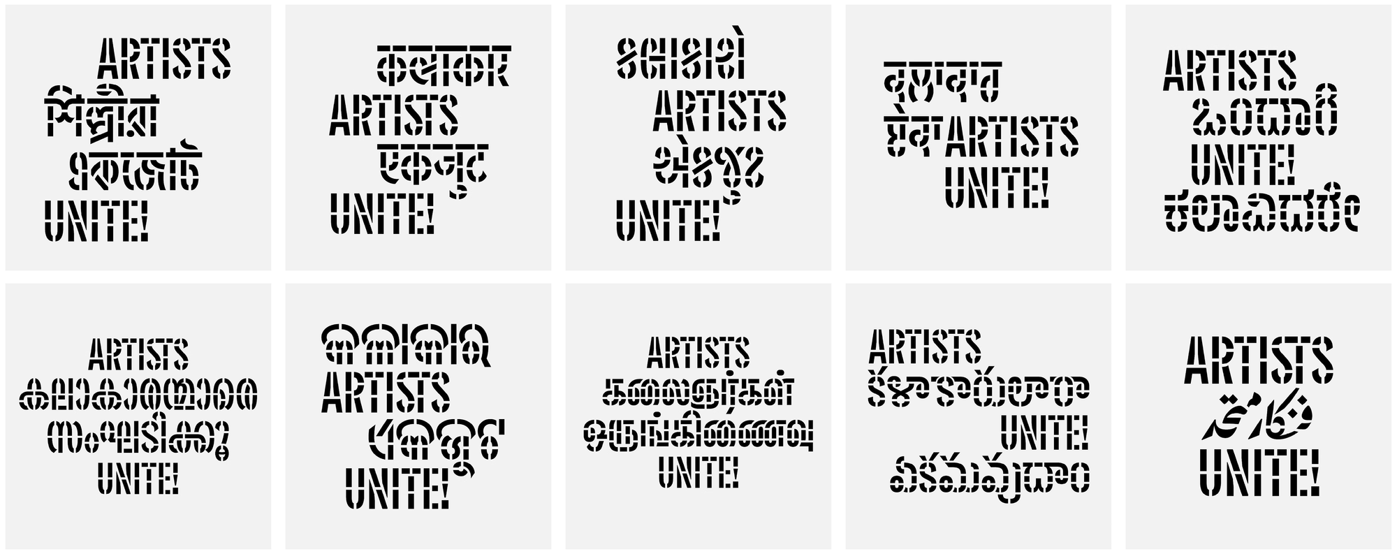
THE POLITICS OF FONT DESIGN: How the hegemony of Latin underscores everything from software to hardware, marketplaces and educational infrastructures
- Through the Typographic Looking Glass: Reflections on the Concept of “Decentralizing Type” by Sahar Afshar
Often, Western typesetting software doesn’t fit the needs of non-Latin scripts. In this text, Iranian type designer Sahar Afshar points out the technological limitations of Latin-centered software and reflects on various problems within the type design market. She discusses the lack of demand for world typefaces, and explains why many designers seek training in a Western context. #Iran #Arabic #Typesetting #Technology #Education - Pluralism and Power Dynamics in Indian Design, by Shiva Nallaperumal, Juhi Vishnani, and Somnath Bhatt
In this interview, the founders of the India-based design studio November share their experiences designing multilingual typefaces in the Indian context. They discuss the idiosyncrasies and unique features of various Indian scripts, and emphasize the importance of designing typefaces for marginalized languages to help them thrive. #India #Typedesign #Education #Tamil #Gurmukhi #Devanagari #Bangla #Gujarati #Telugu - Multi scripts: Blended type family stories, by Lisa Huang, Garine Gokceyan, Lorraine Furter, Émilie Aurat, and Naïma Ben Ayed
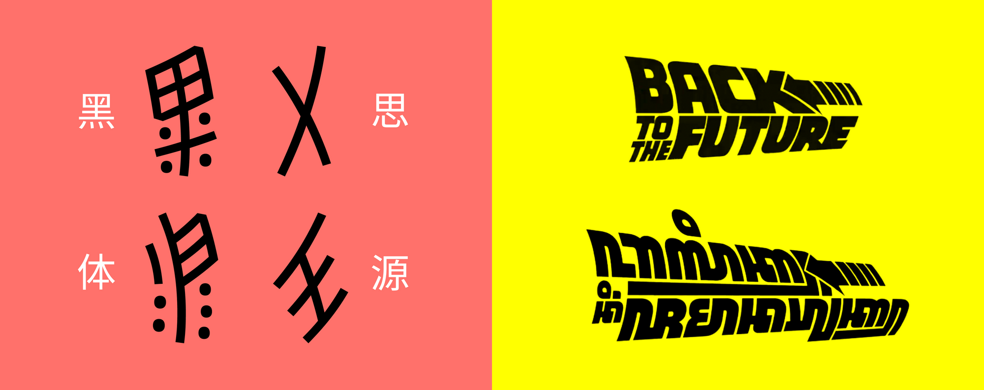
This collective article looks at multi-script technologies and their underlying design paradigms. Authors point out how “matchmaking” or “harmonization” practices often lead to imposing foreign forms—namely Western ideals—on the majority-world fonts. While diving into the characteristics and histories of different scripts, the article points to the many gaps that must be closed in the font market to create space for a truly multi-scriptual world. Further resources in French by the group can be found on the Multi Scripts website. #Lebanon #Armenia #China #Central&SouthernAfrica #WesternAfrica #DigitalDevices #Nüshu #Arabic #Mende #Vai #Kpelle #BassaVah #Medefaidrin #Afáka #Adlam #Chinese #Tifinagh #Armenian
TYPE DESIGN AS INSURRECTION: Journeys, frameworks, and other attempts at resisting the Latin alphabet
- Intercultural and Decolonial: Exploring frameworks for typographic practice, by Rathna Ramanathan
In this lecture, Indian typographer and researcher Rathna Ramanathan highlights the contribution of printing and typography in accessing knowledge. Starting with the role of colonialism in the erasure of knowledge, Rathna dives into a historical journey of Indian printing, providing a detailed insight into her work for the Murty Classical Library of India. Aimed at giving access to Indian classic texts through multilingual and multi-scriptual publishing, the challenge of the project was to design with a vast number of Indian languages and scripts in balance with the English translations in Latin. #India #History #Printing #Typesetting #TypographicGuidelines #AccessingKnowledge #MultilingualDesign #Translation - Decolonizing Typography: The journey of creating a font for an Afrikan writing system, by Tapiwanashe Sebastian Garikayi
The Mwangwego script is an abugida—alphasyllabary—writing system for Malawian languages, designed by linguist Nolence Mwangwenge to replace Latin. In his lecture, Zimbabwean graphic and type designer Tapiwanashe Sebastian Garikayi introduces the script’s history and design, highlighting its importance for the community as a symbol of unity and identity that also makes space for written history. #ConstructedScript #Education #SouthernAfrica #Malawi #Mozambique #Zambia #Zimbabwe #Tanzania #Congo #Burundi #Rwanda #Kenya #Uganda #Mwangwego - Working with the Javanese script: An effort to revive the script topographically, by Aditya Bayu Perdana
In his lecture, Indonesian architect Aditya Bayu Perdana explains the historical and political developments leading to the decreased use of the Javanese script. Nowadays, Javanese—briefly taught at school in Indonesia—is rarely used in the public space, and publishers predominantly use Latin. To bring back interest and encourage the creation of more Javanese fonts, Adityas started to design Javanese versions of Nike and Coca-Cola logos and movie titles—an approach that he calls “Javanising.” #Indonesia #Javanese #History #Javanising - Noto Sans Nüshu: A script created by women from a remote region enters the Google Fonts Noto Sans family, by Lisa Huang
Around the 9th century, Chinese women in the Hunan province developed the Nüshu script to communicate with each other over distance. Ten centuries later, the unique writing sparked the interest of linguists, who preserved it through summer classes and exhibitions. In her text, Chinese type designer Lisa Huang—who designed a Nüshu version of the Google font Noto—shares her thoughts on the importance of digitalizing the script and balancing tradition, cultural legacy, and modernity. #Nüshu #China #History #Research #Digitalization
TOGETHER WE AMPLIFY: A growing collection of platforms, collections and labs disseminating non-hegemonic type knowledge
- The Khatt Foundation—Center for Arabic Typography creates and shares knowledge around Arabic typography in the Southeast Asia and North Africa (SWANA) region and their diaspora. It provides an extensive reading list, and also publishes books and articles such as the Arabic Typography Sourcebook by Huda Smitshuijzen AbiFarès, a historical overview of development and styles that examines technological advances and Arabic letterforms. Khatt also organizes lectures and workshops, curates exhibitions, records podcasts, and conducts long-term research projects. One such project is Typographic Matchmaking in the City, which aims to collaboratively create matching Arabic and Latin fonts for architecture and public space.
- The research project Alternative Pedagogy for Arabic Type Design by designers Naïma Ben Ayed and Khajag Apelian propose to make more accessible type design education for Arabic scripts by creating alternative and non-linear pedagogical paths beyond design schools and studios. Their intentions are to publish fonts as well as collaborate to research and revive Arabic letterforms from the archives and rethink existing technologies and infrastructures, such as design tools and curricula, questions of copyright, and collaborative approaches.
- Two examples that work intensely on amplifying the voices of Arab type designers are the Type Lab within the American University in Cairo, Egypt, and the project Type Platform. Both projects organize lectures in Arabic and English, available through their YouTube channels.
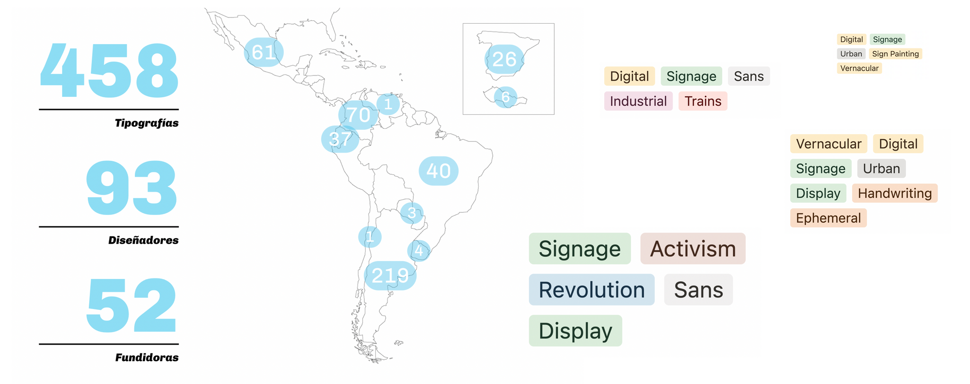
- The Directorio de Tipografía Latinoamericana (Latin American Typography Directory) is a research project by the Faculty of Architecture, Design, and Urbanism of the University of Buenos Aires, Argentina. With a focus on collecting and providing information on Latin American typography, the website features over 400 fonts, up to 100 type designers, and more than 50 type foundries. More projects on typographic research can be found on the faculty’s webpage.
- Typefaces as Cultural Objects by Peruvian type designer and educator Juan Villanueva is an open database of typefaces and letterforms by Latin American designers that honor and preserve Latin American culture.
Further reads:
• Read The Interlocality of Typography by Rachel Jung to learn more about Korean typography and Yu Jiwon’s approach to promoting diversity in typography through her concept of interlocality.
• To dive into the history of Arabic in Egypt, read Language and Message: Developing the Arabic script in Egypt by Basma Hamdy. Published on Designrepository.design, this text draws a line from ancient hieroglyphs to hand lettering and calligraphy in the 7th century to the modern Westernizing and digitization of the script.