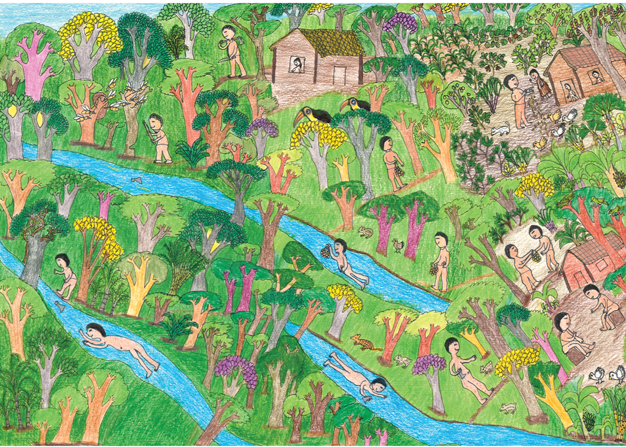
Imagine a design school that is not a school, a classroom that is not a classroom, with teachers who are not teachers, and students who are not students. Picture it: you are surrounded by the cacophony of cars honking, the purring motors of mopeds, and chatter in the flowy and colloquial melody of Derja, the local Tunisian dialect, sprinkled with French words—then, the contrasting intonation of Fus’ha, the literary rendition of Arabic, and some Italian in the background. An explosion of fragrances hits your nostrils: parsley, warm bread, cigarettes, petrol, and the irresistible smell of smoked pepper. You look around: against the bluest sky, the sun illuminates a row of white and sandy-coloured buildings. You are in La Goulette, two streets away from the sea, a busy neighborhood in the northern edge of Tunis in Tunisia. Traffic and business signs set the scene with lettering in Arabic: فواكه جافة - مقهى , bilingual signages, and some in French only: Tabac, Alimentation Générale. Your eyes gaze around in wonder until suddenly, a poster grabs your attention.
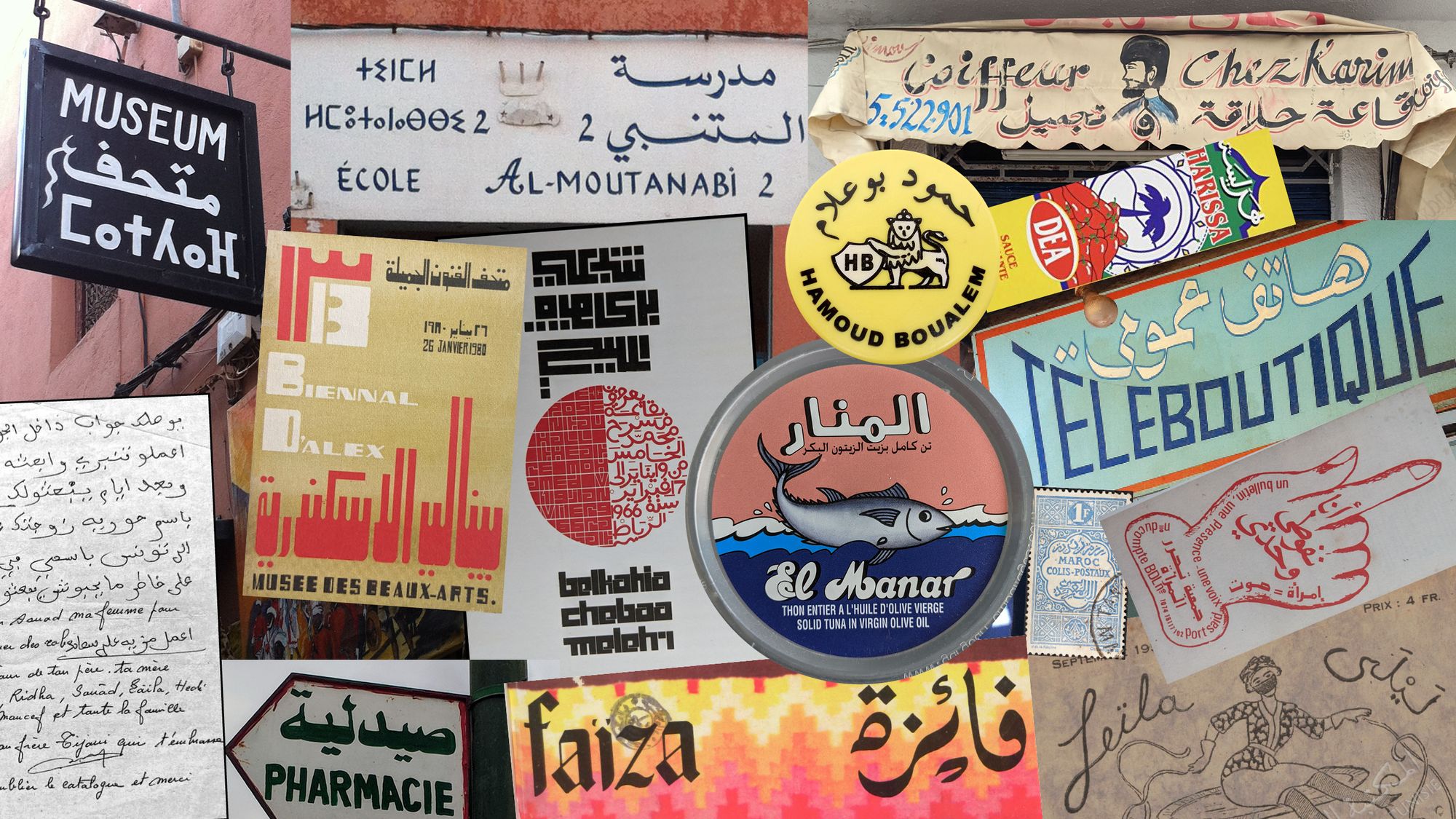
“COLLECTIVE ARCHIVING,” it says in bold Arabic, Tifinagh, and Latin letters. Underneath the headline is a multilingual call to action: “Bring books, periodicals, personal correspondence, and other ephemera.” Inside the room, the scene unfolds before your eyes: a smorgasbord of live archiving in action. Behind a large table filled with all sorts of packaging material, a photographer takes pictures of colorful tuna tins branded in Arabic and French. On the back wall hangs a barber’s sign with beautiful Arabic calligraphy, and just below it, two people catalog a collection of harissa tins and jars. The walls are plastered with photocopies of vintage Tunisian magazine covers such as ليلى /Leïla and فائزة/Faïza. Several tables are joined to form a large surface littered with papers and pens, around which people of various ages compare writing manuals from different eras and trace letters on big sheets of paper. The space looks like a hybrid between a community center and an antique shop, and you cannot resist walking in.
“Much like our ancestors, we speak in different tongues—switching between languages we inherited, languages that were imposed upon us, and languages that we acquired through migration or that we rescued from fading.”
Inside, our eyes finally meet. I’m the one with the short black hair going through a box of papers. 3asslema, I’m Naïma, a French Tunisian type and graphic designer and occasional educator. Welcome to أحْرُف وكَلِمَاتْ وقِصَصْ: a multi-script type design program. I introduce you to the others in the room—an art teacher from Tatahouïne, an Algerian designer from Marseille, a Tunisian calligrapher who lives between Djerba and Paris, a Tifinagh calligrapher from Morocco, and an American Tunisian scholar who lives on a lemon farm. We move to the garden in the back, where you meet more people: a linguist, a poet, a historian, a screen printer, a translator, and a few graphic designers. We drink copious amounts of coffee and tea. I explain that we’ve been going through letters from our family archives. We chat alternatively about letterforms and the stories in the letters. Stories of separation, exile, and hopes for the future, written in a mix of Arabic and French. Much like our ancestors, we speak in different tongues—switching between languages we inherited, languages that were imposed upon us, and languages that we acquired through migration or that we rescued from fading.
This space, our meeting, and our conversations exist only in the fringes of imagination. I am, however, determined to make it happen.
Transforming frustration into imagination
I have been working on multi-script typefaces for over 10 years, collaborating with different brands, communication agencies and type foundries, both in a corporate studio and in my own independent practice based in London, UK. With the exception of non-commercial or self-initiated projects, all the typefaces I worked on were (and continue to be) Latin-first. This means that the Latin font is already designed and approved at the outset, and all other scripts in the typeface have to “match it,” to fit into a visual space that has already been defined by the constraints of Latin.
Latin is the script of the Global North, the center of the type design industry, and the hegemonic voice of capitalism. Consider where most commercial type foundries are based—Europe and North America. Even the tools we use to create typefaces are software designed for Latin by European and North American type engineers. Also, the majority of programs and specializations to study type design are located in Europe and North America. In the very few institutions where multi-script type design is required or at least encouraged, such as the University of Reading, or Esad Amiens, Latin is the core of the curriculum. I guess the argument is that once the foundations have been acquired to design Latin, the skills are transferable to design other scripts.
“Type, at its core, is a connector; a crucial node in the communication circuit that allows for the circulation of knowledge.”
These programs are elitist in their format: they offer limited seats, some of them at high tuition fees. For example, native Arabic students who wish to obtain a degree need to embark on an absurd journey to Europe, detached from an actual multi-script context, hampered by visa hurdles and multiple expenses such as travel and housing. There, they often work alone, which contributes to the myth of isolation of this discipline as a whole. But type, at its core, is a connector; a crucial node in the communication circuit that allows for the circulation of knowledge. To make matters worse, Latin-centric curriculums are not exclusive to Europe or North America; this approach can also occur in design schools across North Africa.
The history of type is intertwined with technologic and economic changes. The version 1.0 of the OpenType format was released in 1997, and its final version 1.6, in 2007. It allowed digital fonts to contain ten of thousands of glyphs and therefore include several scripts within one single file, a true technological revolution in a world that is more and more connected and interdependent. Since the 2010s, the need for multi-script typefaces has skyrocketed. Brands want custom typefaces to speak with one voice across continents, pushing foundries operating in the global North to expand their libraries into multiple scripts with the hopes to breach into new markets. But a design brief for a multi-script typeface that departs from Latin is limiting.
“Working against the legacies of colonialism and structures of capitalism, could we imagine a program to destabilize the hegemony of Latin and imagine type design education otherwise?”
A typeface is the visual voice of a text, delivering a message with a certain personality, eloquence, and tone. When a multilingual person writes, they carry their unique personality through the various scripts they use to communicate. Multi-script typefaces are necessary whenever the same body—be that a person, an organization, or a brand—wants to speak different languages consistently with the same voice. Multi-script typefaces provide matching qualities across various languages, guaranteeing that the different scripts are equally legible and express a similar identity. Wouldn’t it make sense for an approach to multi-script type design education to emerge in a context where multiple languages overlap on a daily basis? Working against the legacies of colonialism and structures of capitalism, could we imagine a program to destabilize the hegemony of Latin and imagine type design education otherwise?
Imagination is the first step to materializing futures that feel near and achievable. I’ve imagined this school that is not a school taking place in a context I’m affectionately bound to: the city of Tunis where my family comes from, but this program could be relevant and adaptable to similar contexts and grow from the commonalities and singularities of each place. It could expand to more scripts, and connect different corners of the African continent and beyond. It is a program I want to co-run, but it is also a program I would love to attend. It is inspired by bell hooks’ Teaching to Transgress and the idea that the classroom starts from who is in the room. It grew from a collage of conversations, experiences, memories, dreams, and desires that meld together, fusing into the potential of something new and unique. It is an invitation to think of alternative futures for multi-script type design education and, by expansion, of multi-script type design practice. Maybe, just maybe… together, we can make it happen.
A sketch for multi-script type design education, lasting four months, location yet to be confirmed:
Principles
- Archiving is a vital collective ritual.
- Moderating all modules and discussion happen in collaboration.
- Bringing together people and knowledge from outside but connected to the discipline of type design facilitates zooming out and perhaps moving on from the status quo.
- Type design is a vessel to facilitate the questioning, exploring, expanding, navigating, and expressing of identities in a broad sense and outside of branding.
- Languages and scripts are not definite spaces, but playgrounds to be explored and expanded; they have rarely been static. Spaces in between are not empty.
- We can deconstruct linearity and structure, revive to preserve, experiment with processes, and write the stories we want to read.
- Education is a collective, collaborative, and deeply caring project.
Assignments
Transnational Archive of Multi-script Letters:
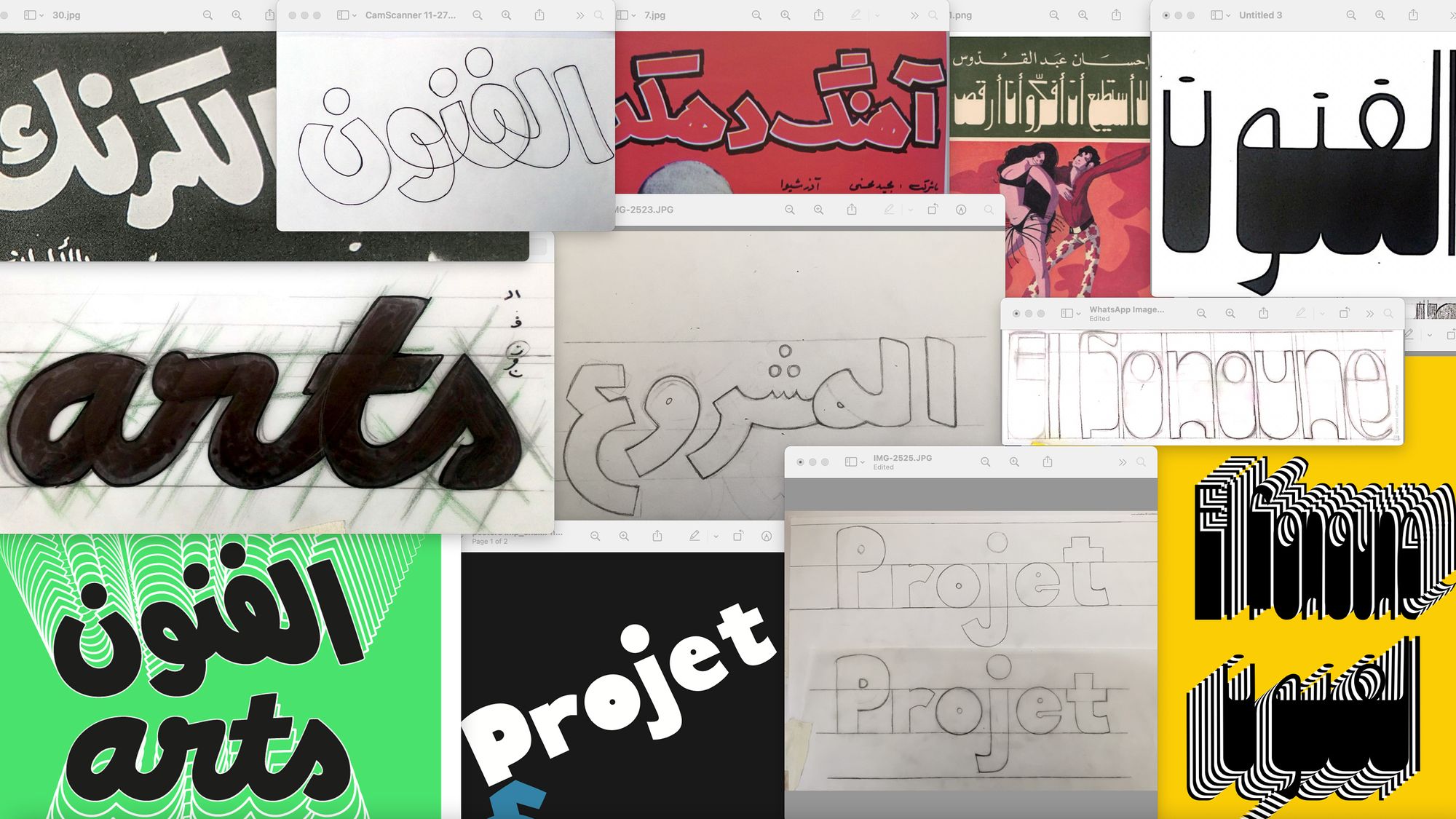
Working collectively and collaboratively, commence an archive of multi-script letters, looking for lettering, calligraphy and writings more than type specimens. Research periodicals, ephemera, street signs, packaging, political leaflets, family letters, etc. In your research, prioritize objects that accumulate at least two scripts, but don’t eliminate one script material if it is interesting. What scripts do you encounter? Any surprises? Any script you don’t know? Document, if you can, the stories behind each of those objects. Scan or take photographs, and note the name, map location, and time if possible. This can get frustrating as some information will be missing, but allow time for this archive to build and for a community to build around it. Someone might join one day who will know the story of who designed this beautiful logo. Embrace the pace of the process. This room is a laboratory and a museum in the making. The emphasis here is on the tangible/physical archive. For the digital part, you might want to propose this collection to an existing archiving platform. Could it be connected nicely to a bigger picture? Maybe you want to open this initiative of collecting multi-script letters and make it a transnational project? This is an ongoing task with no deadline; the methodology can evolve. It will take time to build, but it will be a springboard for other modules to branch out from.
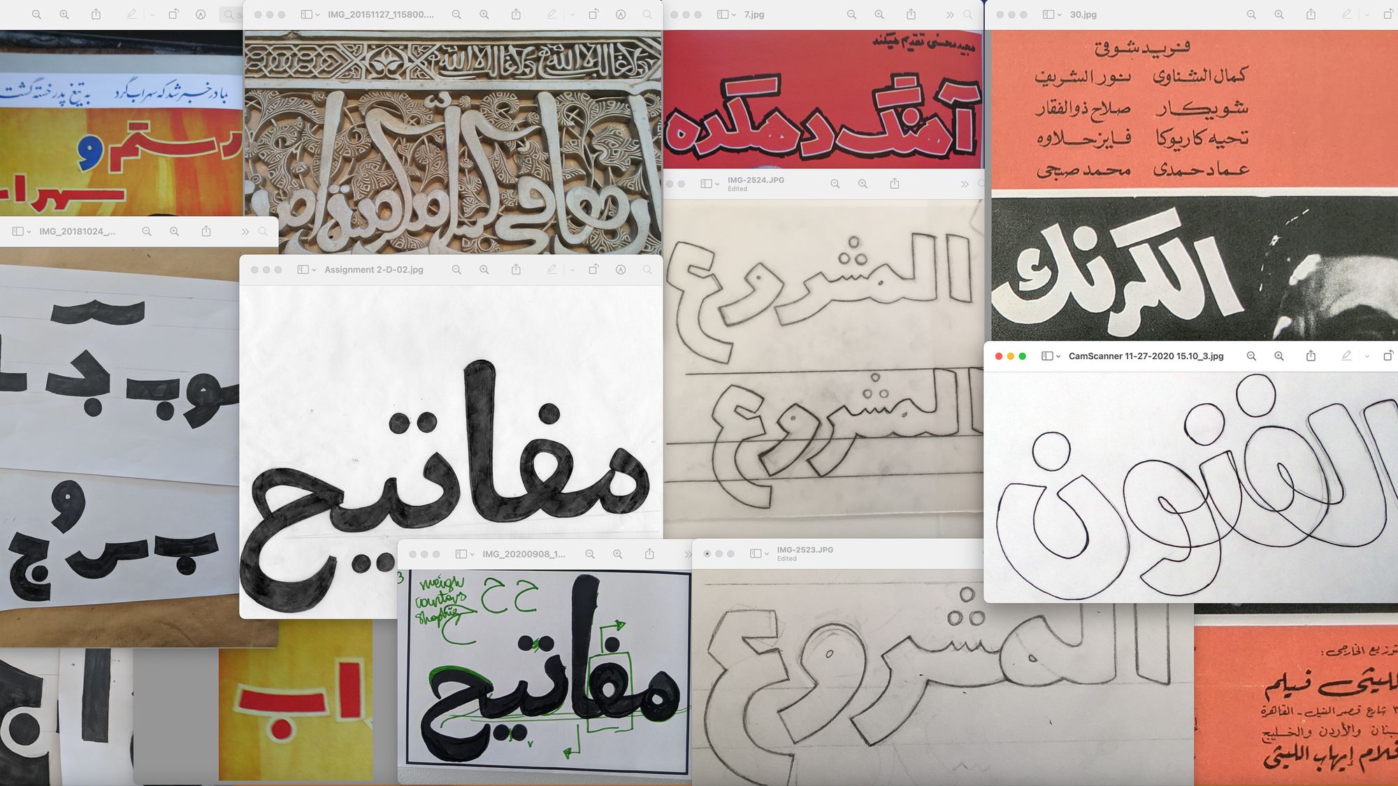
Letters Rally:
Researching letters from the archives that are being created in parallel to this task, you will select a few models that have potential to be developed as typefaces. Think of display design and pick two to four models in one script only. Print or photocopy your models and hand them up to the wall. Collectively discuss the selection. This is a good moment to understand and discuss similarities and differences between writing, calligraphy, lettering, and type. Then start sketching a few letters based on each of your selected models. You can work in groups of two to three people. Once you have a few sketches; put everything up on the wall again and discuss. By now, desires and possibilities should be getting a little clearer. After removing the sketches of design you will not pursue, observe what is left; how does it look together? Is there potential for a nice and original collection of typefaces? Next, create a small character set display typeface in one weight; staying close to the letterforms’ spirit while making the needed refinements. All outcome typefaces will be downloadable and free to the public under an Open Font License. The goal is not to create perfect fonts but to reactivate letters from the archives, allowing for later modification and variation of those letters; this way, it creates a new relation with the archive that transcends nostalgia.
Les Valises des Mots:
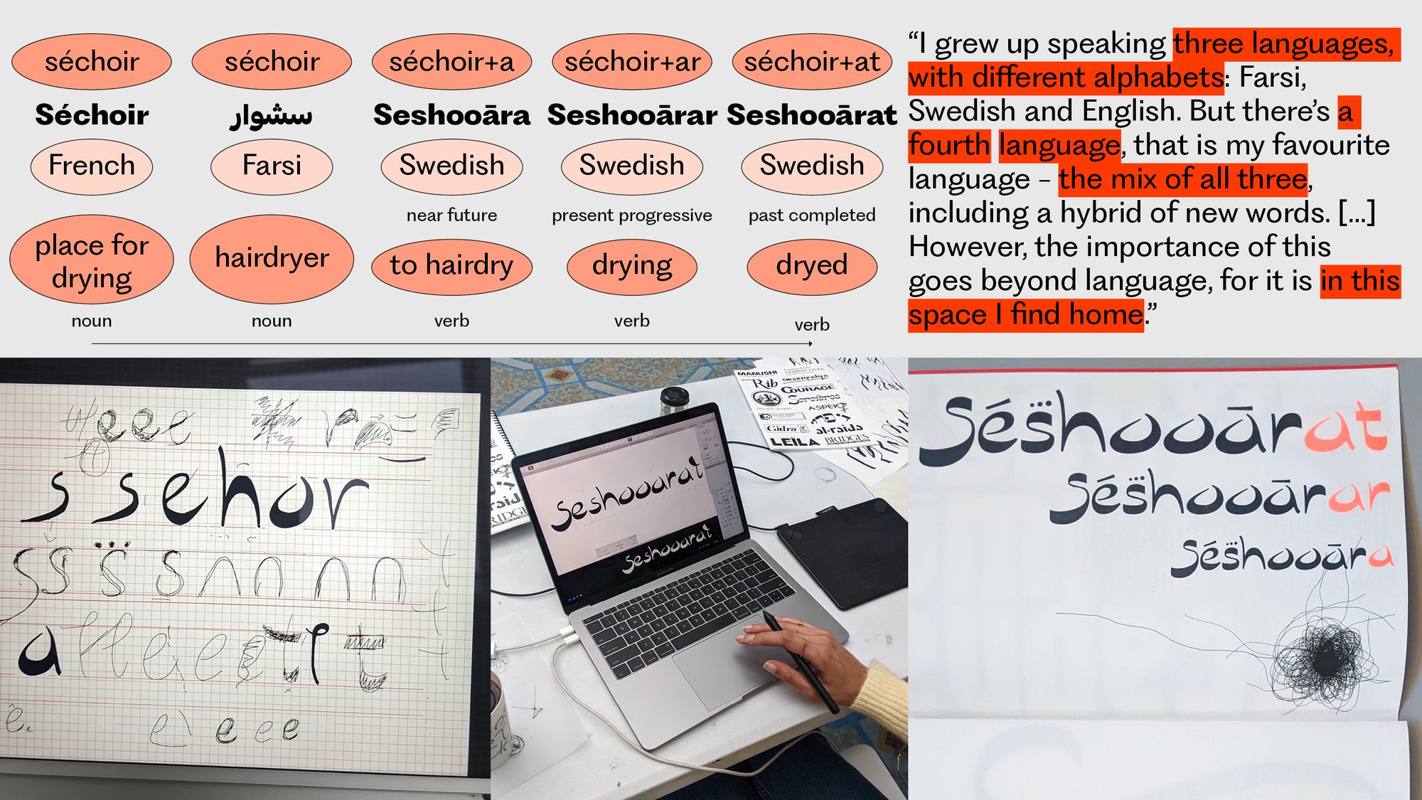
Look for words and expressions that bridge languages together. What happens to words when they travel from one language to another? How does it bridge, and by what means of transport? Does it use several languages in the same expression? Is it applying grammar from one language to a word from another? Is it both? Is there any further stops between the departure and destination script? Dig in your mother’s tongues, dig in your father’s tongues; dig in your memories of multilingual being; how did you navigate this landscape as a child? Have you ever created words and expressions, perhaps with logic and poetry worth sharing, worth archiving? Put together with the group all of your findings; comment and map the languages covered. Write a description for each expression both in terms of meaning and linguistics. Create a typographic template and create an editorial object with the content.
Fluid Forms of Language:
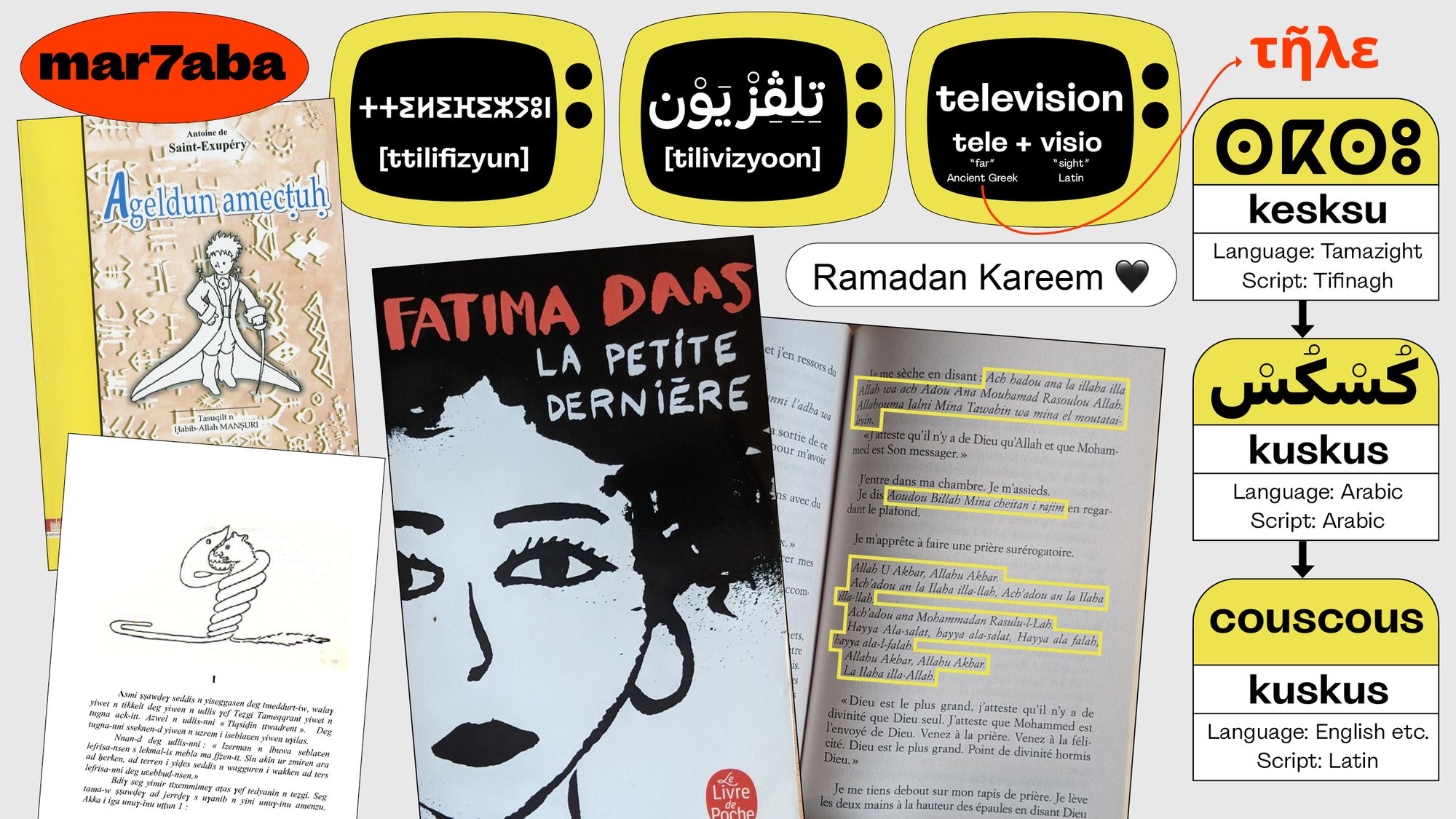
Are languages fluid substances? Are they soft matters? How do you “see” them? Imagine and exchange possibilities. Then think of writing systems, and spontaneously share adjectives to describe them. Does fluid come up? Do we have two opposite lexical landscapes or do they overlap? How many languages can we write with one writing system? Are there orphan writing systems without languages? Are there languages without matching writing systems? What about dialects? Languages and scripts are separate entities that do not always match, or match for a time, for a dance on a manuscript or as a consequence of colonialism. In a team of two, research examples of old and contemporary Arabic text written or typed in the Latin script. Has the opposite scenario occurred? In parallel, research examples of Tamazight text written or typed in the Latin and the Arabic script and again, look for the opposite scenario. Compare your findings.
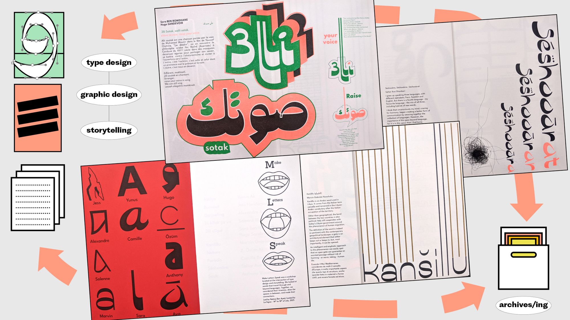
Make Letters Speak:
What is your own experience/history of languages? Do you use different languages when you speak with your family and with your colleagues? Do you speak the same language to your parents and to your children or nephews? Do you love in your mother tongue? What languages do you dream in? Does your personal history match with the history of the place(s) you grew up in, and where you currently live? If we locate scripts and writing systems in relation to the self (expressing) and the collective (communicating), can they dance? Visualize languages and scripts as territory; what happens at their borders? Mutation? Merge? Overlap? Tension? Then imagine means of transport to navigate them. Make spaces in between languages and scripts tangible. How do they translate into letterforms? Think about the fluidity of language and find ways to translate it into letterforms. Using an expression from the Fluid Forms of Language module, create a lettering piece that expresses the queering/merging/ journey of different languages.
Translation:
Translation is a risky operation; the risk being the loss of meaning. Can you think of expressions in your language(s) that cannot be translated? Can you think of words that exist in a language and not in another? Exchange thoughts collectively. Can mistranslation happen in design? Do you have examples in mind? What do you think is needed when we design in several scripts? What if there is a feature that, at first glance, you cannot translate from one script to the other, what would you do? For example, if you have designed an Arabic typeface with a slanted baseline, do you design the Latin on an axis too? Starting from the typefaces created in the Letters Rally Module, imagine if and how the designs translate into Latin letterforms. An additional question to ask yourself before starting is: would this design benefit from being multilingual, and why? Discuss with your peers. You cannot pick the source typeface you have designed in the Letters Rally Module; it must be someone else’s.
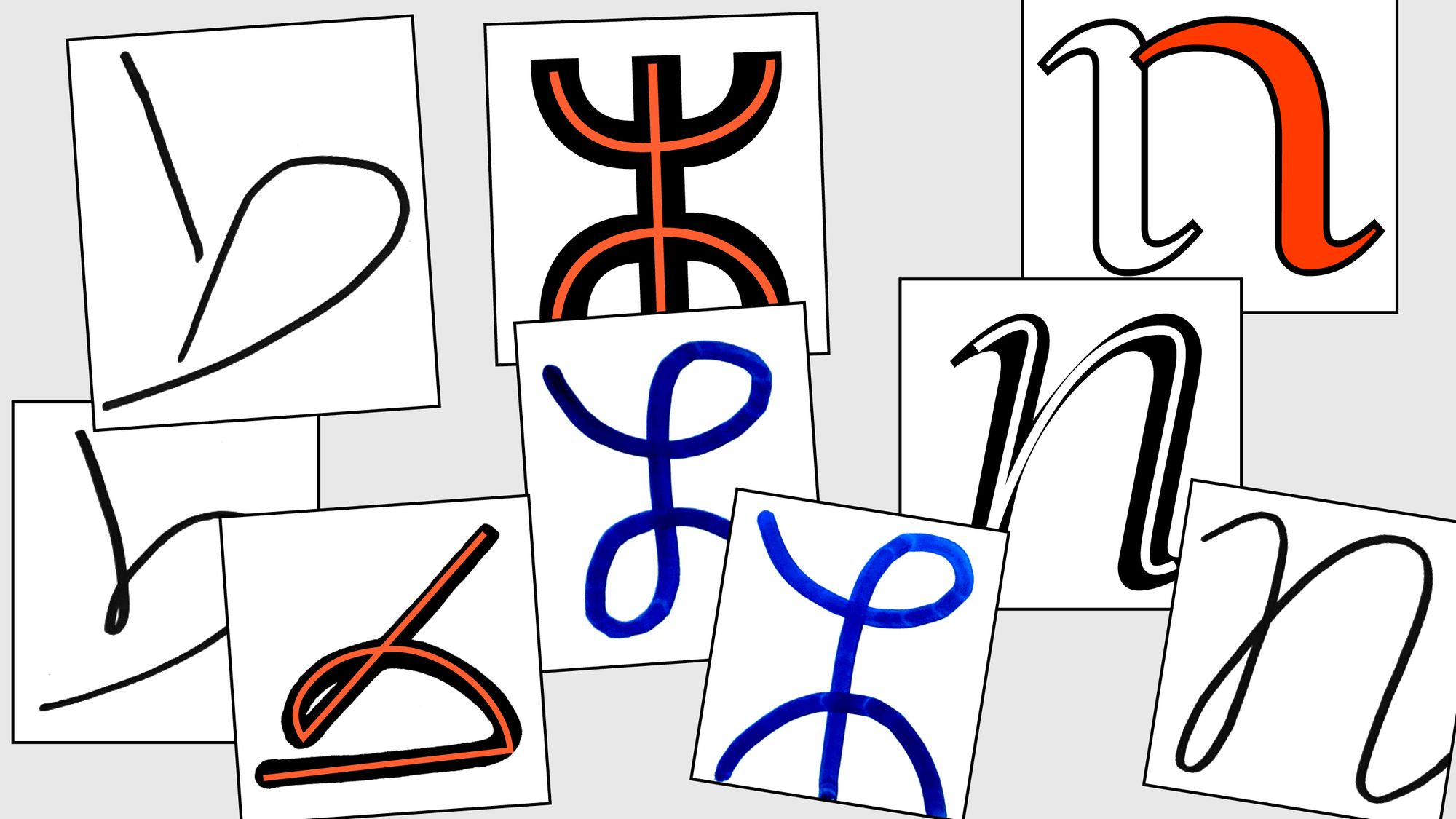
Ductus Labyrinth:
Ductus is a Latin word that means “leading.” It is used in calligraphy to indicate the direction of the stroke of the pen when writing letters, the direction of the stroke for a same letter can vary from one writing/calligraphic style to another. In a team of 3, each focusing on a script (Arabic, Tifinagh, Latin) research and compare those variations. Trace the skeleton for a few letters you can use to write a word in each script. Compare your findings with your teammates, and then swap. Try writing in the script you’ve been studying using styles related to the other scripts. Anything interesting happening? Not yet? Experiment further: no lifting of the pen from the paper is allowed, write with closed eyes, continue each other’s lines, etc.; collectively invent constraints that all of you have to apply to their letters. Once you have some interesting idea(s), change the scale, pick A0 sheets (by the drawing board), pick a tool—any tool that creates weight and contrast—and trace your multi-scripts letters. Take all the space in the format. Then take all the space in the room to display your letters.
Typography of Resistance and Liberation:
Focusing on a specific nation, research the typographic traces of resistance during the period of colonization or at the moment of liberation. How does the independence of a nation manifest through typography and language? What is the impact of colonialism on typography and language in a country that has been colonized? Are there tangible impacts in the colonizer countries? If so, what are they? Do you “see” diasporas in the typographic landscape of countries like France, Belgium, England, Italy, etc.? For example, how and where is the Arabic script/language present in France? Team up for this module and make sure your group is a mix of locals and diaspora. Your research output can be a case study, an essay, the story of the search of this piece of archive you cannot find; you are free to choose the format. Conclude with a collective presentation and discussion.
Storytelling:
What does your typeface have to say? Type specimens usually promote typefaces’ qualities; the range of weights, the character set and languages covered, the functionality and performance in text. The aim here is to bring together type design, graphic design, writing and publishing by approaching the type specimen as a conveyor of stories in addition to promotional material for a typeface. Create a specimen for your typeface displaying both the typeface and a story. You can collaborate with a writer, a poet, a researcher, an activist, someone that creates content and needs publishing. Let this module be an opportunity to use and refine your typeface as you are now switching to a graphic designer role. You can also decide to collaborate with a graphic designer but remain an active participant. Think of this object collectively as all specimens will come together in one publication. Can you make the stories connect? Are there overlaps? What transition can you create to make them parts of the same journey? Is there a narrator? Brainstorm and write together.
Naïma Ben Ayed (she/her) grew up in France and is of Tunisian heritage. She has been (re)connecting with this heritage through her design practice. She is an independent type and graphic designer working with Arabic and Latin scripts. Her interests are in the borders and spaces in between and how they translate into design forms and ideas. After working for several years in a corporate environment, she began her own practice in 2019. She leads workshops that focus on connecting type design to storytelling, language, and archives. She also takes part in initiatives that contribute to opening up the discipline to broader audiences.
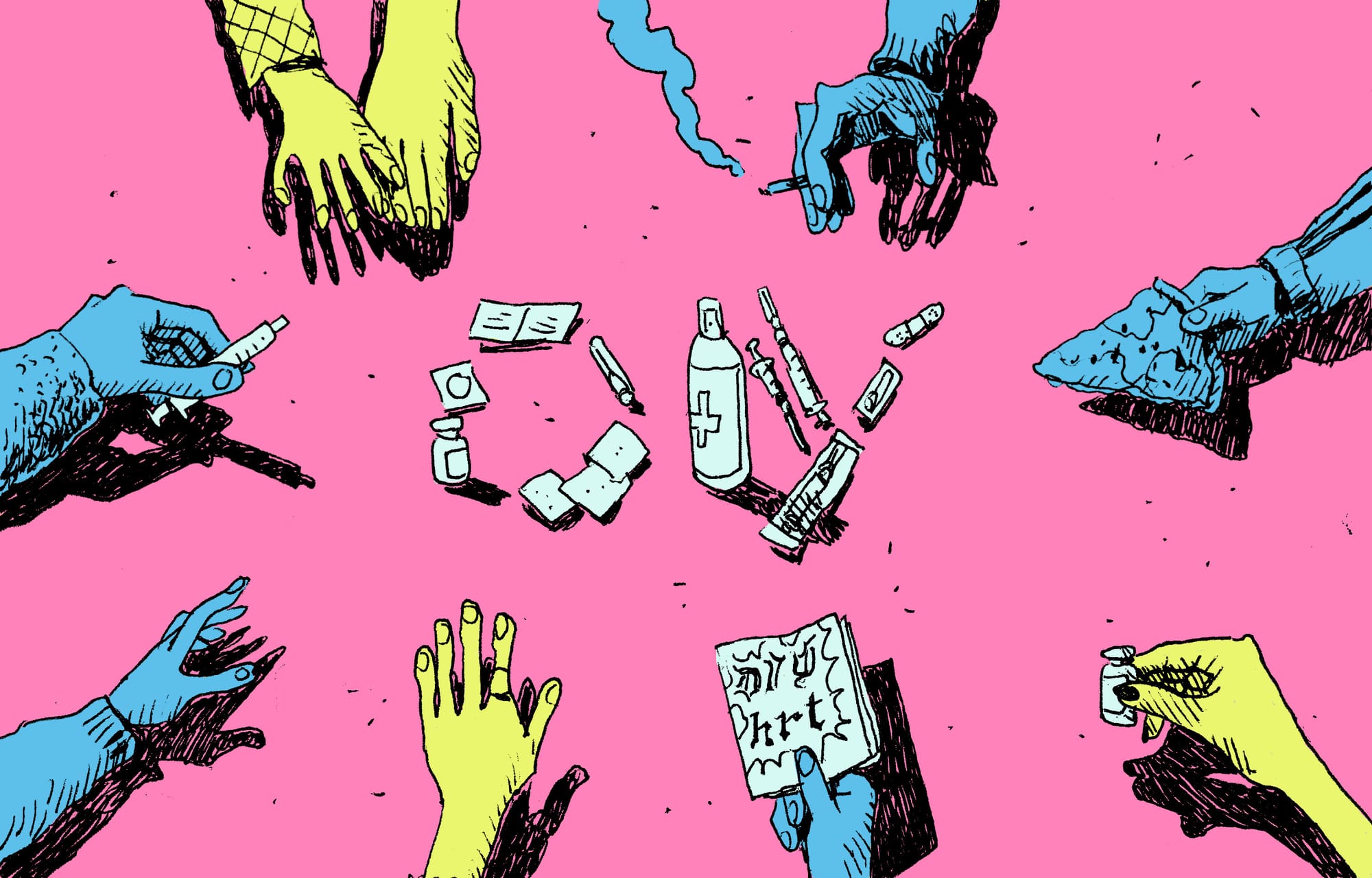
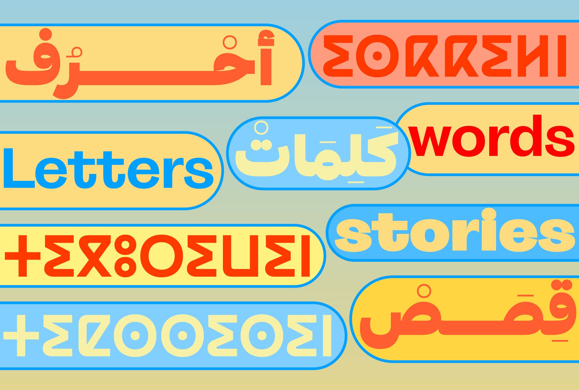
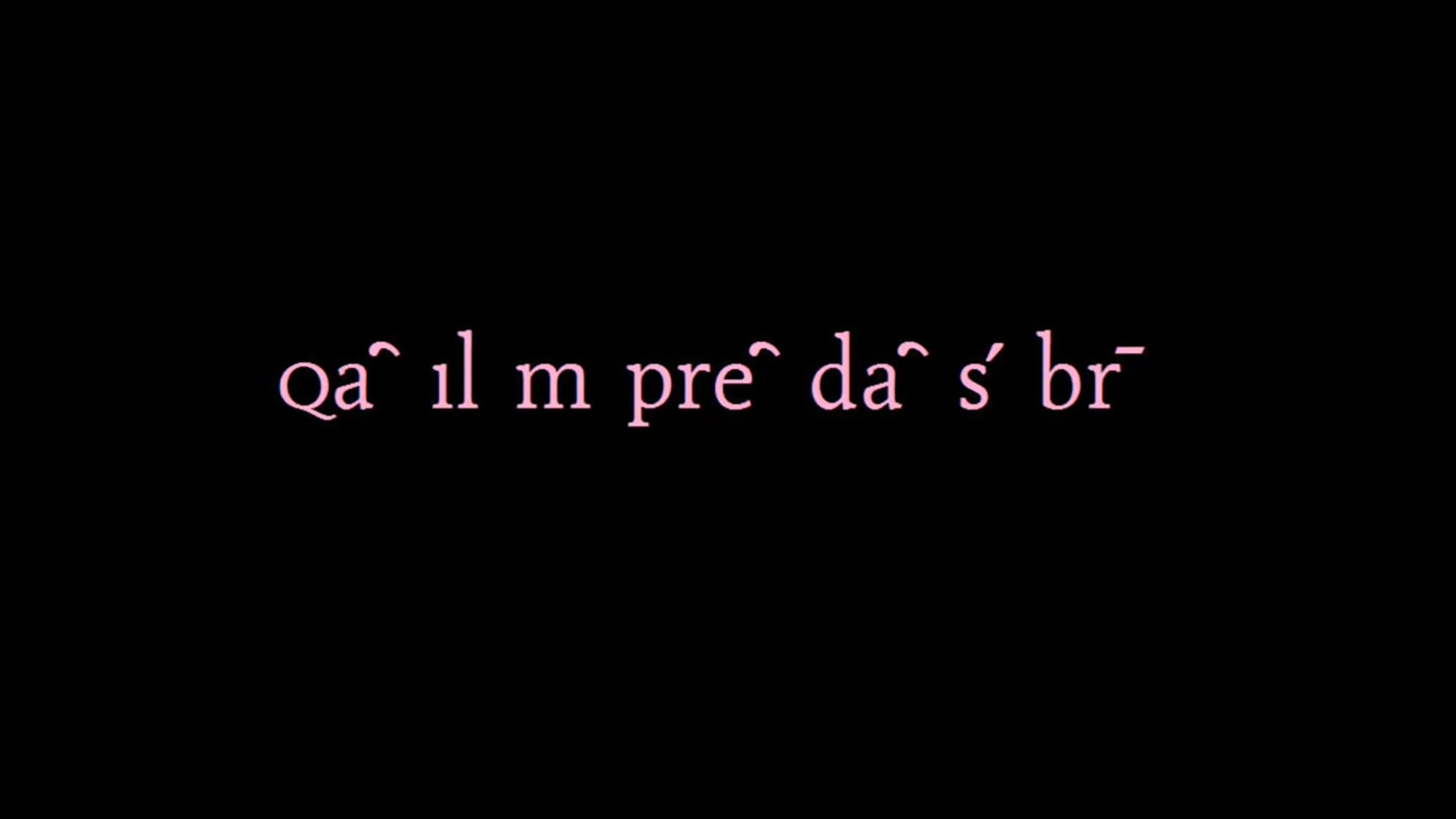
Title image by Naïma Ben Ayed: The words “letters,” “words,” and “stories” in Tifinagh (set in Favorit Tifinagh Bold), Arabic and Latin (set in La Grotesque Black and Bold).