
“Spare Rib will reach out to all women, cutting across material, economic and class barriers, to approach them as individuals in their own rights.” This is just one of the goals that the London-based magazine’s 1972 founding manifesto put forward. Positioning itself as an “alternative women’s news magazine”—as the headline of the manifesto declared—Spare Rib was born out of an underground-press context, which it also sought to escape.
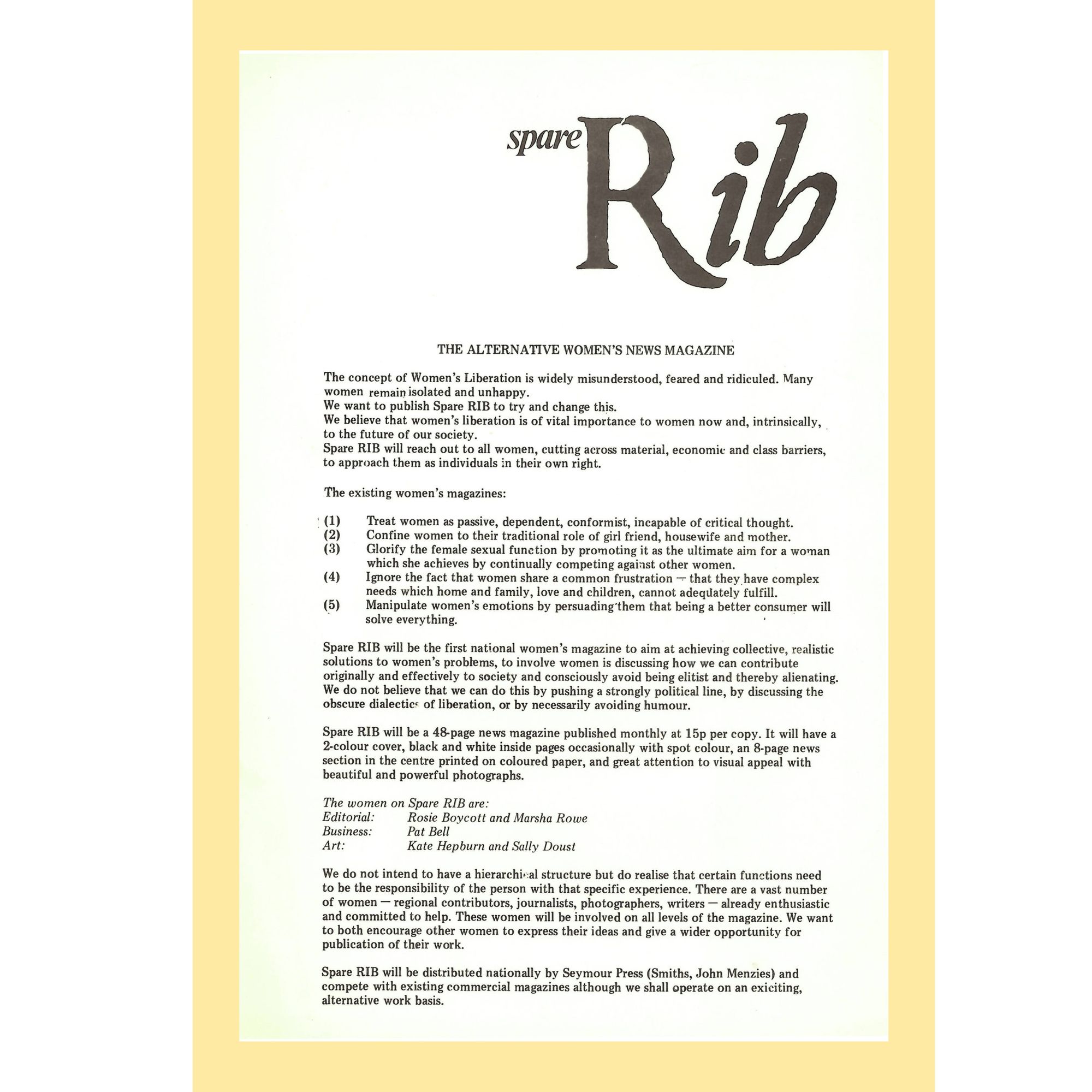
This early manifesto is a critique of both ends of the spectrum—the mainstream and the counterculture. Spare Rib denounced mass-market women’s magazines as “passive, dependent, conformist, incapable of critical thought,” while also stating that it was vital to “consciously avoid being elitist and therefore alienating.” Its editors did not believe they would truly reach all women “by pushing a strongly political line, by discussing the obscure dialectic of liberation, or by necessarily avoiding humor.” Beyond its content, it also set out to be “accessible in its form and available in every newsagent.”
Published monthly, Spare Rib started out with a circulation of 20,000 copies, reportedly reaching 100,000 readers at its peak. To put that into perspective, mainstream Marie Claire in the 90s was circulating at 450,000, and between the 70s and 90s, alternative mags with minuscule print runs of 100 abounded in record stores and feminist libraries around the UK. All the way up to its discontinuation in 1993, Spare Rib found itself somewhere in the middle between the niche and the mass market.
“All the way up to its discontinuation in 1993, Spare Rib found itself somewhere in the middle between the niche and the mass market.”
As a feminist graphic designer and co-editor of a book on contemporary womxn designers, I wondered whether Spare Rib’s middling position was also visible in its design? I was interested in learning from Spare Rib, to understand how its designers chose to bring their feminist ideas into graphic form. And I wanted to see what kind of design strategies and visual means they used to introduce radical, non-mainstream ideas to a broader—and indeed partially mainstream—audience. But how could I even go about looking at a monthly magazine that lasted just over twenty years, with issues featuring around 50-pages each?
The short answer: I couldn’t. At least not for the whole of Spare Rib’s life. The long answer: Following from scholar Joanne Hollows’ description of Spare Rib’s early years (between 1972 to 1974) as a time in which the magazine found its political position within the feminist discourse, I decided to take a closer look at issues from the first year-and-a-half. For comparison, randomly at issues between 1975 to 1976. To analyze the design, I created a diagram, arranging images from the magazine’s regular sections and the pages most representative of each issue one below the other.
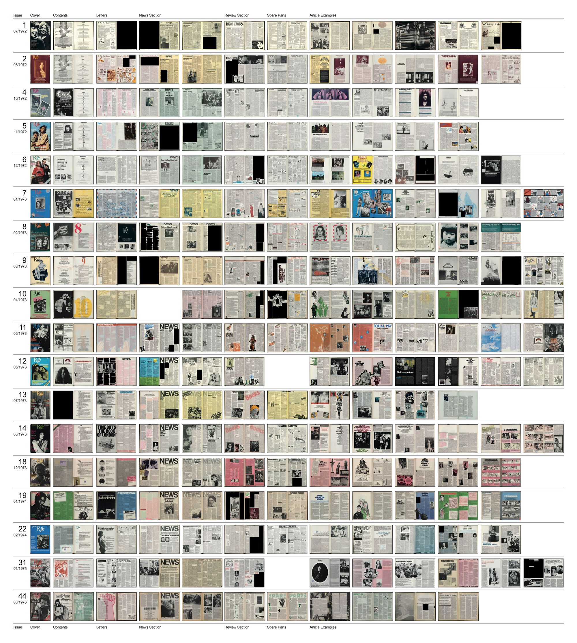
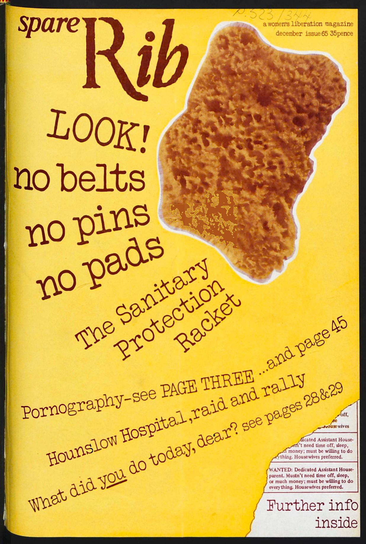
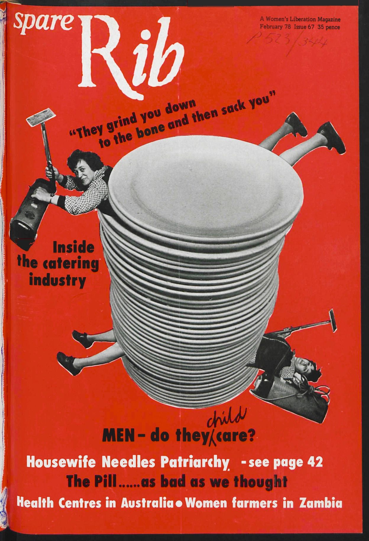
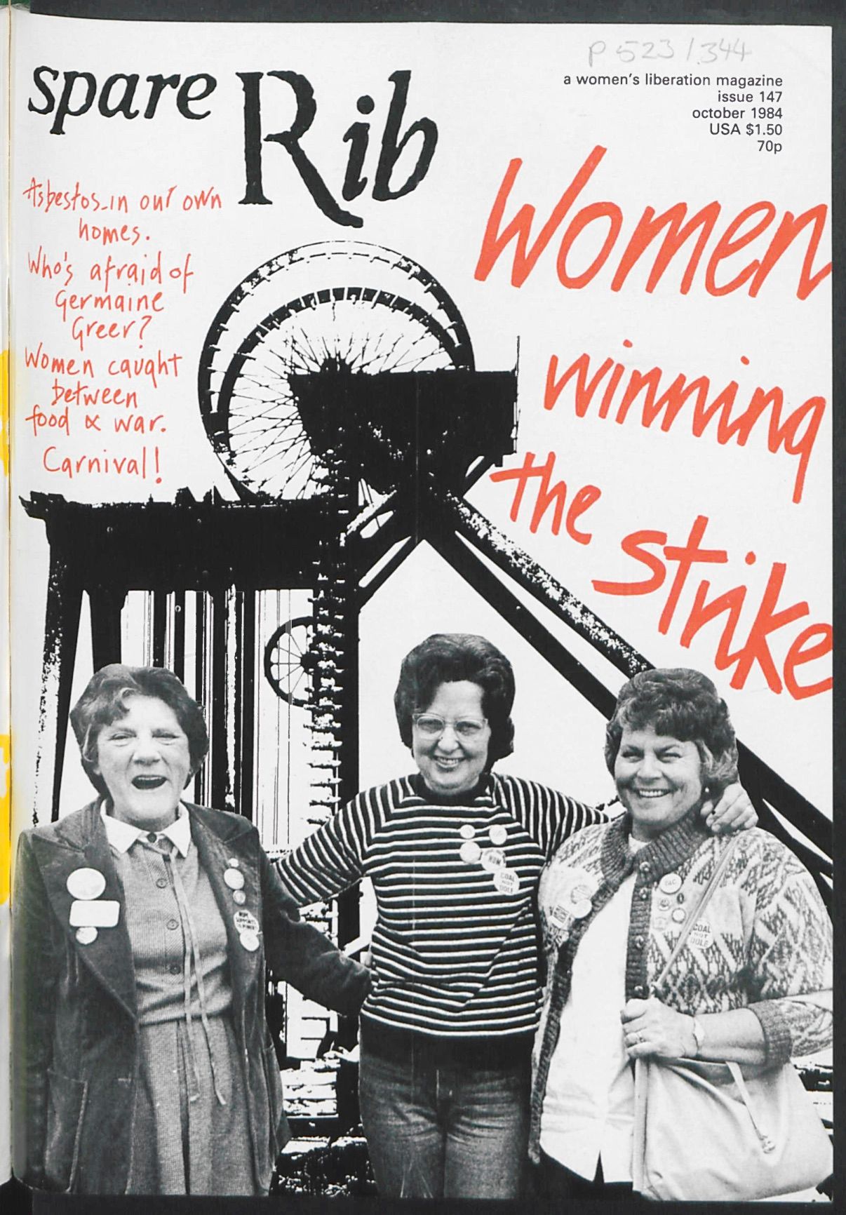
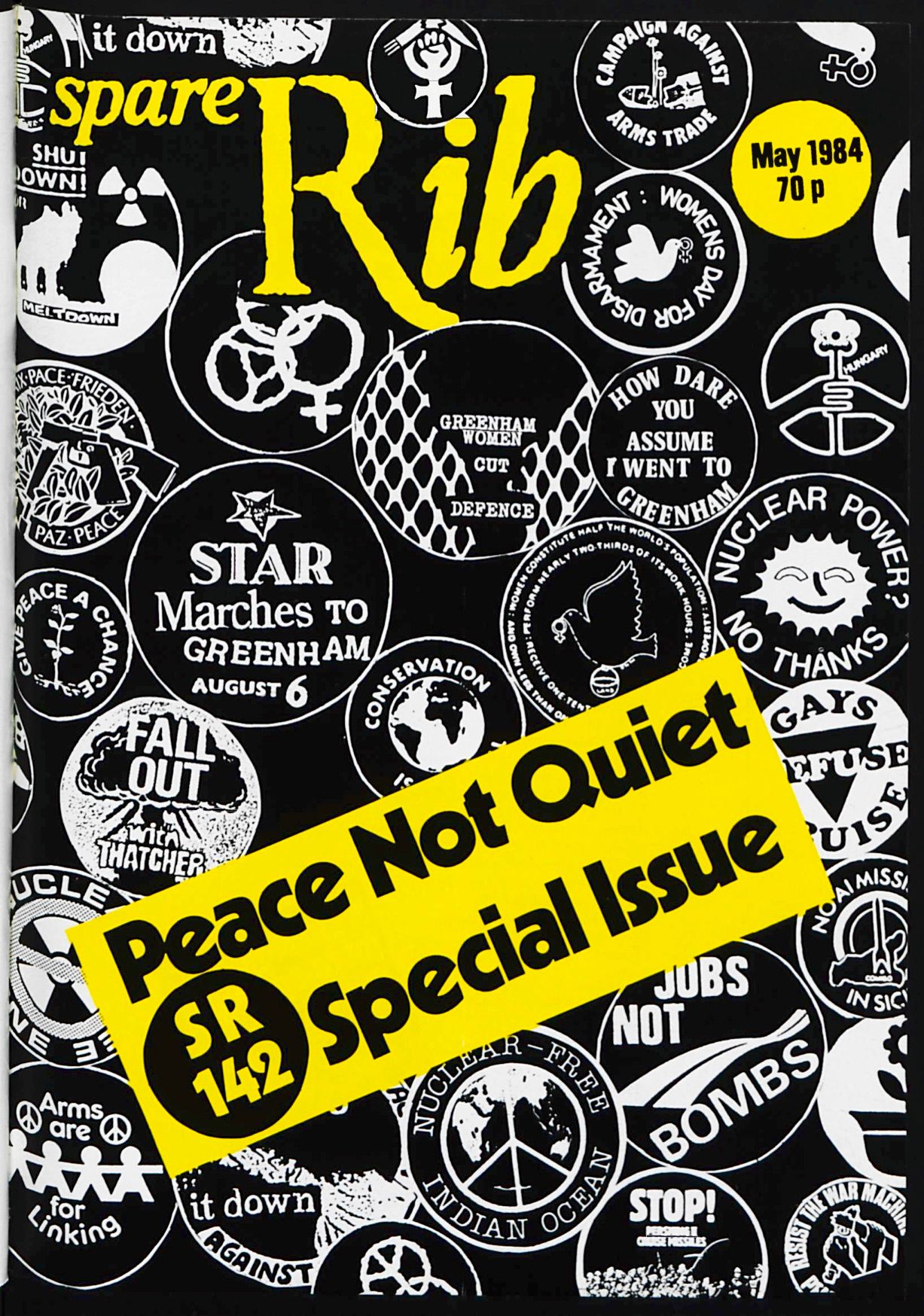
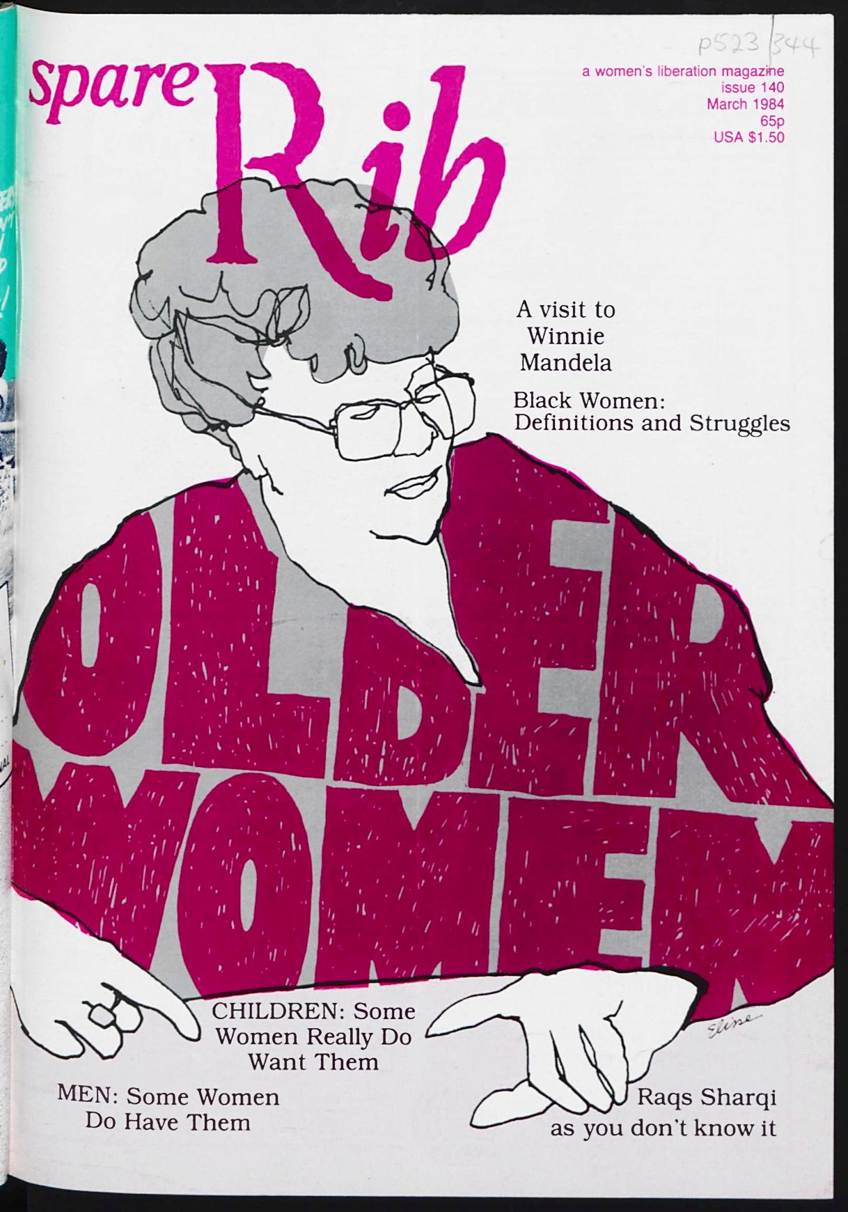
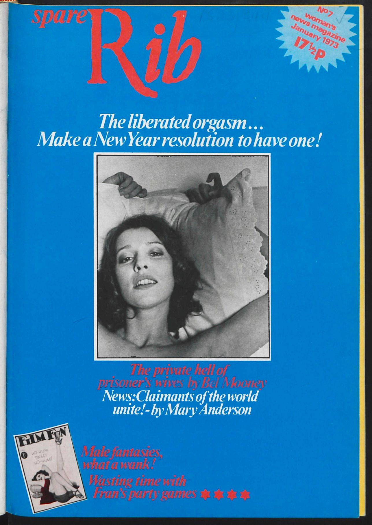
Looking at them in that way, I quickly noticed how much the design changed with every issue, especially in its first year. The magazine was consistent and muted in its first issue, with more subtle layouts strictly aligned to the grid that showed little variation. And then the spreads became more playful and varied, often sporting bright, multi-colored layouts with playful cut-outs, illustrations, and provocative photography. A more toned-down visual language was gradually introduced again from around 1974, with simple two-tone color palettes. Several influences probably also affected specific design changes. For instance, during this early period, the magazine’s distributors persuaded the Spare Rib team to use full-color printing, arguing it would increase sales, which it didn’t, and so this cost-intensive decision was abandoned after only three issues. New designers also often joined the team, such as Lucinda Cowell who came on in 1973 with issue seven, at which point the design became even more lively and colorful.
“Spare Rib’s constantly iterative and somewhat inconsistent design might have been more than mere trial-and-error.”
Rather than following a fixed design concept, these early years seem to have been marked by an iterative process, in which previous design elements or principles were often questioned, broken up, and changed again and again. Even when I quickly browsed over some of the years past 1974, I couldn’t identify a moment when a kind of solidified “Spare Rib-look” appeared. Spare Rib’s constantly iterative and somewhat inconsistent design might have been more than mere trial-and-error. Maybe it turned into strategy? Maybe this is where its secret to being radical-yet-accessible actually lay?
A constantly changing design suggests an openness to change. Something that doesn’t have a fixed form can constantly evolve and respond to different positions. This emphasizes conversation, subjectivity, and collectivity instead of establishing some seemingly objective, single voice. Variety in design suggests diversity in perspectives. And adaptability suggests approachability and the possibility for participation. The playfulness and humor found in many of the design elements of Spare Rib also create a friendly and accessible atmosphere. All of this matches the magazine’s initial goals, which included the aim to “involve women in discussing how we can contribute originally and effectively to society and consciously avoid being elitist.”
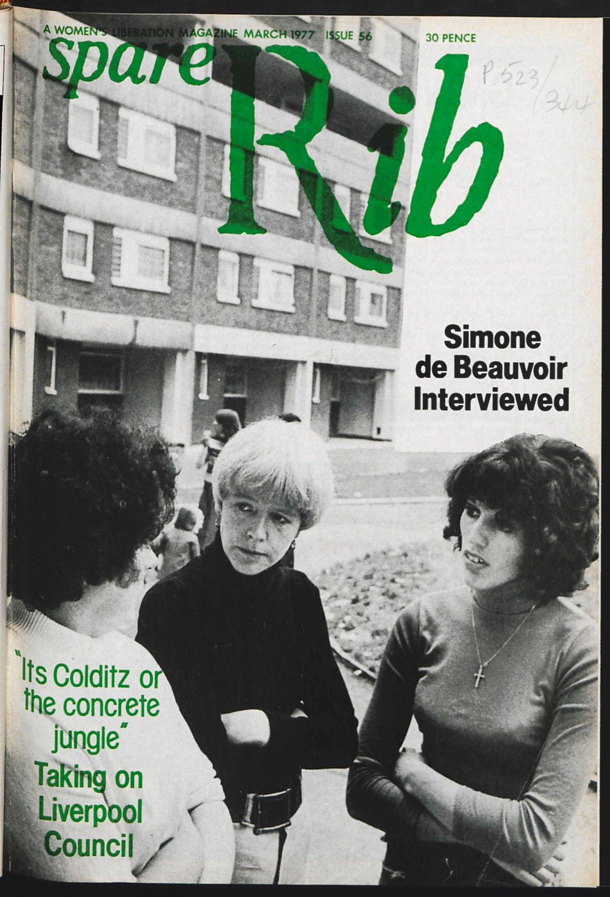
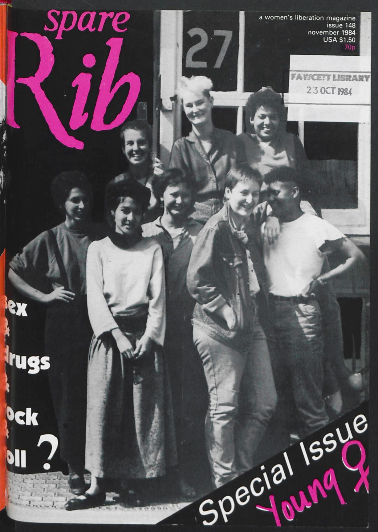
Today, design and branding practitioners generally see an iterative design process as a means to an end, with a final “solution” as the ultimate goal. Spare Rib seems to have done things a bit differently. The iterative-design-proponents would may- be describe its approach as being in a continuous phase of prototyping. Although the layout seems to become more systematic in later years, there’s still a lot of variety in design: Spare Rib always retained some degree of openness and changeability. The only thing that seems to have really stayed the same over the whole two decades was the magazine’s logo, designed from twisted tissue paper by the magazine’s first designers, Kate Hepburn and Sally Doust. Maybe at least one thing has to stay the same.
Silva Baum (she/her) is a graphic designer based in Berlin, Germany. She holds a BA from FH Münster and a MA from HAW Hamburg. In 2019, she co-published notamuse—A New Perspective on Women Graphic Designers in Europe, which she also co-edited and co-designed with Lea Sievertsen and Claudia Scheer.
This text was produced as part of the L.i.P. workshop, and has previously been published in the Feminist Findings zine.